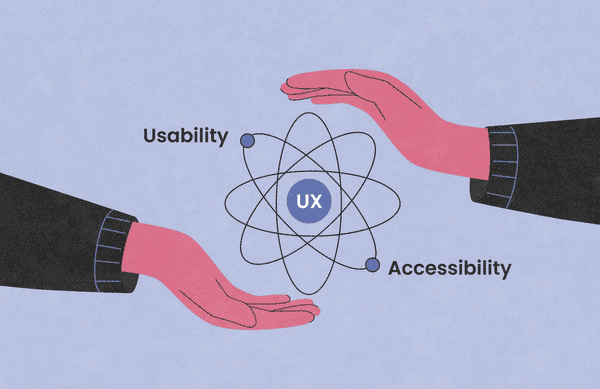
Today’s consumers are bombarded with so many websites and other web products that a clunky platform simply stands no chance of succeeding. To gain a competitive advantage, you need to dedicate time and resources to creating a compelling design. And you must pay attention to two key ingredients: usability and accessibility. They pave the way to a level of efficiency, satisfaction, and inclusivity that increases user engagement, retention, and conversion — all while avoiding costly legal problems. We’ll discuss how these two concepts overlap with each other and how to incorporate them into your own products. But first, let’s revisit the definition of web accessibility and usability and discuss their distinctions.
Web accessibility vs. usability: What are they, and how are they different?
Usability and accessibility are so closely linked that it’s easy to confuse them with one another. But they’re distinct, and you need to fully understand each one to design an optimal user experience.
First, let’s consider these essential design concepts in isolation. Let’s define usability first.
What is web usability?
Usability refers to how easy it is for users to accomplish specific tasks with a digital product. Designers evaluate usability throughout the development process, from the first wireframe to the final product.
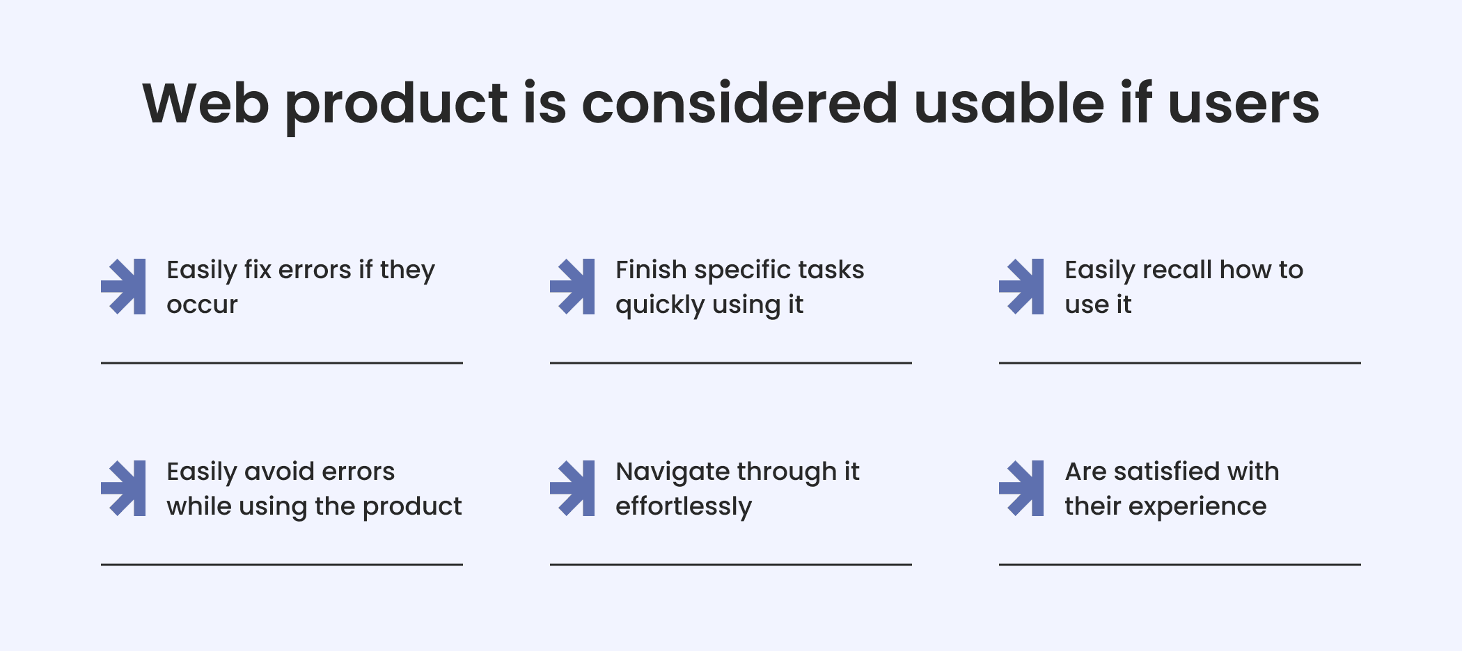
A website or other web product is considered usable if users
- navigate through it effortlessly (even if they are using the product for the first time)
- finish specific tasks quickly using it
- easily recall how to use it
- easily avoid errors while using the product
- easily fix errors if they occur
- are satisfied with their experience with the product To pass the usability test, the user interface must be intuitive. Now let’s see what web accessibility means.
Beyond color contrast: what web accessibility means in the context of Web Content Accessibility Guidelines (WCAG)
Web accessibility has more specified guidelines than usability. Those guidelines pertain to a design process that intentionally takes into account the needs of people with disabilities.
According to this web accessibility definition, a web product’s user interface and user experience should comply with the Web Content Accessibility Guidelines (WCAG) — the international standard for accessibility developed by the Web Accessibility Initiative (WAI) of the World Wide Web Consortium (W3C). The guidelines provide a framework for web developers, designers, and content creators to make websites and web applications usable by individuals with various disabilities.
The WCAG is organized around four key digital accessibility principles.
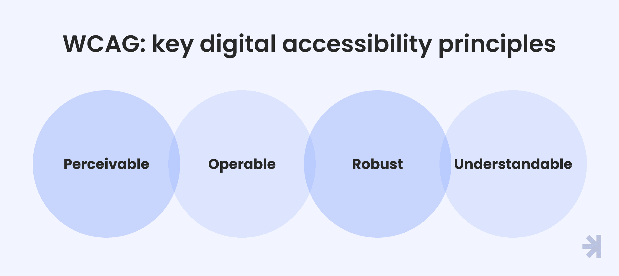
Perceivable
All people should be able to process the information presented in your web product. Features like screen readers, audio narrations, alternative text (alt text) to convey information about images, closed captions, and screen magnifiers make it possible for everyone to use the product.
Operable
All users should be able to navigate the digital product’s interface components. Designers ensure operability by making the navigation structure consistent, adding voice navigation for people with motor disabilities or visual impairments, using large control buttons, and beyond.
Understandable
All users, regardless of their abilities, can perceive your product. In other words, all the content presented in it should be understandable enough so they can interact with the product effortlessly.
Designers achieve this with straightforward and consistent website content, short image captions, and explanatory text or video content. Also, all the texts should be easy to understand, and technical jargon should be avoided.
Robust
Users should have the same experience with your product, no matter whether they use a mobile device, a PC, or an outdated browser. It should also accommodate human-computer interaction using assistive technologies.
How do usability and accessibility differ from each other?
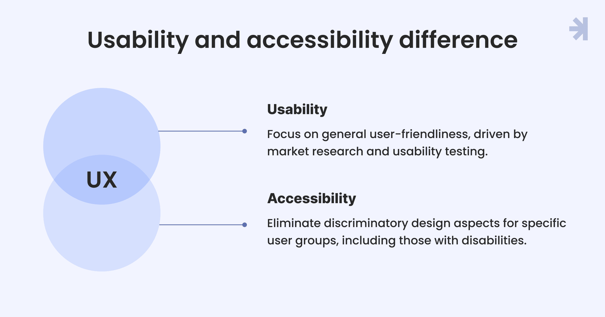
Web usability focuses on general aspects of user-friendliness. It comes from design decisions driven by market research and usability testing. Accessibility is the same but within a specified context. It focuses on eliminating discriminatory aspects of design that exclude specified users groups, ensuring involvement of specific users. That is, people with and without disabilities — be they cognitive, visual, auditory, speech, or motor disabilities — can equally perceive and interact with a web product. While good usability is a value-added service that attracts customers, accessible design is a legal requirement in many jurisdictions. Case in point, the Americans with Disabilities Act (ADA) makes accessibility of services, programs, and activities mandatory. Among other things, it encourages designing websites with accessibility features and allows legal action if websites aren't accessible. At the same time, both concepts have complementary attributes that bring business benefits.
Synergy in design: How usability and accessibility boost revenue
Usability and accessibility have a key similarity — they both contribute equally to elevating user experiences with user-friendly characteristics. That is, many accessibility requirements often overlap with common practices of good UX. As a result, efforts to achieve one often lead to attaining the other.
For instance, increasing color contrast and making font size adjustable to accommodate people with visual challenges enhances user experience for everyone, making content easily discernible in various lighting conditions. Similarly, providing subtitles adds value by allowing users to comprehend audio content when listening isn’t practical or possible. So, more often than not, accessibility requirements improve usability.
And of course, bringing the two together increases the chances of your web product becoming a revenue driver due to its universal design.
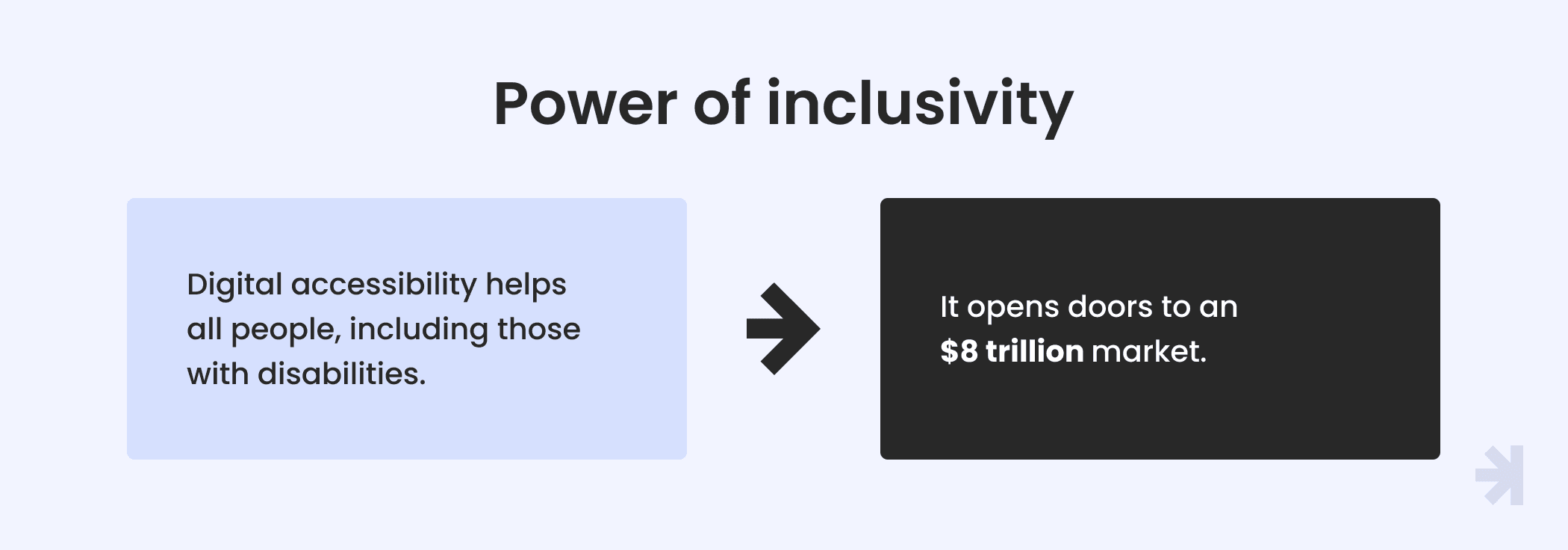
Digital accessibility, in and of itself, leads to higher earnings because it allows businesses to attract customers who are disabled and leverages a sizeable market (valued at $8 trillion). Usability is also powerful, with a business seeing $300 million more in revenue after a button upgrade inspired by usability tests. Another good example is CarMax: the US-based used-vehicle retailer earned $20 billion more after prioritizing UX.
Now let’s move beyond concepts and figures and start talking about the practical side of incorporating the two into your web products.
An invincible combo: Implementation strategies
Designing products that take both usability and accessibility requirements into consideration guarantees equal access to all people who want to use them. But how exactly can you combine the two?
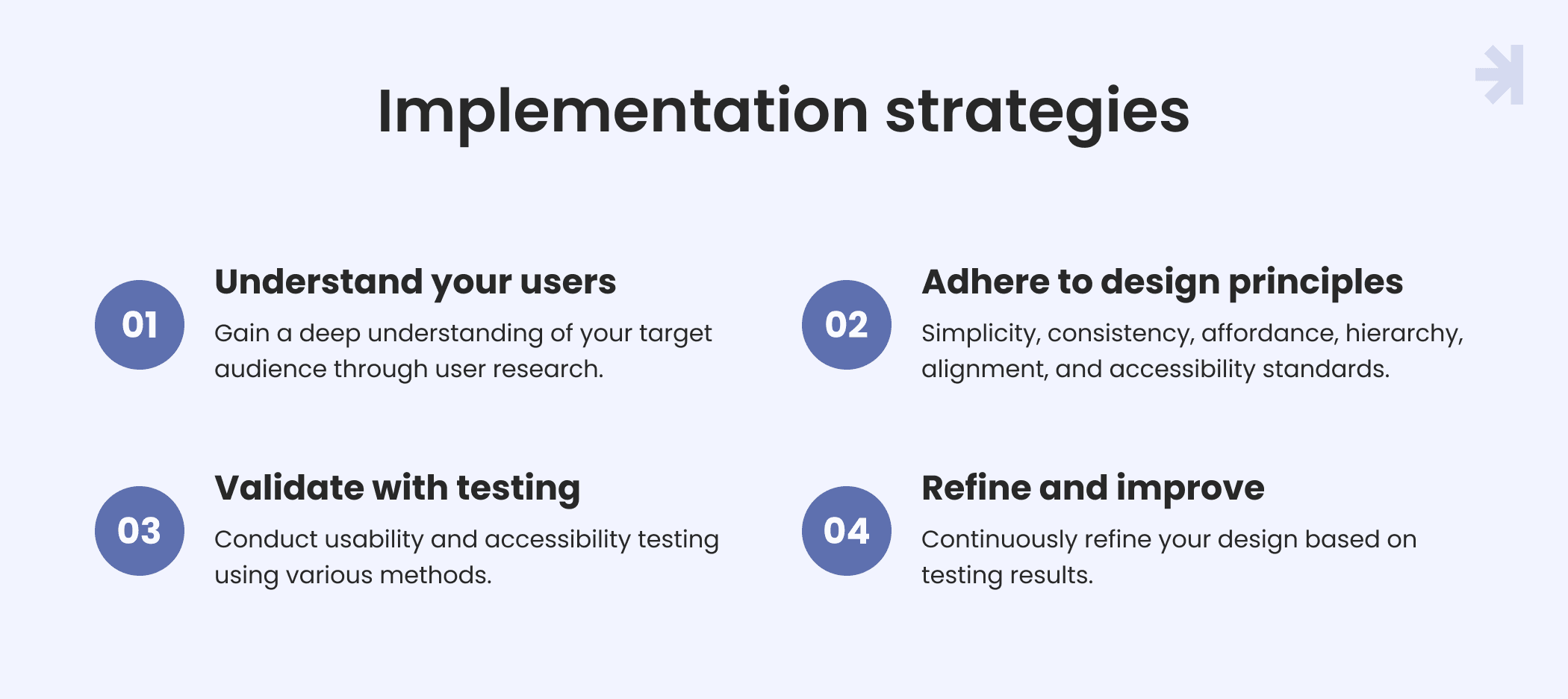
Use the following best accessibility and usability practices as a guide.
Understand your users
The only way to design an interface to sufficiently address the accessibility needs and preferences of users is to gain a deep understanding of your target audience. This is actually the common usability practice.
To define the audience's needs, you can organize one-on-one sessions where a facilitator asks participants to perform tasks using a solution prototype. Also, it’s recommended to conduct stakeholder interviews. If you already have a website, you can use web analytics and heat maps to analyze behavioral user data.
Adhere to web design principles
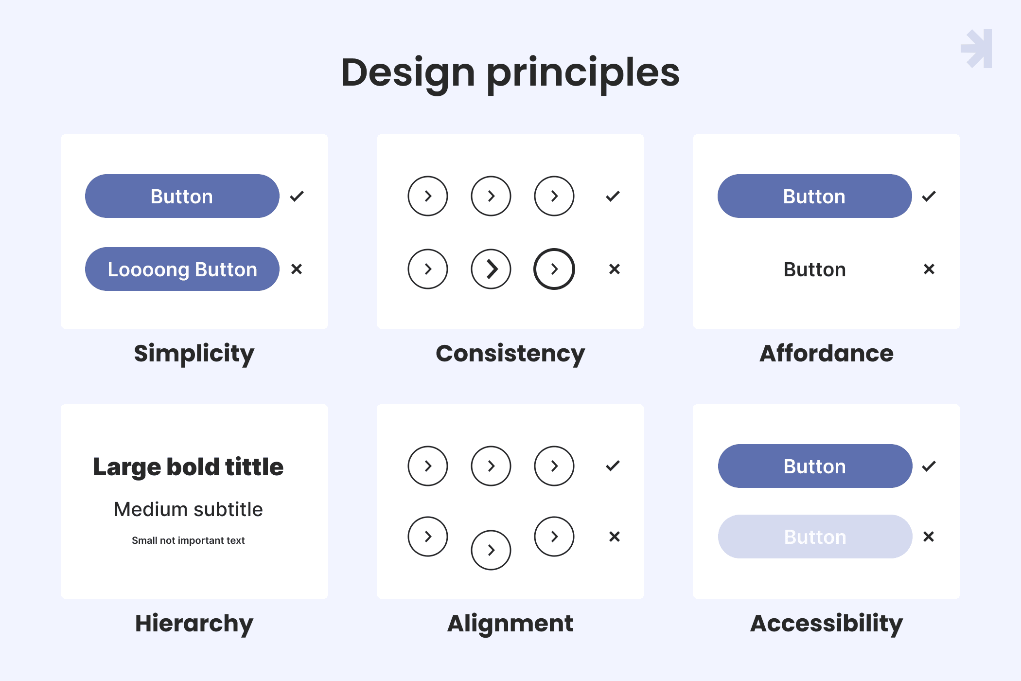
Allow the following web design principles to guide you:
- Simplicity. Create an interface that’s easy to understand and free of unnecessary clutter.
- Consistency. Make your design elements coherent and predictable; use a strong brand identity.
- Affordance. Offer visual cues that make functionality readily apparent. Users should intuitively know what steps to take and where to complete tasks.
- Hierarchy. Use colors, font size, and other design elements to organize and prioritize information.
- Alignment. Use grids and margins to arrange elements and attain visual order.
- Accessibility. Subscribe to the Web Content Accessibility Guidelines (WCAG) and other standards in your locality to ensure your web product has all the essential digital accessibility features, such as being easy to integrate with assistive technologies (such as screen readers) for better human-computer interaction.
Validate your design with usability and accessibility testing
Create a real-life representation of the design in the form of wireframes or prototypes. As much as possible, make these early versions interactive so users can test them. And make sure you include the direct participation of users with different abilities in the testing sessions.
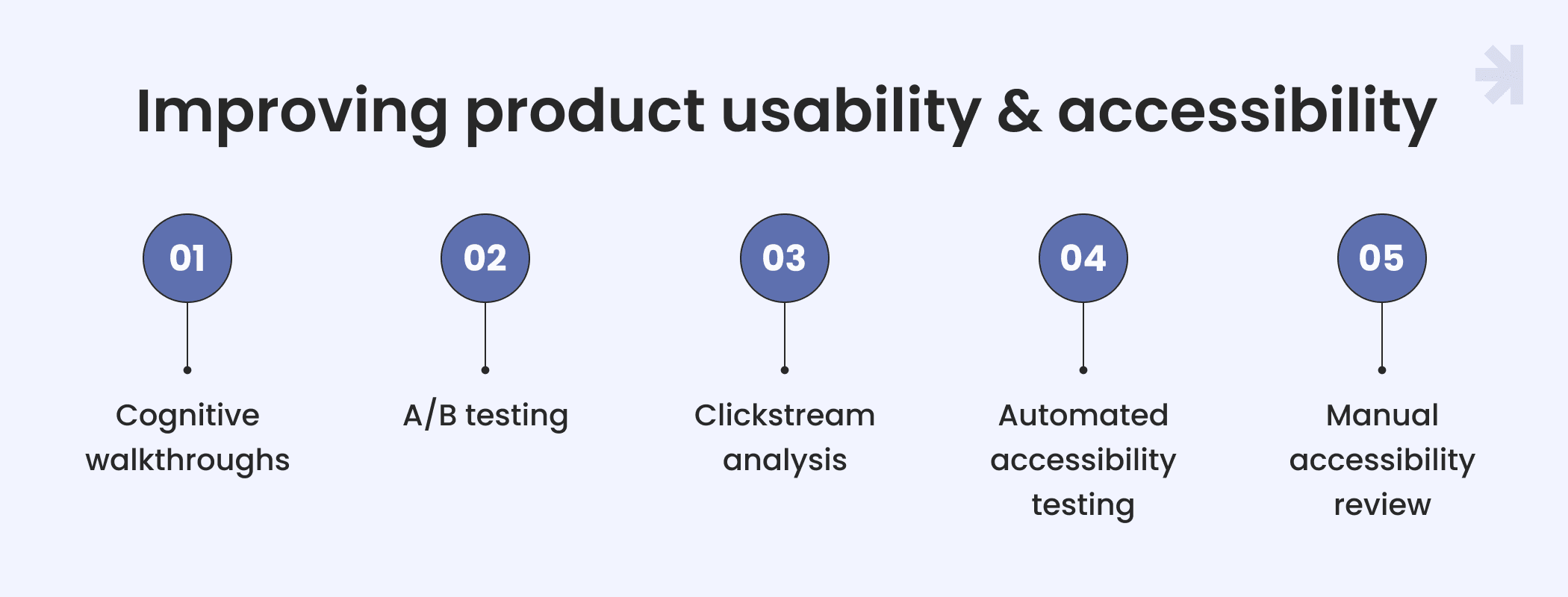
To validate your product and identify areas for improvement, conduct usability and accessibility testing with methods like:
- Cognitive walkthroughs — identify usability and accessibility issues by observing the ease with which new users accomplish tasks
- A/B testing — compare the performance of different design versions
- Clickstream analysis — analyze a website’s usability based on user click paths and interactions to identify popular pages, navigation patterns, and areas with usability or accessibility issues.
- Automated accessibility testing — use automated accessibility testing tools, such as Axe and Wave, to assess digital products and detect accessibility issues.
- Manual accessibility review — While automated tools leverage algorithms and predefined rules to assess the accessibility of your digital product, manual testing involves human interactions with your product, direct inspections, and expert judgment. It catches the accessibility issues that can only be detected with human interpretation.
Combining multiple usability and accessibility testing methods gives you a comprehensive grasp of how users perceive your design and lets you identify areas for improvement more easily.
Refine and improve the design as needed
Based on usability and accessibility testing results, make further improvements to your design. This may require optimizing the code and content. Always keep users front and center, and be ready to convince key stakeholders why certain design changes will benefit the product.
As mentioned above, usability and accessibility testing happens throughout the development process. Accessibility features need to evolve alongside device and operating system changes.
Conclusion
Usability and accessibility are two distinct design concepts with overlapping goals. Usability focuses more on overall user satisfaction. Meanwhile, accessibility seeks to meet legal and ethical standards to accommodate specified users, i.e., people with disabilities. Both aim for and result in a better user experience.
At MagicFlux, we strictly adhere to usability and accessibility principles, embedding them in our well-established design processes.
FAQ
1. Can accessibility and usability sometimes conflict with each other?
Yes, accessibility and usability can clash. In other words, a design that is easy to use might not accessible. For example, usability standards may compel you to use color for visual signaling, which can be a barrier for people who are color-blind.
On the flip side, a solution that follows all accessibility principles might not be user-friendly. For example, a website with a screen reader is technically accessible, but if the reader malfunctions, users won’t benefit from it.
2. Why is it important to balance accessibility and usability?
The right balance between accessibility and usability lets you comply with legal and ethical requirements while keeping up with qualitative standards that increase user engagement and retention. You can expand your audience and boost conversion by embracing diversity and inclusivity.
3. How can designers ensure accessibility and usability are considered during the design process?
Designers must include stringent usability research, usability testing, and compliance with accessibility standards in their design and development process.
4. How can businesses stay up-to-date with accessibility standards and usability trends?
Keep up with usability trends by following reputable sources like the Nielsen Norman Group and UX Design Institute, attending events like the UX Design Summit and UX Live, and observing popular web products in your industry.
Periodically review accessibility standards set by the Web Content Accessibility Guidelines (WCAG), ARIA Authoring Practices, and Inclusive Design Principles.
