While every product owner strives to create a universal product that’s intuitive for any user, the truth is that users will have varying opinions about the product’s user-friendliness, convenience, and aesthetic value based on their cultural characteristics. The one-fits-all approach might not work well when designing products for global audiences. Too often, when creating a new product, a product leader envisions end users who share the leader’s cultural background, when in fact, the future user may have a different cultural background. That’s why considering cultural differences in perception is a must. This article explores the topic of cross-cultural design, provides real-world examples of successful cross-cultural design projects, and offers practical strategies for implementing cross-cultural design principles in your product.

Understanding Cultural Differences
Cross-cultural design refers to design practices that consider different cultures’ unique characteristics. For example, not every culture associates the color red with the winter holiday season or identifies a magnifying glass as a search icon like people in the US or Western Europe do. While individuals in some cultures are happy to see playful, fun in-app UX texts, people from other cultures would rather see plain, to-the-point instructional text.
Geert Hofstede divided these and other cross-cultural differences in how people perceive products into seven dimensions:
- Universalism vs. particularism: Some cultures follow rules no matter what and others consider each situation separately, depending on whether they value rules or relationships more.
- Individualism vs. communitarianism: Some cultures value personal freedom and individual expression more than a sense of community, and others show the opposite preference.
- Specific vs. diffuse: One culture may keep their personal lives quite separate from their work life, believing strong personal relationships (with clients, business partners, colleagues) are unrelated to working together. For another culture, both spheres may overlap.
- Neutral vs. affective: While some cultures keep their emotions to themselves, others are very expressive.
- Achievement vs. ascription: In some cultures, people value each other for their skills or status, while other cultures place a higher value on a certain level of knowledge or coming from a specific background.
- Sequential time vs. synchronous time: While some cultures view time sequentially and clearly differentiate between past, present, and future, other cultures see these as tightly interwoven periods with no clear delineations.
- Internal direction vs. external direction: Some cultures believe they control the environment and others believe that the environment controls them.
Understanding these particulars about their target audience helps businesses communicate their message precisely and thereby avoid misinterpretations of their branding. Plus, it’s important to know how people of certain cultural backgrounds perceive information, navigate the product, and build associations.
Real-World Examples
Let’s explore two examples of brands that used cross-cultural design principles to introduce their products to new markets.
Wix
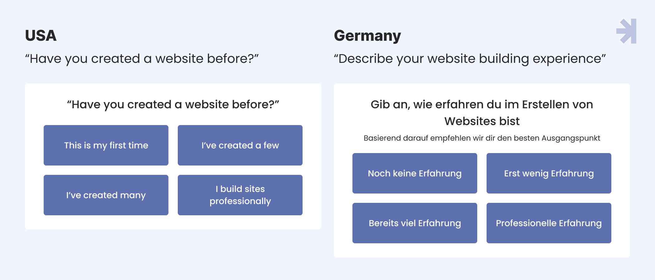
Wix is a popular website-building platform that incorporated cross-cultural insights into its onboarding process. When Wix’s UI asks users about past experience with website-building tools, it formulates the request in a different way, depending on whether a user comes from the US or Germany. In the US culture, most people have no issues sharing their past experiences. But German users are reluctant to answer questions online, especially questions about themselves.
Wix changed the wording for each country when they asked users to describe their experience. Wix asked US users “Have you created a website before?” For German users, Wix changed the question into a task by changing the wording to “Describe your website building experience.”

And the focus of the question changes subtly, too. The US version focuses on the user (“Have you created a website before?”, with answer choices in a first-person format: “I’ve created many,” for example). But the German interface shifts attention to their experience (“Describe your website building experience”, with answer choices avoiding personal pronouns: “No experience so far,” for example).
Wix also addressed Germany users’ strong tendency to avoid uncertainty. German users needed to understand why the website needs to ask about prior experience, so Wix explained that users should share this information for better personalization of the interface.
Read more: Human-Centered Design vs. Design Thinking: An Insightful Overview
Pharmacy Online
The Australian company, Pharmacy Online, adapted their website’s home page information architecture, popular products section, and banner design to suit Chinese cultural preferences. The company recognized that a simple translation is insufficient to make digital experiences comfortable for users.
The Chinese version of the website features a banner with congratulations to people born under the current year’s Chinese zodiac sign, with a special promotion. While the banner won’t likely have any relevance for users from countries other than China, Chinese visitors will find it delightful.

The Chinese version of Pharmacy Online’s home page features more category search options than the English version, as it’s common for Chinese websites to break information down into smaller chunks. Chinese webpages also fill all the space on a webpage with text and pictures, whereas Western-style webpages tend to leave more blank space, with users navigating through the website click-by-click.
Even the shopping cart appears in one location for Chinese users, and another location for Western users, according to the external patterns for websites in each culture.
Strategies for Cross-Cultural Design
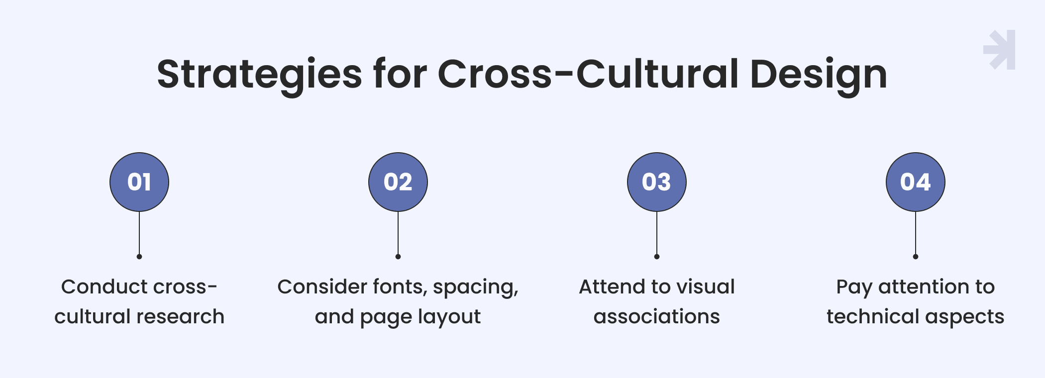
There are several effective strategies to follow to delight users with a product that is intuitively understandable and friendly to their culture.

Conduct cross-cultural research
Carefully researching your target audience must be your first step to designing a product that speaks to users in their language and respects their culture. And we’re not talking about simple translation.
Designers and product leaders need to learn about their audience's cultural norms. For example, in regions where Christianity is not the main religion, users won’t be interested in Christmas gift guides or festive color redesigns.
Creating a user persona can help you outline the main characteristics of an average user from a certain region. Plus, you can look at which digital products are popular in a culture and pay attention to their features, navigation systems, and UI elements.
Consider fonts, spacing, and page layout
Remember the Wix case study above? Wix also recounted that they inverted their typical font hierarchy for a Japanese version of the platform to align with the typography typical of Japanese culture.
When it comes to translating a digital product to a particular language, fonts, and page layout are critical points to consider. In addition to different typography rules, languages can have different font sets and text expansion conventions. Think about Arabic — it’s read left to right instead of right to left, so a web page’s entire layout would need adjustment.
Some languages tend to have longer words than others, and as a result, the translated text might need a larger text box, and you may need to redo the whole layout for a cohesive look.
Additionally, languages based on a non-Latin alphabet, for example, Ukrainian with its Cyrillic alphabet, might be available in fonts that are different from those available for the Latin alphabet, so you’ll need to make stylistic decisions.
Attend to visual associations
While red can symbolize festivity and love in the US, it’s more directly associated with danger for some regions. Colors and imagery evoke different associations in different cultures. For example, in Japan, traffic lights use the bluest shade of green, often called “bleen” or “grue” to signal “go”. But if you ask a Japanese person, they will answer that the light is blue. The Japanese language originally had no word for green — it was added about 800-1200 years ago. It’s a great example of how color can be perceived differently in various regions.
With globalization, many colors have similar associations globally. However, it’s still vital to consider the cultural significance of colors and what association your customers will make with your brand’s primary color palette. Does green mean calmness or prosperity to them? You may have to make adjustments for different cultures.
The same goes for symbols, like icons. A famous case is Amazon’s mobile app in China. Amazon learned some cultures associate a magnifying glass icon with search, and others understand a compass icon to mean “search.”
Pay close attention to your visual materials: users in Muslim countries would be more accepting of women wearing hijabs in photos and illustrations as it is a more culturally recognizable appearance for them.
Read more: Accessibility in Web Design: Top Five Reasons It’s Important
Pay attention to technical aspects
The cross-cultural design process is not limited to the UI. It’s also important to consider what device type users prefer.
In Japan, iOS accounts for 65% of all smartphones, whereas in India, only 5% of smartphones use iOS, as users in India have adopted Android devices more readily. When entering a new market, consider which mobile platforms, computers, and web browsers users are familiar with.
Keep in mind that some tools, like PayPal, are not available in all regions, or users may prefer other methods.
Another point is login methods: Chinese users might want to log in with their WeChat account, as they do on their local platforms.
Conclusion
While many Western product teams want to believe their design appeals to global audiences, each user’s cultural context influences their perception of the product, including visual associations and navigation patterns.
Applying cross-cultural design principles lets you adapt products to the particularities of various cultural dimensions to make the product understandable for users from different cultures.
The main practices for implementing cross-cultural design include conducting cross-cultural research, considering typography and page layout changes, adapting the visual elements, such as illustrations, to appeal to each culture, and paying attention to how the technical aspects of products vary in different regions, like which devices are most prevalent.
Successful cross-cultural design is easy if you collaborate with a design agency that knows how to delight users from different cultural backgrounds. MagicFlux provides personalized UI/UX solutions for businesses — let’s discuss how to speak to your audience’s heart.
FAQ
What is cross-cultural design?
Cross-cultural design refers to design practices that take the unique cultural characteristics of different regions into account.
Why does cross-cultural design matter?
Cross-cultural design lets you create products that are user-friendly, intuitive, and easy to navigate depending on the audience’s regional culture; plus, brands can convey their intended message while avoiding misunderstandings caused by cultural differences.
How do I design for different cultures?
While designing for different cultures, it’s paramount to:
- Conduct preliminary socially conscious research
- Consider UI particulars, like typography
- Build positive visual associations
- Account for technical aspects, like which payment tools are available in the region
What are the seven dimensions of cultural differences?
The seven dimensions of cultural differences are universalism vs. particularism, individualism vs. communitarianism, specific vs. diffuse, neutral vs. affective, achievement vs. ascription, sequential time vs. synchronous time, and internal direction vs. external direction.


