

A website’s layout is more than just a visual frame. It’s the foundation of every digital experience. The way web pages are structured and how site visitors move through them directly influence how effectively your content performs, both for users and search engines.
In this article, we’ll break down the anatomy of a website from the basic website structure that helps users navigate easily, to the essential elements that make each web page engaging, accessible, and SEO-ready. You’ll learn what goes into a clear website layout, how to design core pages like the home page, landing page, and contact page, and how a thoughtful website structure supports both user-friendly experiences and search engine optimization.
Whether you’re planning a basic website, managing e-commerce sites, or building more complex websites, understanding how all the pieces fit together will help you design layouts that guide, convert, and grow.
Why web layout matters for user experience
A strong website layout is what turns information into an experience. It shapes how site visitors see, move, and make decisions across web pages. When the website’s structure is clear and intuitive, users don’t have to think about where to click next. They just flow naturally through your content.
Good web design isn’t only about aesthetics. It’s about clarity and guidance. A consistent website structure helps users recognize patterns, find essential elements, and take action faster. Whether you’re designing for mobile devices or large screens, the right hierarchy: headlines, visuals, and call to action buttons – builds trust and keeps people engaged.
From a business perspective, a well-structured user interface directly affects performance. Clear layouts reduce bounce rates, increase conversions, and improve website usability. They also make your content more readable for search engine crawlers, helping your pages rank higher in search results. In short: the better your website layout, the better your outcomes for both people and search engines.
The essential elements of a perfect web layout
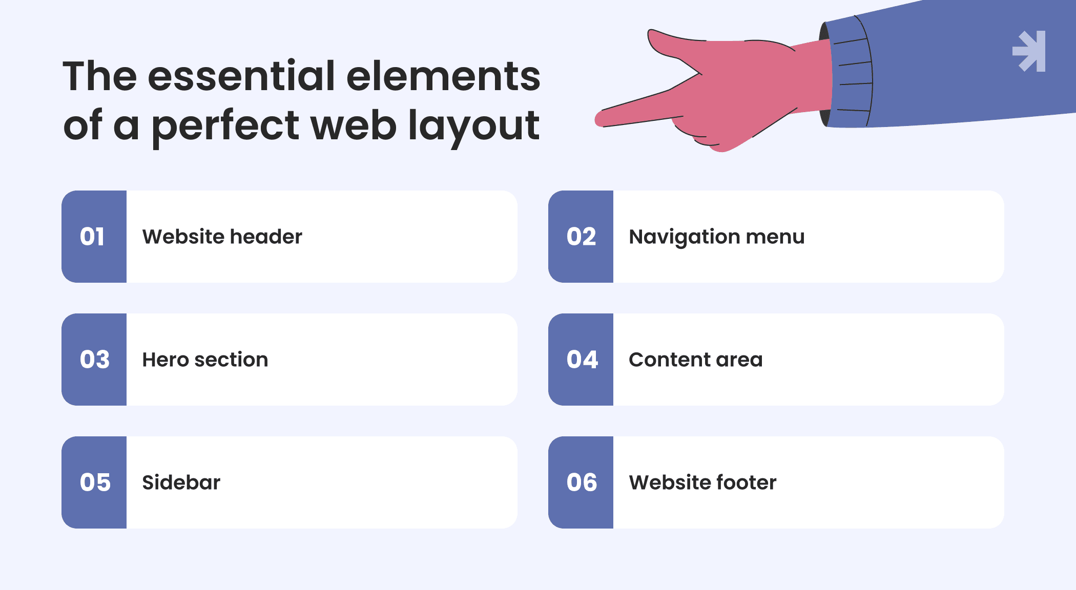
Every effective website starts with a clear structure. Understanding the anatomy of a website means knowing how each section works together to guide users, build trust, and support search engine optimization. The anatomy of a website consists of structural, functional, and visual components including the header, hero section, body content, and footer. Let’s look at the essential components that shape a well-balanced website layout.
1. Website header
The header is often the first thing a site visitor sees. It includes your logo, website menu, and sometimes a search bar or hamburger menu on mobile devices. A consistent header creates a quick visual connection with your brand and helps users navigate between different pages with ease.
2. Navigation menu
A clear website structure relies on intuitive navigation. Menus help visitors navigate a website by providing a map of the site's structure. Whether it’s a classic horizontal menu, dropdown menu, or mega menu, navigation should be simple and predictable. A well-designed menu can significantly speed up achieving goals and satisfying user needs.
3. Hero section
Located at the top of the home page or landing page, the hero area gives a brief description of who you are and what you offer. Paired with a strong headline and a call to action button, this small but helpful element encourages users to keep exploring.
4. Website content area
This is where your story lives – the main body of each web page or blog post. Website content includes all elements that communicate a message to visitors, such as text, images, and videos. Clear typography, visuals, and spacing make the content easy to scan, while structured headings help both users and search engines understand the context. For e-commerce sites, this section may include products, reviews, or videos that encourage visitors to act.
5. Sidebar or secondary navigation
A sidebar is a narrow vertical column that appears alongside the main website content, often used to display additional links, advertisements, or calls to action. Some web pages use a sidebar menu on the left or right side to provide quick access to other pages, categories, or filters. It’s a helpful element for complex websites and news websites where users need to find information fast.
6. Footer
Often overlooked, the footer supports navigation and trust. The footer is the bottom section of a website that often contains links to important information and legal details. Footers serve as a secondary navigation area, providing additional links and information that users may seek after scrolling through the main content. The footer typically contains essential information such as copyright details, contact information, and links to other pages.
Together, these sections form the backbone of your website’s structure, making it user-friendly, visually consistent, and ready for both site visitors and search engines.
Principles behind effective layout design
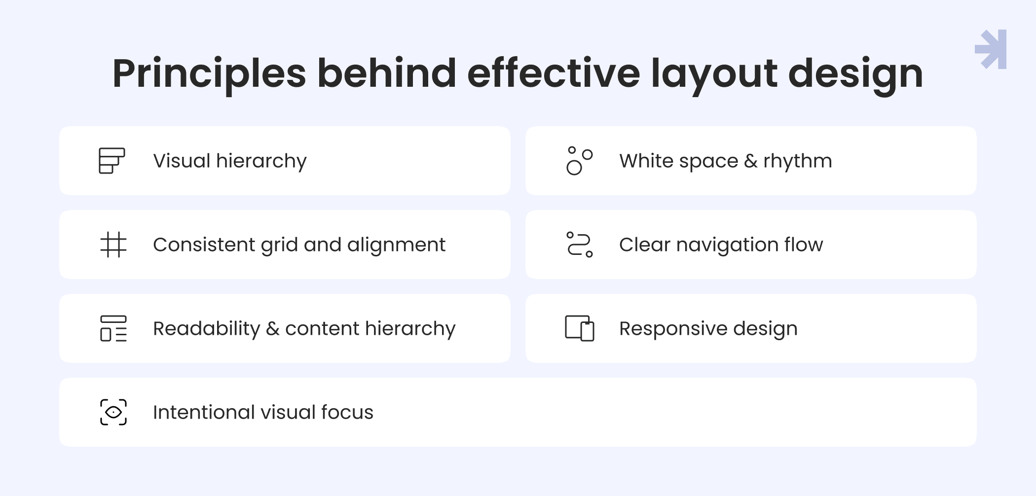
Designing a great website layout is about balance between clarity and creativity, structure and flexibility. Whether you’re building with website builders, coding from scratch, or using content management systems, these principles will help you create layouts that feel natural, intuitive, and user-friendly.
1. Visual hierarchy
Guide attention with contrast, size, and placement. The most important elements like headlines or call to action buttons should stand out first. A strong hierarchy helps site visitors understand what matters on a web page without feeling overwhelmed.
2. Whitespace and rhythm
Whitespace isn’t wasted space. It’s what gives your content room to breathe. Adequate spacing between sections improves readability, focus, and user engagement. It also makes essential elements easier to recognize, especially on mobile devices.
3. Consistent grid and alignment
A structured grid helps maintain visual order across multiple pages. It ensures every web page feels connected as part of one coherent website structure, improving both usability and brand recognition.
4. Clear navigation flow
Strong layouts guide visitors naturally. Use visual cues like color, icons, and spacing to lead users through different pages, from the home page to landing pages or a contact page. Consistent positioning of the website menu, dropdown menu, or hamburger menu helps people know where they are at all times. Breadcrumbs help users understand their location within a website's hierarchy and facilitate easier navigation back to previous pages.
5. Readability and content hierarchy
Typography plays a major role in the website’s content experience. Combine readable fonts, accessible colors, and clear headings to help users and search engine crawlers interpret your content easily.
6. Responsive design
A website’s structure must adapt to all screens. Testing layouts across mobile devices and browsers ensures a consistent experience everywhere, reducing broken links, scroll fatigue, and confusion. Responsive design ensures that website elements rearrange to function properly on mobile, tablet, and desktop devices.
7. Intentional visual focus
Use imagery, icons, and animation sparingly. Each visual should support the message, not distract from it. This focus helps keep passive users engaged and encourages meaningful interactions.
When these principles come together, they create a positive user experience where design supports clarity, and clarity supports action.
Accessibility and usability considerations
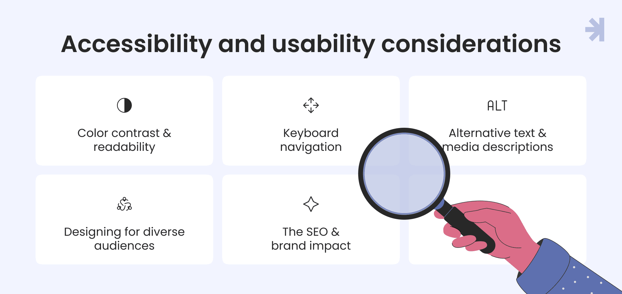
An effective website layout isn’t only about beauty or conversion. It’s about inclusion. Accessibility ensures that every site visitor, regardless of ability, can understand and use your web pages comfortably. Following WCAG (Web Content Accessibility Guidelines) makes your website’s structure more usable for everyone, and it’s a vital part of strong search engine optimization.
1. Color contrast and readability
Text should always stand out clearly against its background. Proper color contrast helps users with low vision or color blindness read content easily. A clean user interface with sufficient spacing and legible typography improves website usability and reduces eye strain.
2. Keyboard navigation
Not every site visitor uses a mouse or touch screen. Ensuring that users can move through web pages and interact with essential elements using only a keyboard is key. This supports people with mobility impairments and enhances overall user-friendly design.
3. Alternative text and media descriptions
Adding alt text to images, captions to videos, and clear labels to icons helps search engine crawlers and assistive technologies understand your website’s content. It also ensures users with visual or auditory limitations can still grasp your message fully.
4. Designing for diverse audiences
Accessibility goes beyond compliance. It’s about empathy: thinking about older adults, users with cognitive challenges, or people viewing your web pages on mobile devices in bright sunlight. Testing your website layout under different conditions helps you create experiences that feel effortless for everyone.
5. The SEO and brand impact
Accessible design benefits both users and search engines. It improves structure, reduces errors, and makes your website’s content easier to crawl and index. Beyond ranking, accessibility strengthens trust: positioning your brand as thoughtful, reliable, and genuinely human-centered.
A truly accessible website structure doesn’t just check boxes; it opens doors. When everyone can engage, explore, and act, your product and your message reach farther.
Common web layout mistakes to avoid
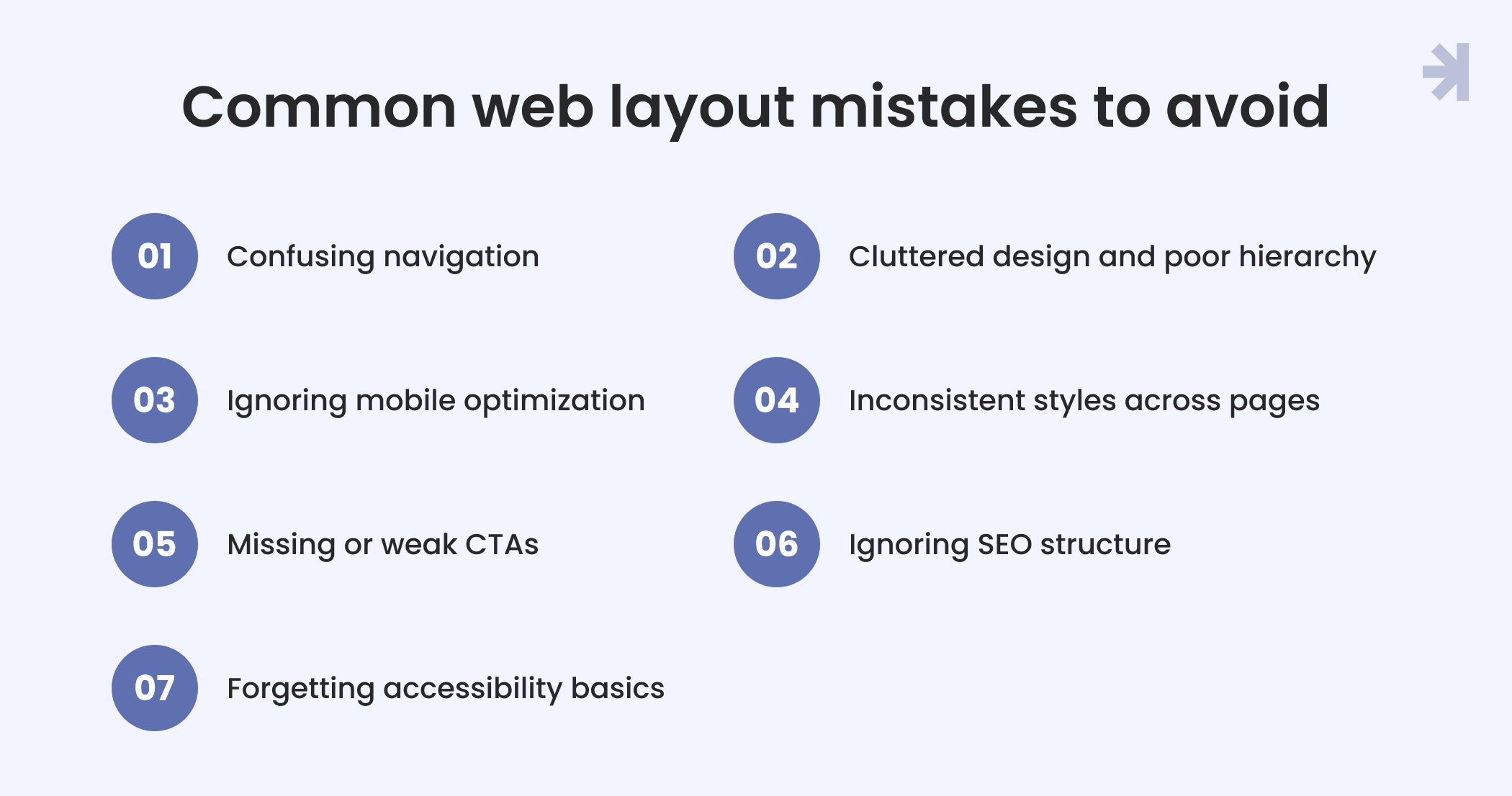
Even the best ideas can fall short if the website’s structure isn’t clear or consistent. Whether you’re building with website builders or managing a custom web development project, avoiding these common layout mistakes will help you keep your website layout effective, user-friendly, and optimized for search engines.
1. Confusing navigation
If users can’t find what they need, they leave. Overloaded mega menus, missing links, or inconsistent dropdown menus make navigation frustrating. Keep the website menu predictable and make sure site visitors can easily move between different pages and sections.
2. Cluttered design and poor hierarchy
Too many visuals or mismatched styles can distract users from what really matters. Use whitespace and alignment to highlight essential elements and maintain a clear visual hierarchy across all the pages.
3. Ignoring mobile optimization
Many site visitors browse on mobile devices. A layout that breaks, scrolls endlessly, or hides the hamburger menu will quickly lose users. Responsive website structure is no longer optional. It’s expected.
4. Inconsistent styles across pages
Every web page should feel like part of one system. Mixing different button styles, headings, or colors weakens trust and confuses users. Use a shared design system or content management system to keep your visuals consistent.
5. Missing or weak CTAs
A call to action button is a small but helpful element that drives engagement. Without clear CTAs, users might not know what to do next – sign up, buy, or learn more. Place them strategically throughout your web pages to encourage visitors to act.
6. Ignoring SEO structure
Poor heading hierarchy, broken links, or missing metadata confuse search engine crawlers. Clean html code and logical website structure help search engines understand your website content and show it properly in search results.
7. Forgetting accessibility basics
Lack of contrast, missing alt text, or non-functional keyboard navigation can make your site inaccessible. These small errors limit your reach and hurt both usability and website’s SEO.
Avoiding these pitfalls helps you design web pages that look good, perform well, and deliver a seamless experience for every site visitor on every device.
Final takeaways: A layout is more than just looks
A strong website layout does far more than organize visuals. It shapes how site visitors think, feel, and act. The best designs balance beauty with usability, guiding people smoothly across web pages while supporting real business goals.
A clear website’s structure helps users find what they need, boosts engagement, and makes your website’s content easier for search engines to understand. When your web design is consistent, accessible, and purposeful, it not only improves the user interface but also strengthens your brand’s credibility and visibility online.
In the end, the anatomy of a website is about connection between your story and your audience, between visuals and performance. A thoughtful, user-friendly structure turns a static site into a living experience that attracts, engages, and grows.
Need help creating your perfect website layout? Let’s talk!
Designing a clear, user-friendly layout takes more than templates. It takes strategy, empathy, and experience. At MagicFlux, we help businesses turn complex ideas into intuitive, conversion-driven web pages that both users and search engines love.
Whether you’re launching a basic website, reworking landing pages, or scaling e commerce sites, our team can craft a website structure that aligns with your goals and reflects your brand’s personality.
Let’s build a layout that works hard for your users and even harder for your business.
What is the most important aspect of a website?
The most important aspect is a clear website structure that helps site visitors easily navigate between web pages. A well-organized website layout improves usability, supports search engine optimization, and ensures every web page serves a purpose guiding users toward meaningful actions.
What is the difference between a landing page and a home page?
A home page introduces your brand and guides users to different pages on your site. A landing page, on the other hand, focuses on one specific goal like collecting leads or promoting a service. While the home page provides an overview, the landing page drives a single, measurable action.
Where should I place a search bar for the best user experience?
The search bar should be visible and consistent across all core pages, usually in the website header or near the website menu. This placement helps site visitors find content quickly, especially on complex websites or news websites with large amounts of information.
How do I create a user-friendly navigation for mobile devices?
For mobile devices, use a hamburger menu or a simplified dropdown menu that keeps navigation clean and easy to access. Prioritize the most important links and make sure users navigate smoothly without zooming or scrolling excessively.
What role does the call to action button play in user engagement?
A call to action button is a small but helpful element that directs attention and drives conversions. Strategically placing CTAs throughout your web pages encourages users to explore, sign up, or make a purchase improving user engagement and overall performance.
