


Designing for healthcare differs from designing for any other industry. Every interface, every click, and every piece of information can have a direct impact on patient outcomes, patient safety, and the quality of patient care. Working in healthcare means handling sensitive data, navigating strict healthcare regulations, and addressing the needs of multiple healthcare professionals and healthcare providers.
In this article, we’ll share practical lessons from healthcare UX design that help teams create digital health tools that are accessible, intuitive, and trustworthy. You’ll learn how to design for diverse user groups, simplify complex medical data, foster trust through consistent interfaces, and collaborate effectively with clinicians. By following these lessons, UX designers can make a real difference in the healthcare sector, improving both patient engagement and clinical outcomes.
Why healthcare UX/UI is different
Healthcare products stand apart from typical digital applications. In healthcare, design choices directly impact patient outcomes and emotional security. Here’s why:
- Strict regulations and compliance: Designers must follow healthcare regulations, provide data security, and protect sensitive data.
- Multiple user groups: Interfaces must serve healthcare professionals, medical professionals, and patients, all with different needs. Poor user experience in healthcare can lead to significant financial losses and even patient harm due to usability issues.
- Accessibility and inclusivity: Tools like patient portals must be usable for diverse user groups, including older adults and those with impairments.
- High stakes: Poor usability can lead to errors or miscommunication, directly affecting patient care and patient outcomes. Effective UX design can help reduce clinician burnout by streamlining workflows and minimizing unnecessary digital tasks.
- Human impact: Thoughtful healthcare UX allows clinicians to focus on the individual patient, improving efficiency, trust, and engagement.
In short, healthcare UX/UI is not just about aesthetics or functionality. It’s about designing digital health tools that are safe, reliable, and human-centered, because every interaction matters.
Lesson 1: Design for accessibility and inclusivity
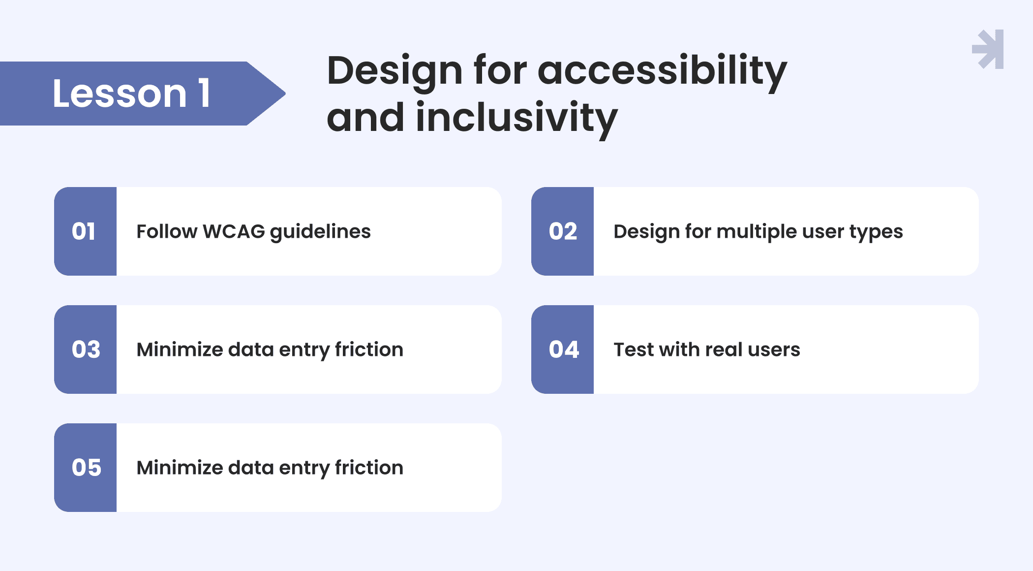
Accessibility and inclusivity are fundamental in healthcare UX design. WCAG compliance and usability for diverse user groups like patients, healthcare professionals, clinicians, and elderly users are not optional. They make sure everyone can interact with health tools safely and effectively.
Practical lessons from experience:
- Follow WCAG guidelines: Ensure color contrast, readable fonts, clear labels, and keyboard accessibility to support users with visual or motor impairments.
- Design for multiple user types: Patient portals should be intuitive for patients, while medical software must accommodate fast workflows for clinicians.
- Minimize data entry friction: Reduce patient data input steps, use pre-filled fields, and support assistive technologies.
- Test with real users: Conduct usability testing across age groups, regulatory compliance, and roles to uncover pain points early.
- Consistency is key: Apply uniform patterns so that healthcare providers and patients quickly understand interactions, reducing errors.
In our experience, accessibility is the requirement that gets deprioritized most consistently under deadline pressure, and the one that generates the most expensive rework when it's addressed after launch rather than built in from the start. The teams that treat WCAG compliance as a design constraint from day one rather than a final checklist item ship faster and with fewer post-launch issues.
By prioritizing accessibility, UX designers make healthcare products more inclusive, improve patient engagement and user experience.
Lesson 2: Balance simplicity with complexity
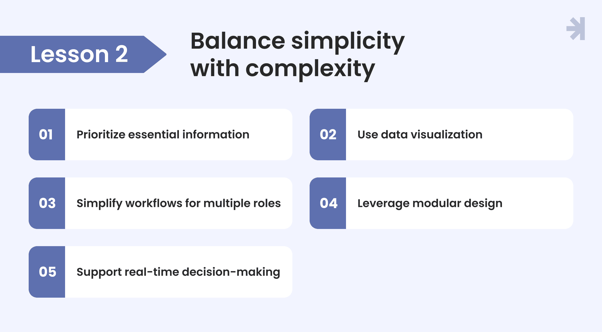
In the healthcare sector, UX designers face a constant challenge: presenting complex medical information and vast medical data in a way that is clear, actionable, and safe. Healthcare providers and medical professionals rely on healthcare software, digital healthcare tools, and medical devices to make critical decisions, from tracking vital signs to managing patient records.
Here’s how to balance complexity and simplicity:
- Prioritize essential information: Focus on key metrics that directly impact patient care and patient health, without overwhelming users with unnecessary detailed data.
- Use data visualization: Graphs, charts, and dashboards help healthcare providers quickly interpret health records, patient data, and results from diagnostic tools. Healthcare software often aggregates data from multiple sources, requiring careful design to ensure clear and cohesive user experiences.
- Simplify workflows for multiple roles: A user friendly interface should serve both clinicians managing patient monitoring and administrative staff handling patient management.
- Leverage modular design in healthcare applications: Break complex processes into manageable components, making healthcare software scalable and easier to maintain.
- Support real-time decision-making: Present health data and patient information in ways that improve diagnostic accuracy and streamline medication management. Healthcare users often require interfaces that allow for 'at-a-glance' comprehension due to stress and time constraints.
One pattern we see repeatedly in complex healthcare products is interfaces that were designed to show everything because stakeholders were afraid of hiding something important. The result is screens where nothing is important because everything competes equally for attention. The hardest design work in healthcare is often the editorial work – deciding what not to show and trusting that the interface will surface the right information at the right moment.
Balancing simplicity with complexity is a cornerstone of healthcare UX. It makes both safe and efficient healthcare solutions, helping healthcare providers deliver better patient care every day.
Lesson 3: Build trust through clarity and consistency
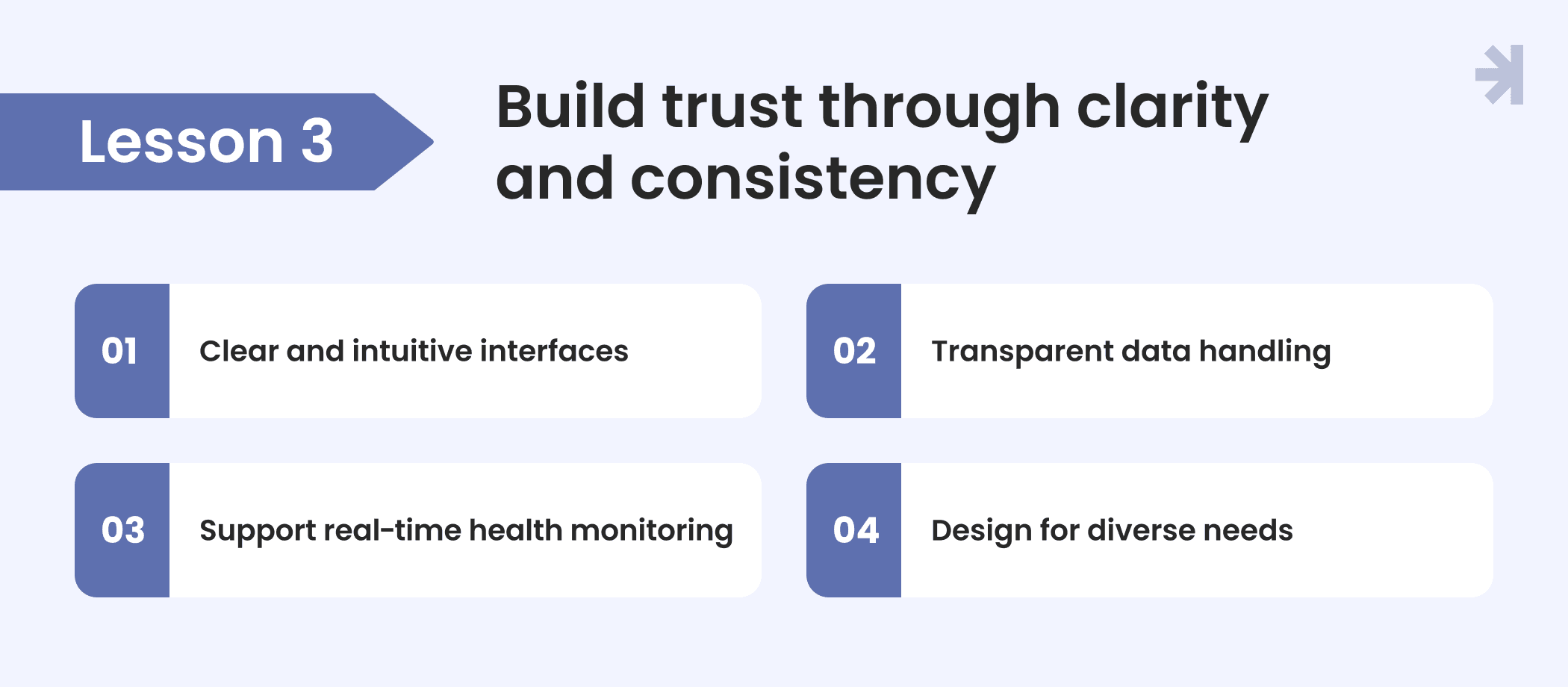
In healthcare UX, trust is everything. Patients and healthcare providers need to rely on interfaces that communicate clearly, handle patient data responsibly, and maintain consistency across healthcare applications and medical software. A confusing or inconsistent experience can compromise patient health, reduce diagnostic accuracy, and hinder healthcare services.
Key strategies to build trust:
- Clear and intuitive interfaces: Use familiar patterns and simple navigation to reduce errors and improve user interactions in both digital healthcare tools and medical devices. A well-designed patient portal empowers patients to manage their health information, providing tools for tracking progress and managing conditions.
- Transparent data handling: Display patient information, health data, and medical records clearly while maintaining data security and patient privacy. The sensitive nature of medical data requires compliance with regulations such as HIPAA, which adds complexity to the design process.
- Support real-time health monitoring: Present vital signs and patient data in ways that improve diagnostic accuracy and provide actionable insights quickly.
- Design for diverse needs: Incorporate user centered design principles so that all healthcare professionals can efficiently use the tools, from nurses to doctors, without compromising workflow.
Working on clinical products taught us that trust is built in the smallest moments – the microcopy on an error state, the way a loading screen communicates progress, the language used to explain why a data field is required. Patients and clinicians form their opinion of a system's reliability from these details long before they encounter anything that could be called a major feature.
By prioritizing clarity, transparency, and consistency, UX designers in the healthcare industry can create digital tools that foster trust, improve patient engagement, and enhance patient centered design across the healthcare system.
Lesson 4: Support different user groups
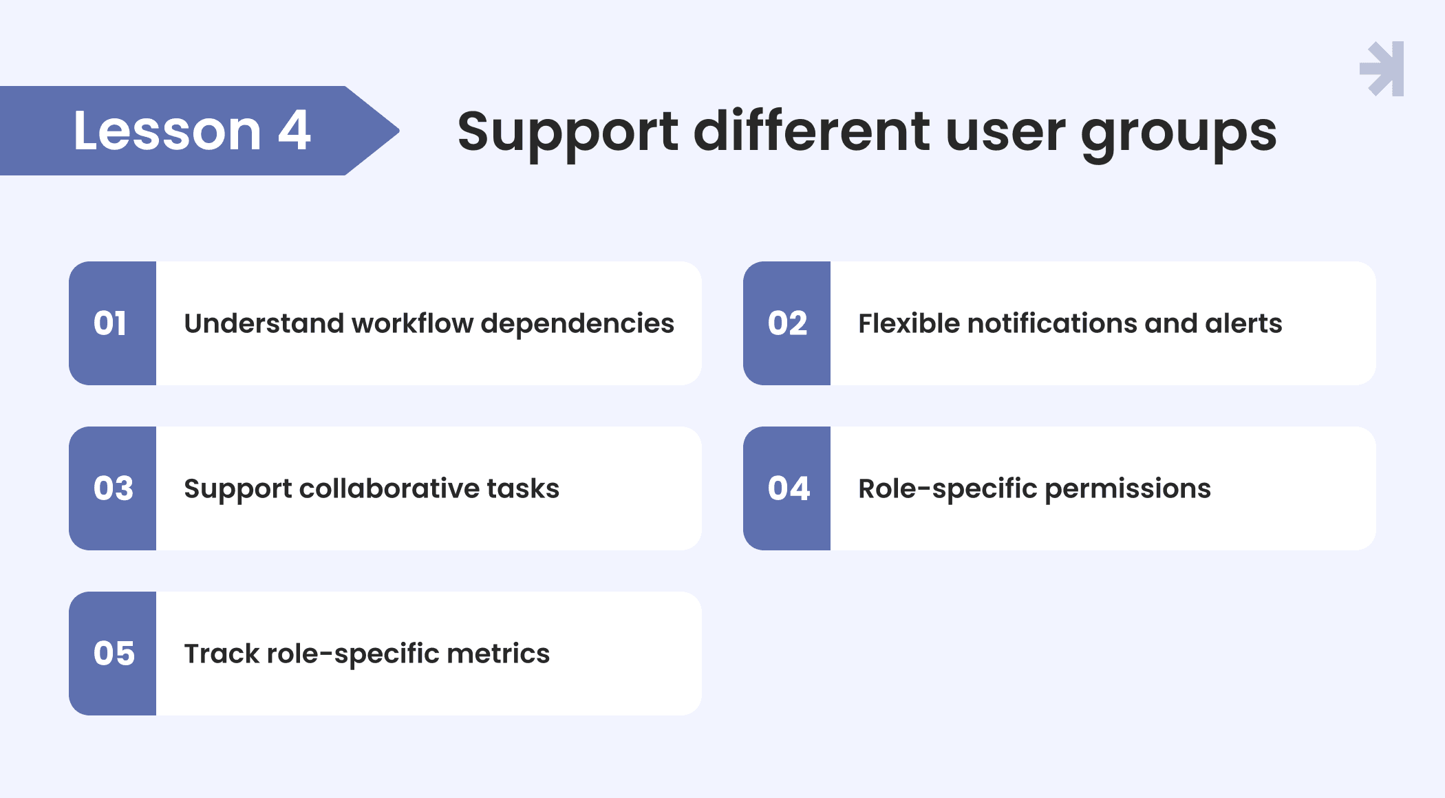
One of the unique challenges in healthcare UX is designing for multiple stakeholders who interact with the same healthcare system: doctors, nurses, patients, and administrators. Designing a seamless and efficient experience for healthcare users requires an understanding of the target users in their everyday environment while upholding legal regulations such as HIPAA. Each group has distinct responsibilities, priorities, and interactions with healthcare applications. The goal is to meet everyone’s needs without creating a fragmented experience.
Practical strategies:
- Understand workflow dependencies: Map how tasks flow between roles to identify potential bottlenecks in patient management or medication management. User-centered design (UCD) places the needs, preferences, and goals of end-users at the forefront of the design process in healthcare.
- Flexible notifications and alerts: Customize alerts for each role, for instance, critical updates for clinicians versus administrative reminders for staff.
- Support collaborative tasks: Enable medical professionals to share patient information and coordinate actions efficiently across the healthcare system.
- Role-specific permissions: Implement access controls so each stakeholder sees only relevant patient records or health data, maintaining safety and privacy.
- Track role-specific metrics: Provide healthcare providers and administrators with dashboards reflecting performance, workload, or healthcare projects relevant to their responsibilities.
In our projects, the most common source of multi-role design failure is a discovery phase that involved one user group thoroughly and treated the others as variations of the same person. Doctors and nurses using the same system are not interchangeable users with slightly different permissions. They have fundamentally different mental models, different relationships with time pressure, and different definitions of what a good interaction looks like.
Designing with these principles allows UX designers to create digital healthcare tools that work seamlessly for all users, improving efficiency, reducing errors, and supporting better patient care.
Lesson 4 in practice: Tiro.health
The strategies in Lesson 4 aren't hypothetical. They describe exactly the challenge we worked through with Tiro.health, a HealthTech startup building a medical documentation platform that had to serve three fundamentally different user groups within the same product.
The three roles were distinct in every meaningful way. Junior nurses needed to build complex medical forms from scratch, often without technical support. Doctors needed to complete those forms quickly during patient care, with AI assistance they could trust rather than second-guess. Administrators needed to manage the entire operation, configure workflows, and oversee the platform without relying on developers for every change.
The existing product had been designed without clear role separation. One interface, one navigation structure, one interaction model for users with completely different mental models, priorities, and time constraints. Nurses found form building slow and dependent on developer involvement. Doctors were manually double-checking AI suggestions because the interface didn't communicate what the AI was doing or how confident it was. Administrators were managing workarounds rather than using the system as it was intended.
Our process started with the workflow mapping described in Lesson 4. We interviewed each user group separately, observed real tasks in context, and documented where the experience broke down for each role. What emerged was a clear picture of three distinct jobs to be done that a single interface was trying to serve simultaneously and failing at all three.
The solution was deliberate role separation within a unified product. We designed two distinct core experiences sharing one design system: a drag-and-drop form builder for nurses and administrators built around templates, presets, and conditional logic that removed developer dependency entirely; and a keyboard-first form completion experience for doctors with inline AI assistance that made suggestions visible, explained confidence levels clearly, and made accepting, editing, or overriding AI inputs feel natural rather than disruptive.
Role-specific permissions, customized notifications, and dashboards relevant to each user's responsibilities were built into the system from the start rather than added as afterthoughts.
The outcomes were measurable across all three roles:
- Doctors completed medical forms up to 20% faster, recovering time previously lost to interface friction and manual AI verification
- Junior staff reduced form creation time by approximately 30%, eliminating the developer dependency that had been a consistent bottleneck
- A shared WCAG-compliant design system reduced development time by around 25% and ensured consistent, accessible experiences across all user groups
The Tiro.health project illustrates the central argument of Lesson 4: when you design for the workflow dependencies between roles rather than for each role in isolation, the product becomes stronger for everyone, not just for the role that gets the most design attention.
Read the full Tiro.health case study
Lesson 5: Collaborate closely with healthcare professionals
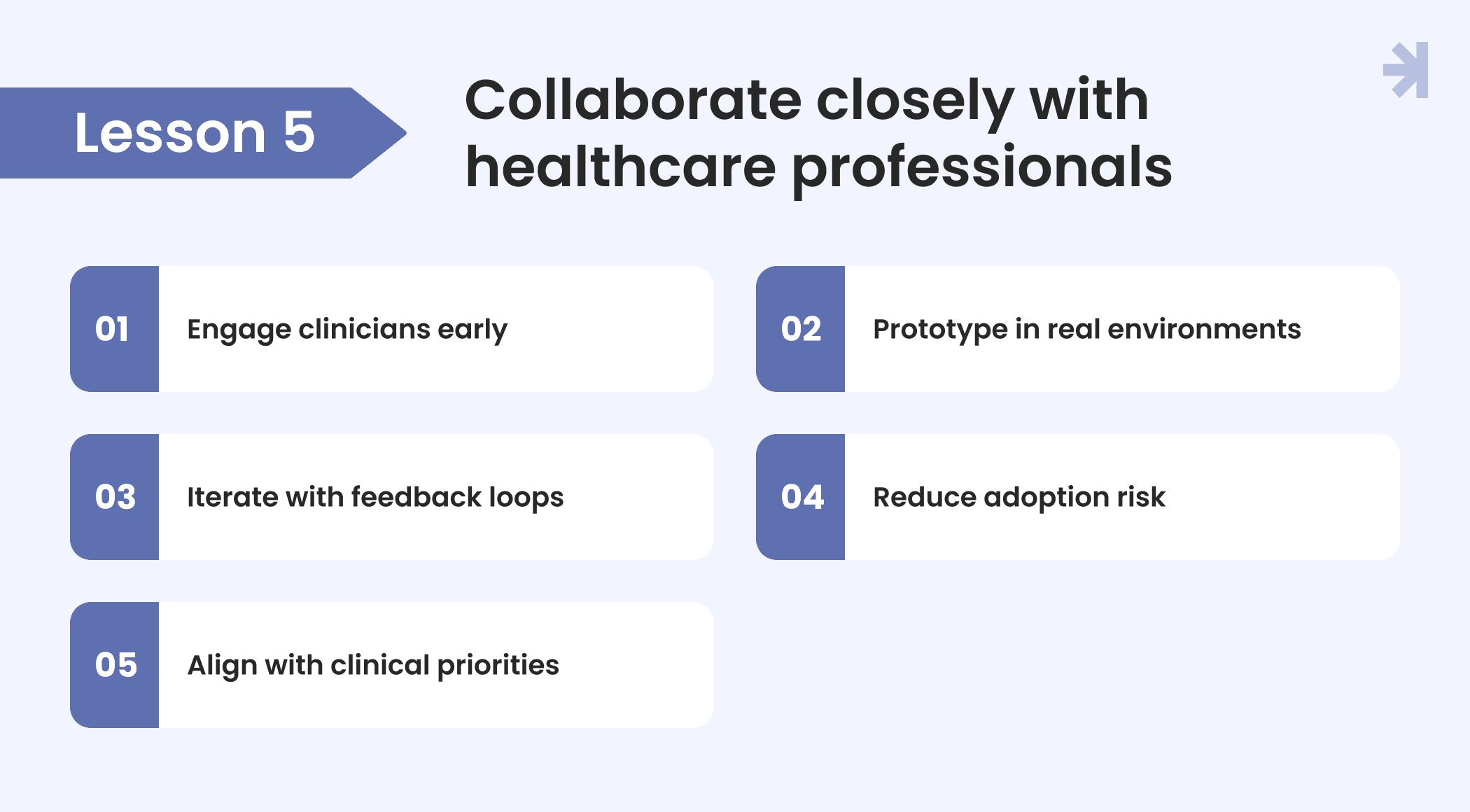
Collaboration with professionals is essential for effective healthcare UX. UX designers cannot fully understand the complexities of clinical workflows, medical devices, or patient interactions without direct input from those who work on the front lines. Co-creation and real-world testing ensure digital healthcare tools are practical, safe, and widely adopted.
Key strategies:
- Engage clinicians early: Include doctors, nurses, and specialists in the design process to capture domain expertise and real-world needs.
- Prototype in real environments: Test healthcare applications in actual clinical settings to identify workflow gaps, inefficiencies, or potential errors before full deployment.
- Iterate with feedback loops: Continuous feedback from medical professionals improves interfaces, patient data handling, and overall user experience.
- Reduce adoption risk: Collaborative design ensures that healthcare providers are comfortable with new tools, leading to higher usage and better patient care.
- Align with clinical priorities: Focus on features that improve diagnostic accuracy, patient monitoring, and patient health, ensuring that technology supports outcomes rather than creating friction.
The most valuable research sessions we've run with clinical staff weren't formal interviews. They were observations – sitting with a nurse during an actual shift, watching a doctor complete documentation between patient appointments, seeing an admin navigate three systems simultaneously to answer one question. What people describe doing and what they actually do under real conditions are often completely different. You only find the real design problems by being present for them.
Working hand-in-hand with healthcare professionals, UX designers can build healthcare solutions that are reliable, user-friendly, and trusted.
Lesson 6: Plan for long-term usability and scalability
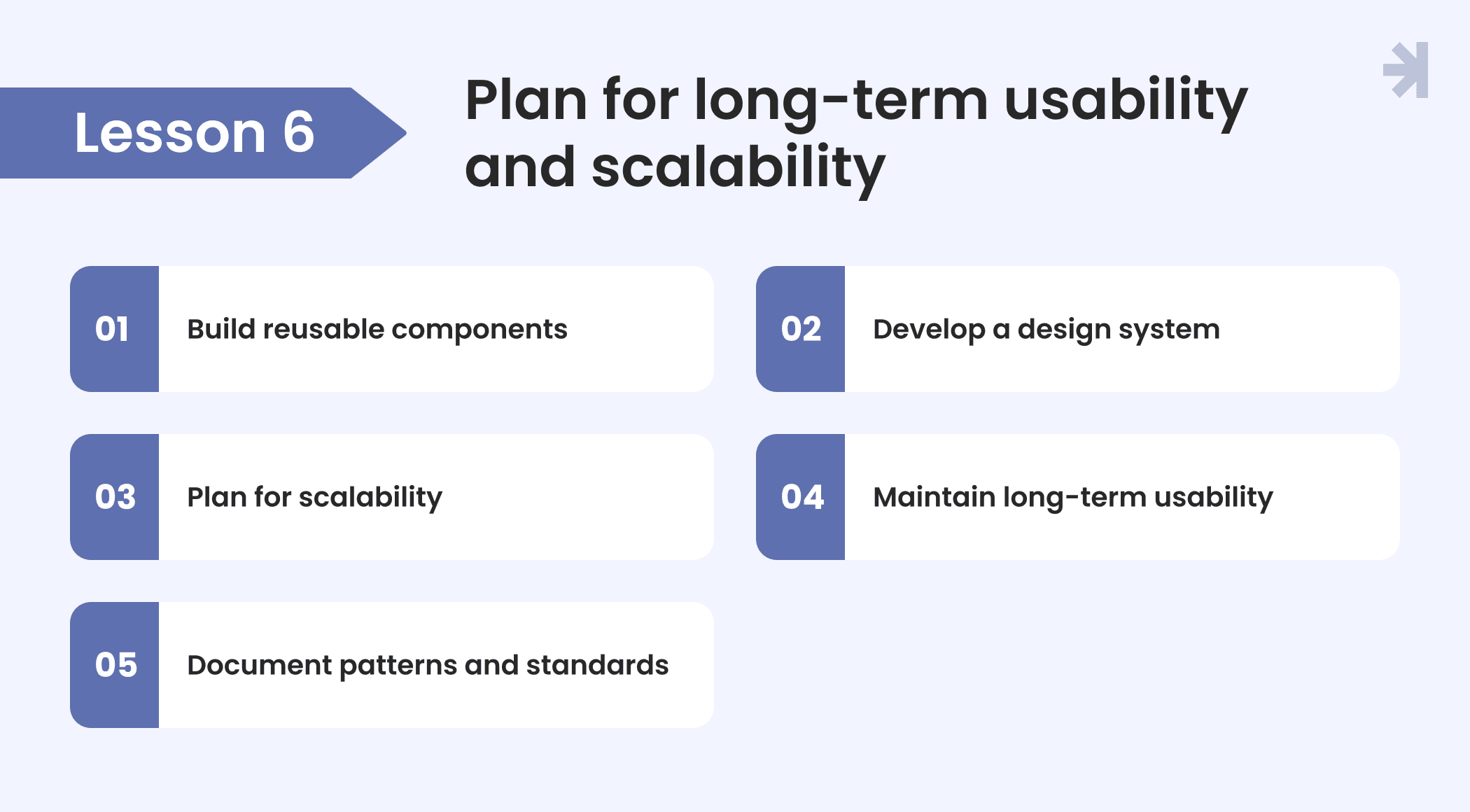
Healthcare systems are constantly evolving. New regulations, unique challenges, updated protocols, and shifting healthcare services require digital healthcare tools that can grow and adapt over time. UX designers must plan for the long term, ensuring that interfaces remain effective, maintainable, and scalable.
Key strategies:
- Build reusable components: Create modular elements in medical software and healthcare applications that can be repurposed across different tools and workflows.
- Develop a design system: A consistent user experience across healthcare software supports providers in learning and using new features without confusion.
- Plan for scalability: Design interfaces and architectures that can handle increasing data, patient records, and integration with new digital tools or devices.
- Maintain long-term usability: Consider future expansions, real time health monitoring, and evolving workflows to prevent interface obsolescence.
- Document patterns and standards: Clear documentation of UI patterns, access controls, and interaction rules helps teams maintain consistency across healthcare projects.
A design system is the single most underinvested asset in most healthcare products we've audited. Teams build interfaces feature by feature without establishing shared components, and two years later they have a product where the same interaction pattern works differently in five different parts of the system. The cost of retrofitting consistency into a product that was never designed with a system in mind is almost always higher than the cost of building the system properly at the start.
By planning for scalability and long-term usability, UX designers create healthcare solutions that remain effective, reliable, and supportive to everyone as systems evolve.
Is your healthcare product working for every user it was built to serve?
Most healthcare UX problems don't announce themselves as design problems. They show up as clinical staff creating workarounds, patients abandoning portals after the first visit, and administrators managing complexity the system was supposed to reduce. The lessons in this article describe what causes those problems and how to fix them.
MagicFlux designs healthcare products for teams that want to solve those problems properly, with research-grounded, role-specific UX that holds up in real clinical environments. We've done it for HealthTech startups and enterprise healthcare organizations across patient-facing, clinical, and administrative use cases.
Ready to talk about your product? Get in touch.

How do we know if our healthcare product needs a UX redesign or just incremental improvements?
The clearest signal is whether usability problems are isolated or structural. Isolated issues like a confusing label, a poorly placed button, or an unclear error message can be fixed incrementally without disrupting the broader product. Structural problems like role-blind navigation, information architecture that doesn't match how users actually think, and interfaces that require workarounds to complete core tasks need a more systematic approach. A UX audit is usually the fastest way to distinguish between the two. It gives you a prioritized map of where the product is losing users and why, so you can make an informed decision about scope before committing to a full redesign.
How do you conduct user research with clinical staff who have very limited availability?
Clinical professionals rarely have time for traditional hour-long research sessions. We work around that constraint by using a combination of contextual observation (shadowing real workflows without interrupting them), short structured interviews of 15 to 20 minutes scheduled around shift patterns, and asynchronous methods like annotated screen recordings or brief diary studies. The goal is to understand real behavior under real conditions without creating additional burden for already stretched clinical staff. In our experience, 45 minutes of observation in an actual clinical environment produces more actionable design insight than three hours of stakeholder interviews in a meeting room.
How long does a healthcare UX project typically take from research to final designs?
It depends on scope and the number of user roles involved. A focused engagement covering a single workflow or a specific part of the product, including research, wireframes, and validated designs, typically runs 4 to 8 weeks. A full product redesign covering multiple roles, a design system, and end-to-end user flows for a complex healthcare platform typically runs 12 to 20 weeks. The most reliable way to scope it accurately is to start with a defined discovery phase, which gives both sides a clear picture of the work involved before committing to a full engagement.
Can MagicFlux work within an existing healthcare product, or only on new builds?
Most of our healthcare UX work happens on existing products: platforms that have grown organically over time, inherited from a previous team, or built feature by feature without a unified design strategy. Starting from scratch is the exception rather than the rule. We're experienced in working within existing constraints, identifying where improvements can be made incrementally without requiring a full rebuild, and establishing design system foundations that make future development faster and more consistent. If you have a live product with real users, that's often the best starting point since there's already behavioral data to learn from.