Case studies

/

SocioLocal

SocioLocal

UX design for a digital marketing platform: Better brand loyalty and customer experience

We helped SocioLocal rebuild their multi-location platform to improve user experience, speed up content workflows, and give digital marketers better control over brand consistency and customer engagement.

Client Industry:

Marketing

B2B SaaS

Tags:
Digital marketing
UX design
Brand loyalty
User experience
Social media management
boosted

overall customer engagement

Redesigned the digital marketing platform SocioLocal to streamline campaigns and boost engagement.

improved

campaign launch times

Teams launch campaigns faster and more easily

achieved

EAA 2025 compliance

Campaigns launch with higher engagement

About the client & product

SocioLocal is a marketing tech startup building tools for multi-location brands. Their core product is a B2B digital marketing platform that helps digital marketers manage marketing campaigns across multiple channels, while maintaining consistent brand identity.

About the client & product

The platform

was in the early MVP stage when we joined. The client needed support in refining the user experience, improving current engagement, and aligning the product with clear business goals.

About the client & product

They were solving a familiar challenge:

  • Central teams lacked the tools to manage campaigns efficiently, and local stores struggled to customize content without losing brand consistency.
  • This gap impacted both the customer experience and content performance.
About the client & product

We stepped in to help with:

  • Market research and competitor analysis
  • UX strategy and flow optimization
  • UI design and visual language
  • Prototyping and reusable component design
  • Design system creation with accessibility in mind

The challenge

SocioLocal came to us with a clear goal: redesign their digital marketing platform to help central teams and local stores manage marketing campaigns with less friction and stronger brand consistency. But delivering a smooth user experience across such different user roles wasn’t easy.

Central teams needed control over branding and scheduling. Local store managers needed the freedom to customize posts without breaking the system.We had to design a platform that worked for both, while also improving overall customer experience and supporting the needs of digital marketers working across multiple channels.

Research & Discovery

Before jumping into design, we spent time learning how central marketing teams and local store managers actually use the platform and where it was slowing them down. Through stakeholder interviews, user feedback, and secondary research, we identified key behaviors and pain points that shaped our approach.

What we learned early on

01

Complex workflows

Central teams needed a clear way to plan and schedule campaigns across multiple channels.

02

Limited flexibility

Local stores wanted freedom but felt overwhelmed by complicated processes.

03

Brand control issues

Both user groups struggled with inconsistent brand management and slow approvals.

What we prioritized

01

Quick access

Users valued fast, intuitive access to customizable templates and previews.

02

Role-aware design

We focused on balancing central control with local flexibility.

03

Accessibility

Ease of use and compliance were critical to improve customer experience.

Key users we designed for

By centering the redesign on how real users work and interact with the platform, we laid the foundation for a more user-friendly, efficient, and accessible digital marketing experience.

Central marketing teams

managing brand-wide campaigns, scheduling posts, and tracking performance

Local store managers

customizing content, engaging local audiences, and maintaining brand consistency

UX/UI design process

We approached the redesign by carefully mapping out user needs and business goals. Our process focused on creating clear, efficient workflows, a visually accessible interface, and a robust design system, all designed to make social media management faster and easier for both central teams and local stores.

UX strategy & Flows

  • We structured the platform around two main user roles, each with tailored navigation and workflows. This role-aware approach simplified the user experience by showing relevant tools only to the right users.
  • Key flows like content scheduling, approval, and post customization were redesigned to reduce unnecessary steps and clarify next actions. For example, the approval workflow was streamlined to speed up campaign launches and reduce bottlenecks.
  • We focused on clear interaction patterns that minimized cognitive load and made complex marketing processes feel intuitive and manageable.

UI design & Visual language

  • Our visual design aimed to balance brand consistency with flexibility. We used a clean, modular layout with clear visual hierarchies and color-coded categories to help users quickly identify content types and statuses.
  • Accessibility was a priority. We provided compliance with EAA 2025 standards by adding alt text for non-text elements, optimizing color contrast, and supporting keyboard navigation and focus states. The interface is fully responsive and offers a seamless experience on both web and mobile devices.
  • Microinteractions were designed to provide subtle feedback like hover states, progress indicators, and real-time previews, boosting user confidence and engagement.

Design system & Implementation support

We created a reusable design system that accelerated development and kept consistency across the platform. This system included components for buttons, forms, content cards, and navigation elements, all built with accessibility in mind. Close collaboration with developers and QA happened through a Slack channel and weekly syncs. We used detailed Figma prototypes and annotations to bridge design and development, making sure interactions were implemented accurately and efficiently.

Key solutions & highlights

01

Balancing brand control with local flexibility

The problem:

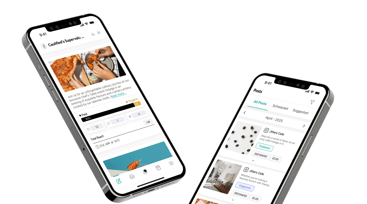
Central marketing teams struggled to maintain brand consistency, while local store managers felt restricted and unable to tailor content to their audiences.

Our solution:

We designed role-specific interfaces that give central teams powerful brand controls and approval workflows, while allowing local stores to customize posts through branded content pools and templates.

Benefit:

This balance reduced approval times and increased local post customization, boosting overall customer engagement and brand loyalty.

reduced errors

and saved time

reduced errors

02

Streamlined content scheduling and approval

The problem:

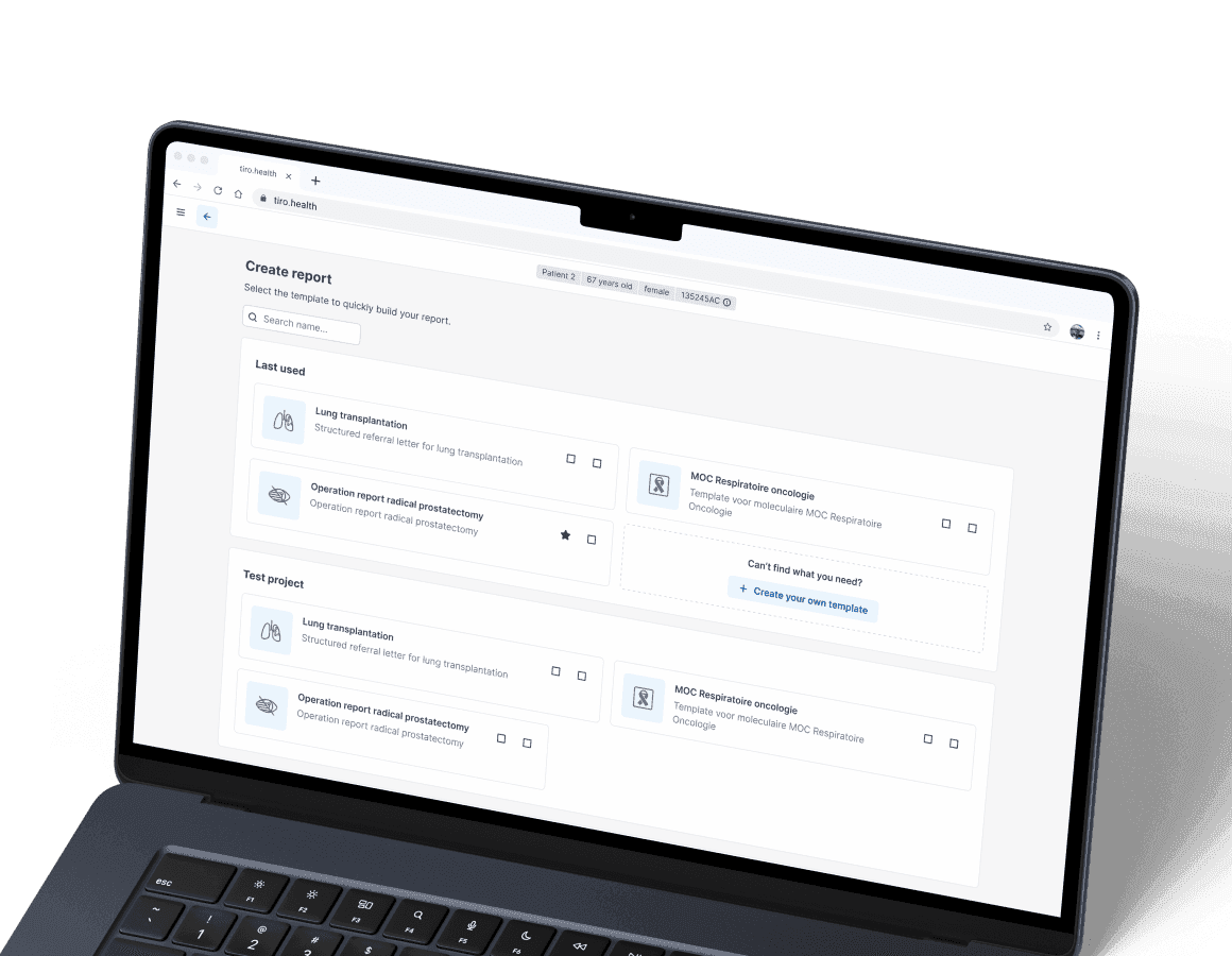
Manual scheduling and unclear approval flows caused delays and inconsistent posting across locations.

Our solution:

We created a simplified content calendar with clear visual cues, automated approval workflows, and real-time post previews, making scheduling faster and more reliable.

Benefit:

Campaign launch times improved, leading to more timely marketing campaigns and higher engagement across all channels.

cut down

reporting time

cut down

03

Accessibility and usability for all users

The problem:

The existing platform lacked accessibility features, limiting its usability for some users and risking non-compliance with EAA 2025 standards.

Our solution:

We implemented comprehensive accessibility features, including alt text for non-text elements, keyboard navigation, and color contrast improvements embedded in a shared design system.

Benefit:

The platform now meets EAA 2025 requirements, improves user satisfaction, and supports a broader range of users.

saved

the team resources

saved

Outcomes & Results

Our redesign turned a complicated platform into a user-friendly, accessible tool that helps digital marketers run marketing campaigns more efficiently across multiple locations.

Outcomes & Results
Business outcomes
  • Approval delays dropped, speeding up campaign launches and supporting business goals
  • Brand consistency improved, boosting loyalty across all locations
  • Manual work decreased so marketing teams could focus on creating value, not managing processes
  • User engagement rose thanks to better scheduling, content customization, and clearer workflows
Outcomes & Results
User outcomes
  • Digital marketers and local managers completed tasks faster with simplified, role-specific flows
  • Users reported a better experience thanks to intuitive design and accessibility improvements
  • Confidence grew as customizable templates and previews reduced errors and guesswork
  • The platform now reflects good UX and aligns closely with real user needs
icon

Lessons & reflections

More case studies

Got an idea? Let’s talk!

Sviatoslav Nytka
Sviatoslav Nytka
Design Lead
linkedin

Sviat has a medical degree and has studied accessibility and rehabilitation science. He has worked on 20+ projects, focusing on improving UX design and accessibility. Sviatoslav is a lecturer at top Ukrainian universities, collaborates with governmental organizations, and hosts the UX time podcast.

We use cookies to personalize content and ads, to provide social media features and to analyze our traffic. Check our privacy policy to learn more about how we process your personal data.