Case studies

/

Tiro.health

Tiro.health

Improving healthcare UX with smarter, accessible digital forms
Healthcare UX
Digital health tools
Web app
Workflow optimization
Design system
AI
hero-image
reducing form creation time
by ~30%

Flexible form builder allowed junior staff to customize forms without developer help, reducing form creation time.

doctors complete medical forms
up to 20% faster

Streamlined interface and intuitive shortcuts let doctors complete medical forms more efficiently, saving time during patient care.

accelerated development time
by ~ 25%

Reusable design system components and clear prototyping reduced iterations, speeding up development and improving collaboration with developers.

About
Tiro.health is a HealthTech startup on a mission to improve how healthcare providers manage medical documentation. Their team is building a modern digital health platform that supports both administrative staff and clinicians with faster, smarter workflows.
Challenge
Tiro.health came to us with a big goal: streamline complex medical information without adding friction to already overwhelmed healthcare professionals. But transforming that goal into a seamless product experience meant tackling several layered challenges, both technical and human. Healthcare UX design presents unique challenges due to the complexity of medical data, the critical nature of healthcare services, and the diverse needs of users.
Research & Discovery
Before jumping into design, we spent time investigating real frustrations and real workflows in healthcare solutions, including insights from medical professionals, as their expertise is important in shaping the overall healthcare experience. A key focus of our research was on patient engagement, so our solutions can foster active participation and improve the healthcare journey for all users
Process
Our design process focused on creating intuitive, accessible workflows and a scalable design system, all tailored to meet the fast-paced, complex needs of healthcare professionals.
Key solutions
We simplified complex healthcare workflows into solutions that save time and reduce frustration, helping staff focus on patient care.
Results
Thanks to the redesigned platform, Tiro.health achieved meaningful improvements for both the business and its users, while also supporting health systems and enabling telehealth services.
Lessons & Reflections
This project reminded us of some important lessons about designing for the healthcare sector: it’s not just about making things look good. It’s about creating tools that truly support people under pressure.
About

Tiro.health is a HealthTech startup on a mission to improve how healthcare providers manage medical documentation. Their team is building a modern digital health platform that supports both administrative staff and clinicians with faster, smarter workflows.

Challenge

Tiro.health came to us with a big goal: streamline complex medical information without adding friction to already overwhelmed healthcare professionals. But transforming that goal into a seamless product experience meant tackling several layered challenges, both technical and human. Healthcare UX design presents unique challenges due to the complexity of medical data, the critical nature of healthcare services, and the diverse needs of users.

Research & Discovery

Before jumping into design, we spent time investigating real frustrations and real workflows in healthcare solutions, including insights from medical professionals, as their expertise is important in shaping the overall healthcare experience. A key focus of our research was on patient engagement, so our solutions can foster active participation and improve the healthcare journey for all users

Process

Our design process focused on creating intuitive, accessible workflows and a scalable design system, all tailored to meet the fast-paced, complex needs of healthcare professionals.

Key solutions

We simplified complex healthcare workflows into solutions that save time and reduce frustration, helping staff focus on patient care.

Results

Thanks to the redesigned platform, Tiro.health achieved meaningful improvements for both the business and its users, while also supporting health systems and enabling telehealth services.

Lessons & Reflections

This project reminded us of some important lessons about designing for the healthcare sector: it’s not just about making things look good. It’s about creating tools that truly support people under pressure.

Case icon
At its core, the product combines two tools:
  • A form builder that lets junior staff (like nurses) create complex medical forms using structured templates, presets, and shortcuts.
  • A form filler that allows doctors to complete those forms quickly using artificial intelligence assistance, keyboard commands, and contextual guidance to improve efficiency and accuracy.
Case icon
The business problem was clear:

Too much time was being lost to rigid paper forms or outdated EHR systems, leading to staff frustration, medical care errors, and slower care delivery. In the context of complex healthcare systems, there was a critical need for seamless integration with existing workflows for better efficiency. Tiro.health wanted a digital solution that reduced friction, saved time, and improved patient outcomes without overwhelming users.

Case icon
They brought us in as a long-term design partner to help:
  • Translate complex healthcare services workflows into intuitive interfaces.
  • Design with accessibility in mind (WCAG compliance, keyboard navigation).
  • Build a flexible design system to support future scaling.
  • Create a product that serves both healthcare professionals and many patients indirectly.

What we learned early on

01

Time pressure is constant

Every second spent navigating a confusing interface is a second taken from patient care.

02

Documentation wasn’t just a chore

It was a critical part of providing safety, accuracy, and accountability in medical data, especially when managing large amounts of patient information.

03

One size didn’t fit all

A junior nurse filling out forms needed a very different interface from a senior doctor reviewing them.

What we prioritized

01

Less repetitive tasks

Used smart presets and recommendations to automate routine actions and save time.

02

Error prevention

Added real-time validation and clear confirmations to prevent mistakes and support better health outcomes.

03

Accessibility first

Made the product easy to use for all users through clear structure, readable content, and accessible design patterns.

Who we designed for

We identified three key personas with very different workflows and goals.
Through interviews, workflow mapping, and close collaboration with the Tiro.health team, we created a clear foundation for purposeful, inclusive UX that respected the realities of modern digital healthcare. UX designers focused on a human-centered approach, prioritizing the needs and experiences of both patients and medical professionals.

Clinicians
Clinicians

Time-sensitive, accuracy-focused, often working on the go.

Nurses / Admin Staff

Responsible for creating and maintaining forms, often less technical but highly process-driven.

01

UX strategy & Flows

We began by mapping out core user journeys for both primary personas: the junior staff building forms and the doctors filling them out. Our goal was to make complex workflows feel natural and efficient.

  • We prioritized keyboard interactions for fast and detailed data entry without relying on a mouse. It is essential for time-pressed healthcare providers.
  • Key flows like form creation, conditional logic setup, and form filling were simplified by breaking them into smaller, manageable steps. It reduced cognitive load and sped up task completion.
  • We introduced contextual decision trees to help new users choose the right components intuitively to support patient-centered experiences and improve learnability without overwhelming experienced users.
  • Navigation was designed to be consistent and predictable, so users always knew where they were and how to complete tasks quickly.
  • Error prevention strategies were implemented by adding real-time data to reduce mistakes and provide accuracy throughout the workflow.

02

UI design & Visual language

Based on insights, we map user journeys, create personas, and plan wireframes, user flows, and interface elements for a clear, purposeful structure.

  • We strictly followed WCAG guidelines, focusing on color contrast and keyboard accessibility to make the platform usable for both people with and without disabilities.
  • The interface uses clean typography, spacious layouts, and intuitive icons to reduce visual noise and support rapid scanning of complex sensitive data.
  • We designed microinteractions like animated component previews and subtle feedback on form actions to make the experience engaging and reduce errors.

03

Design system & Implementation support

For consistency and scalability, we built a custom design system based on the popular shadcn/ui library.

  • Components were tailored to healthcare products' needs, including separate settings for animated previews, accessibility features, and keyboard interactions.
  • We created reusable UI elements to speed up development, maintain design quality as the product evolves, and support secure data sharing across healthcare systems.
  • Our close collaboration with developers involved regular syncs, Figma prototypes with annotations, and design QA sessions for a smooth handoff and accurate implementation.
  • This collaborative workflow helped address technical constraints early and fostered shared ownership of user experience across teams.
01
Flexible form builder for junior staff
The problem:

We don’t just make things look good. We make them feel effortless. Our focus is on design that moves your product forward and makes users smile. No busywork or fluff.

Our solution:

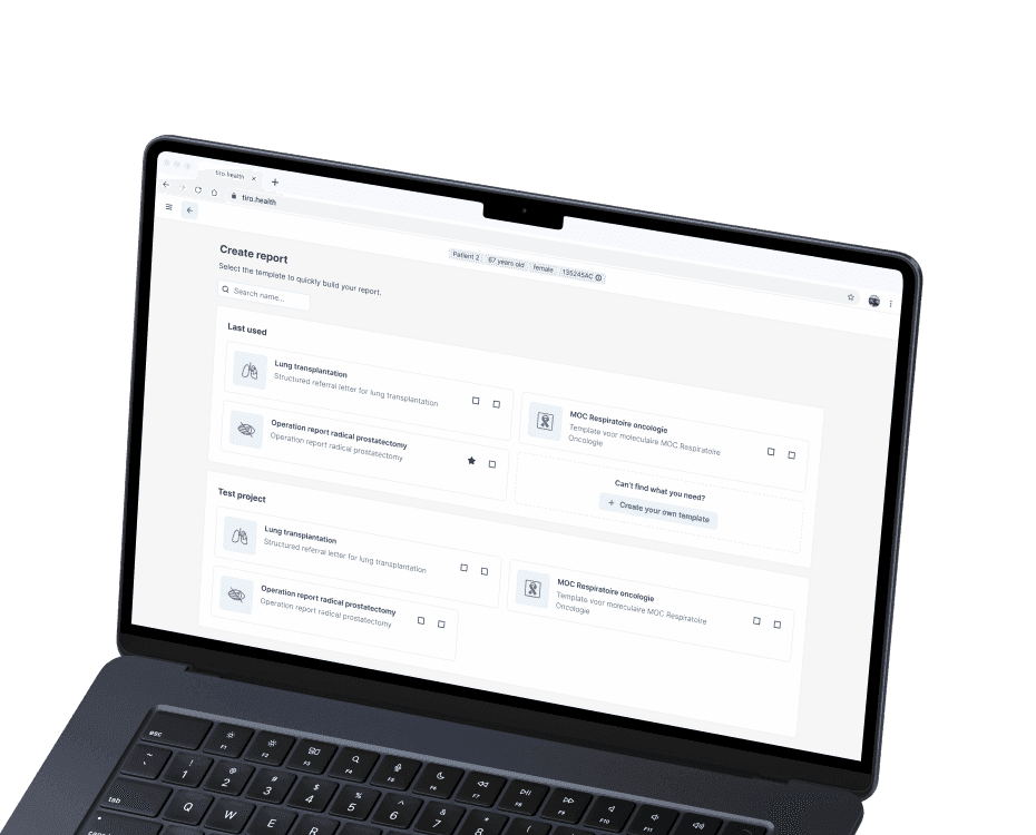
We designed a drag-and-drop form builder with conditional logic, presets, and shortcuts that adapts to diverse healthcare products workflows. It’s flexible and easy to learn, supported by in-app educational previews and decision trees.

The benefit:

This allowed junior staff to customize forms without developer help, reducing form creation time by an estimated 30%, and medical teams to respond faster to changing individual patient needs.

reducing form creation time
by ~30%
logologo
02
Streamlined form filler for doctors
The problem:

Doctors have limited time to complete paperwork and struggle with slow form-filling processes.

Our solution:

We crafted a fast, user-friendly interface with AI-powered suggestions that speed up health data entry and reduce repetitive actions.

The benefit:

Doctors can now complete medical forms up to 20% faster, freeing valuable time to focus on patient care and improving overall documentation accuracy. 

doctors complete medical forms
up to 20% faster
logologo
03
Accessible design system with developer collaboration
The problem:

Inconsistent UI components and a lack of accessibility features led to a fragmented user experience and slow development cycles.

Our solution:

We developed a design system, tailored for healthcare sector needs, with built-in accessibility (WCAG compliance).

The benefit:

The design system improved UI consistency across the platform, accelerated development time by approximately 25%, and made the product usable for both people with and without disabilities.

accelerated development time
by ~ 25%
logologo
Case icon
Business results:
  • Reduced paperwork reliance, driving faster onboarding of healthcare teams onto the digital platform.
  • Increased user engagement through an intuitive, accessible interface tailored to real workflows, supporting better patient health outcomes by more effective monitoring and management.
  • Strengthened client positioning as a leader in digital health solutions with a scalable, consistent design system.
Case icon
Patient outcomes:
  • Doctors completed forms up to 20% faster, cutting down administrative burdens and reducing fatigue.
  • Nurses and junior staff could build and modify forms with greater autonomy, speeding up care adaptations.
  • Positive usability feedback highlighted improved clarity, reduced errors, and higher satisfaction across all user groups

More case studies

Got an idea? Let’s talk!

Sviatoslav Nytka
Sviatoslav Nytka
Design Lead
linkedin

Sviat has a medical degree and has studied accessibility and rehabilitation science. He has worked on 20+ projects, focusing on improving UX design and accessibility. Sviatoslav is a lecturer at top Ukrainian universities, collaborates with governmental organizations, and hosts the UX time podcast.

We use cookies to personalize content and ads, to provide social media features and to analyze our traffic. Check our privacy policy to learn more about how we process your personal data.