A B2B EdTech tool redesigned with clear, web-first UX to make campaign creation easier and boost student engagement.
A guided 4-step flow replaced the complex setup, helping teams launch with confidence.
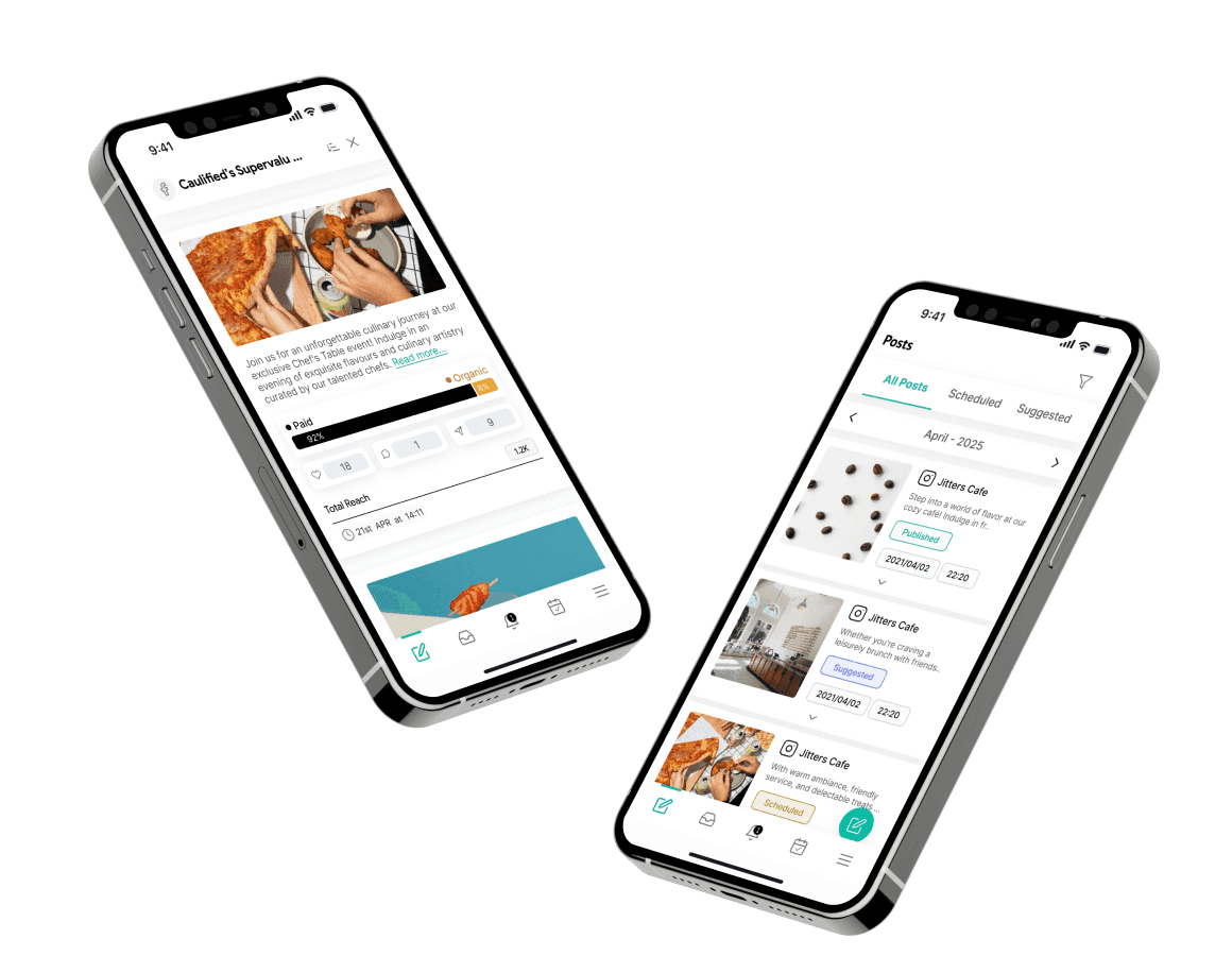
Dashboards gave teams instant insights to act quickly and connect better with students.
01
Users struggled with too much data at once, making it hard to focus on key actions and follow the campaign process.
02
There was no clear path from setup to results, and users couldn’t see what was working or get immediate feedback.
03
Users wanted tools that go beyond sending messages: features that help track progress, meet learning goals, and create engaging experiences.
01
We focused on creating a clear, step-by-step path from setup to results, reducing cognitive load and helping teams complete campaigns efficiently.
02
Dashboards and visual cues were prioritized so users could track performance, make data-driven decisions, and improve student engagement.
03
Design choices aimed to reduce reliance on support, giving staff intuitive tools that encourage autonomy and make the overall learning experience better.
We focused on the roles that directly influence student engagement and campaign success. Understanding their workflows, goals, and pain points helped us create solutions that reduce complexity, improve efficiency, and support meaningful learning experiences.

Focused on increasing student participation in learning programs

Responsible for guiding prospective students and improving communication
01
UX strategy & Flows
We started by understanding the structure of the entire tool. The original campaign setup forced users to complete everything on one cluttered screen. It was easy to get lost or miss a step.
02
UI design & Visual language
Visually, we focused on clarity, contrast, and a sense of calm. We modernized the look using a clean layout, clear headings, and consistent use of icons and color.
03
Design systems & Implementation support
Given the product’s integration with Salesforce, we built a flexible design system that aligned with their technical constraints. We created reusable components such as buttons, cards, modals, input fields, and layout blocks that worked within Salesforce limitations but still delivered a consistent, modern user experience.
Setting up a campaign felt complex and time-consuming, especially for non-technical users.
We turned it into a simple step-by-step flow with smart defaults and tips aligned with common tasks in the engagement tool. The new flow also allows users to create and manage WhatsApp and email campaigns more efficiently.
Users finished campaigns faster, with fewer mistakes and less stress.

The old dashboard was cluttered and hard to read. Users couldn’t track results or improve their approach.
We redesigned the analytics using clean visuals and filters that focus on what matters most, like open rates and student replies.
Teams saw a significant boost in user engagement and could now make better decisions in less time. Improved analytics also help teams understand how students learn and engage, leading to more effective educational outcomes.

Users kept asking for help in campaign creation. The tool didn’t offer much direction.
We added templates, tips, and smart suggestions to guide users as they worked based on real behaviors and needs.
Support tickets dropped, and users felt more confident using the product on their own.


Sviat has a medical degree and has studied accessibility and rehabilitation science. He has worked on 20+ projects, focusing on improving UX design and accessibility. Sviatoslav is a lecturer at top Ukrainian universities, collaborates with governmental organizations, and hosts the UX time podcast.