

In most industries, a broken button or a confusing navigation menu is a minor inconvenience. In the healthcare sector, it can become a clinical risk that directly affects patient safety, medical care, and ultimately patient outcomes.
The modern healthcare industry relies on advanced healthcare technologies, AI-assisted diagnostics, and digital health tools. Yet many healthcare apps and digital health tools are still built on fragmented UI foundations. Interfaces often struggle to present complex medical information, dense medical data, and critical alerts in a way that supports confident decision-making.
For UX designers working in healthcare UX, this creates recurring problems. Teams repeatedly rebuild the same UI elements: tables for patient records, inputs for patient data, dashboards for data visualization, and forms tied to electronic health record systems. These are not innovation challenges. They are infrastructure problems.
Magic Health UI was created to solve this at the foundation level. It is an open-source UI component library and Figma UI kit designed specifically for healthcare UX design. It helps teams build consistent, accessible, and compliant healthcare technologies faster and safer.
Why UI component libraries matter in healthcare UX

In healthcare UX, consistency and clarity are not aesthetic preferences. They are safety requirements. A well-structured UI library becomes the backbone of a reliable healthcare user experience.
Consistency across healthcare systems
Healthcare products rarely exist in isolation. Healthcare providers use multiple tools across different healthcare systems, from internal dashboards to a patient portal. A shared UI kit ensures consistent behavior, visuals, and user interactions, reducing cognitive load for healthcare professionals.
Speed without sacrificing safety
Building interfaces from scratch increases the risk of inconsistency and error. Reusable UI components allow UX designers and healthcare designers to move faster while maintaining quality across healthcare applications.
Accessibility is built into UI elements
Accessibility is essential in the healthcare industry. When accessibility is embedded directly into UI elements, teams support diverse user groups, including clinicians, patients, and caregivers, by default, not as an afterthought.
Shared language for teams
A component-based UI library gives UX professionals, developers, and product teams a common vocabulary. This reduces misunderstandings and helps teams focus on solving real challenges in healthcare, not debating UI basics.
The healthcare “tax” on UI design
Most general-purpose UI kits are built for consumer tech. Healthcare introduces unique challenges that demand a domain-specific UI component library.
High data density
Clinicians need to review patient information, vitals, lab results, medications, and medical history simultaneously. Healthcare UX design must support dense layouts without overwhelming users. Purpose-built UI components make this possible.
Accessibility and regulation
Global regulations require inclusive design across healthcare services. Many healthcare companies face significant challenges due to inaccessible interfaces. A healthcare-focused UI library ensures accessibility is consistent across all components.
Data awareness and HIPAA
Healthcare interfaces must account for sensitive patient information, health data, and medical data. UI patterns must support robust security measures, data security, and regulatory compliance, including health insurance portability.
Planning a healthcare UI component library
Before designing components, we focused on understanding shared patterns across the healthcare industry. Instead of optimizing for a single product, we studied workflows common to healthcare providers and medical professionals.
These included patient portals, clinical dashboards, telehealth services, and tools for real time health monitoring. Despite different use cases, these products rely on similar UI elements and interaction patterns.
We also considered domain-wide requirements: accessibility standards, HIPAA constraints, medical device considerations, and privacy laws. These factors shape every effective healthcare UX solution.
Healthcare design systems used in the process:
Foundation of the library: Styles, tokens, and guidelines
Once the strategic groundwork was complete, we moved on to building the foundation of the Magic Health UI component library – the shared styles, tokens, and guidelines that every UI component relies on.
In healthcare UX design, these foundations are not decorative. They directly influence clarity, accessibility, and safe decision-making across healthcare systems.
Our goal was to create a UI foundation that supports dense information, reduces cognitive load, and scales across healthcare applications, from clinician dashboards to patient-facing tools.
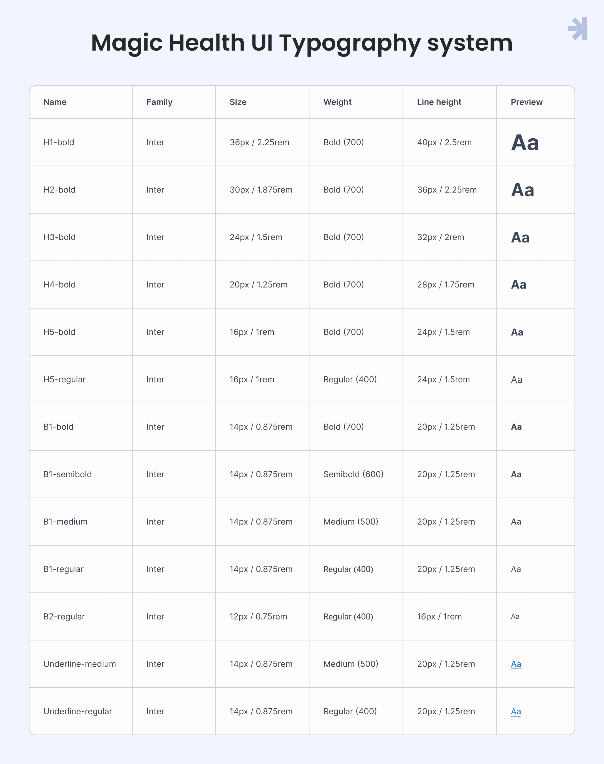
1. Typography: Designing for clarity under pressure
Healthcare interfaces frequently present high-density, high-stakes information: lab values, medication lists, patient records, vital signs, and medical history. Typography must make this information scannable, readable, and unambiguous even in stressful healthcare settings.
Choosing the right typeface
System fonts such as San Francisco, Roboto, or Segoe UI are often a solid choice due to their screen optimization and availability. However, when building a reusable UI library and Figma UI kit, we also needed consistency, flexibility, and strong support for medical terminology.
We chose Inter as the primary typeface for Magic Health UI. Its open apertures, generous spacing, and neutral character improve legibility across devices from high-resolution clinical workstations to older tablets used in patient portals. Inter also provides reliable coverage for medical symbols and special characters used throughout healthcare software.
To avoid readability issues, we intentionally excluded lighter font weights. In healthcare UX, clarity is closely tied to patient's health status, and text that becomes hard to read under poor lighting or visual strain introduces unnecessary risk.
2. Color system approach: Accessibility first
Color in healthcare serves functional purposes first and aesthetic purposes second.
Our color system is designed to convey status, highlight critical information, and remain accessible to users with various forms of color vision deficiency.
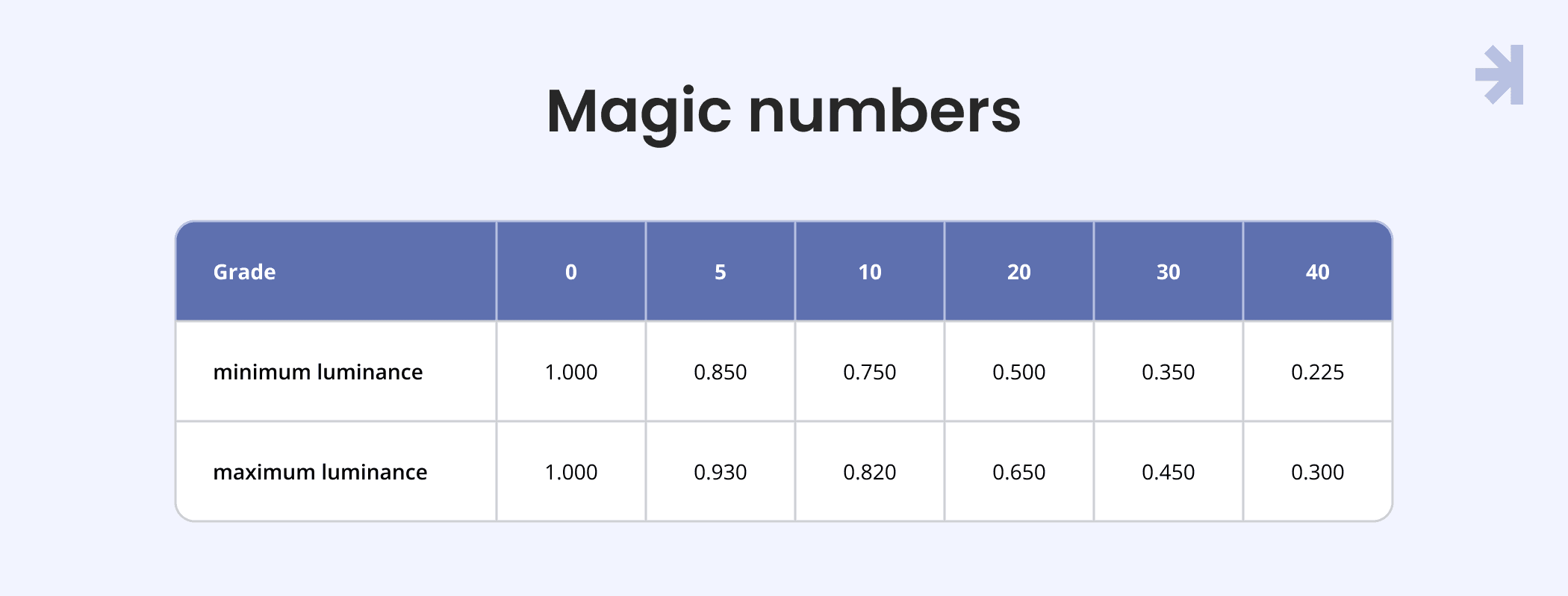
Magic numbers
To provide accessibility across the interface, we adopted the Magic Numbers method, inspired by the USWDS and Salesforce Lightning Design System.
A magic number is the difference between two color grades (for example, 90 and 40). This difference helps determine whether a color pair meets accessibility standards.
Magic Numbers work because each color grade fits within a defined relative luminance range. Since WCAG and Section 508 contrast requirements are based on the luminance ratio between two colors, keeping colors within these ranges ensures predictable and accessible contrast combinations.
Each color grade has a minimum and maximum luminance value, which allows designers and developers to safely combine colors without recalculating contrast ratios every time.
How to use it:
- Look at the numbers in colors (e.g., brand-60, neutral-10).
- Subtract one from the other to get the magic number. Example: 60 − 10 = 50
- Compare the result to this simple rule:
- 40+: Meets WCAG 2.2 AA for large text (3+)
- 50+: Meets WCAG 2.2 AA for standard text and AAA for large text (4.5+)
- 70+: Meets WCAG 2.2 AAA for standard text (7+)
Easy way to build your palette: Magic Numbers tool
This system allows UX designers and developers to create accessible combinations without recalculating contrast every time they use a new UI component.
Variables
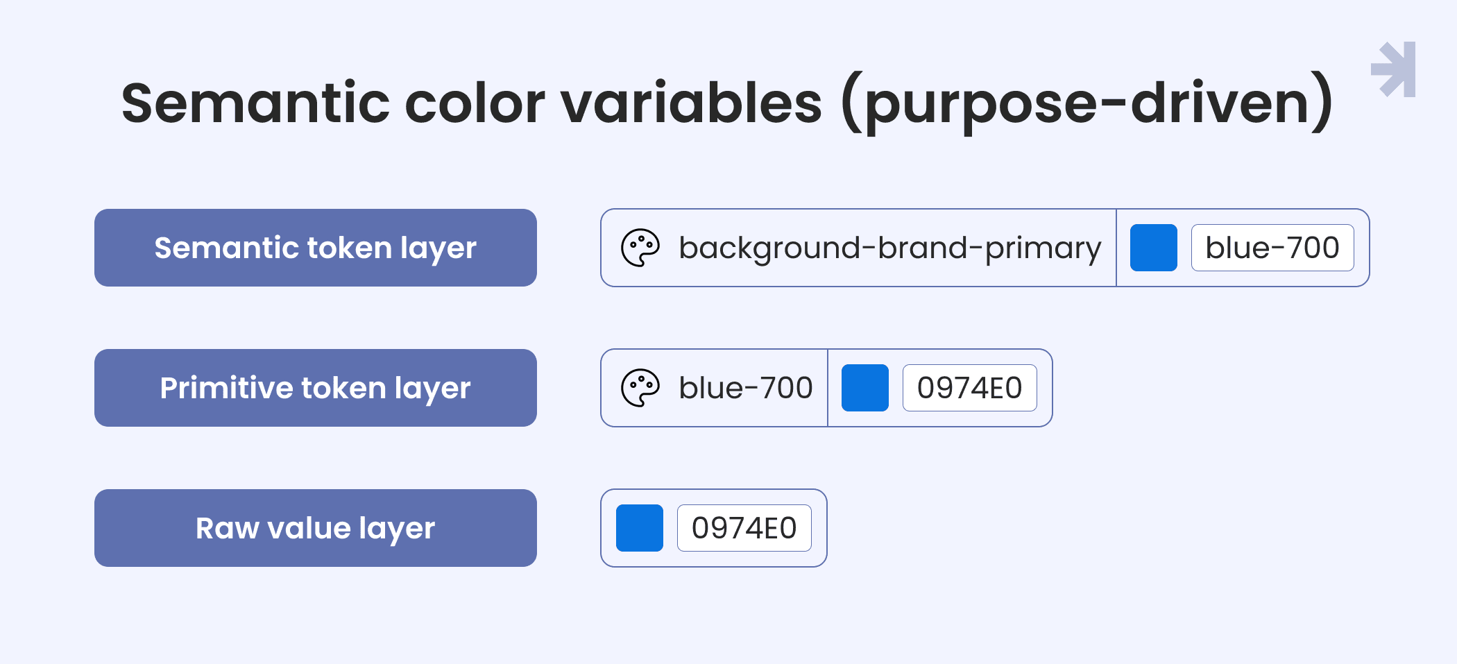
We use a two-tier color variable system that balances consistency, flexibility, and clarity for both designers and developers working on healthcare digital solutions.
- Primitives (values)
Primitives are the foundation of the color system. They represent raw HEX color values (for example, #101828) without any semantic meaning.
- Usage: Used only as base values, not directly applied in UI components
- Purpose: Act as the single source of truth for all colors
- Benefit: Updating one primitive updates every dependent color across the system
- Semantic color variables (purpose-driven)
Semantic variables are aliases mapped to primitives and tied to a specific UI role or context. Instead of using abstract names like neutral-90, we use descriptive, intention-revealing names such as:
- background-brand-primary
- border-neutral-primary
- text-danger
Why this matters:
- Contextual clarity: The name communicates intent (error, success, primary action) without guessing
- Design–dev alignment: Everyone understands how and where a color should be used
- Thematic flexibility: Semantic variables make it easy to support multiple themes (light, dark) while keeping one source of truth
Scope of use:
- Content: Text, typography, icons, brand imagery
- Backgrounds: Page surfaces, containers, disabled states
- Borders: Component outlines and interactive states
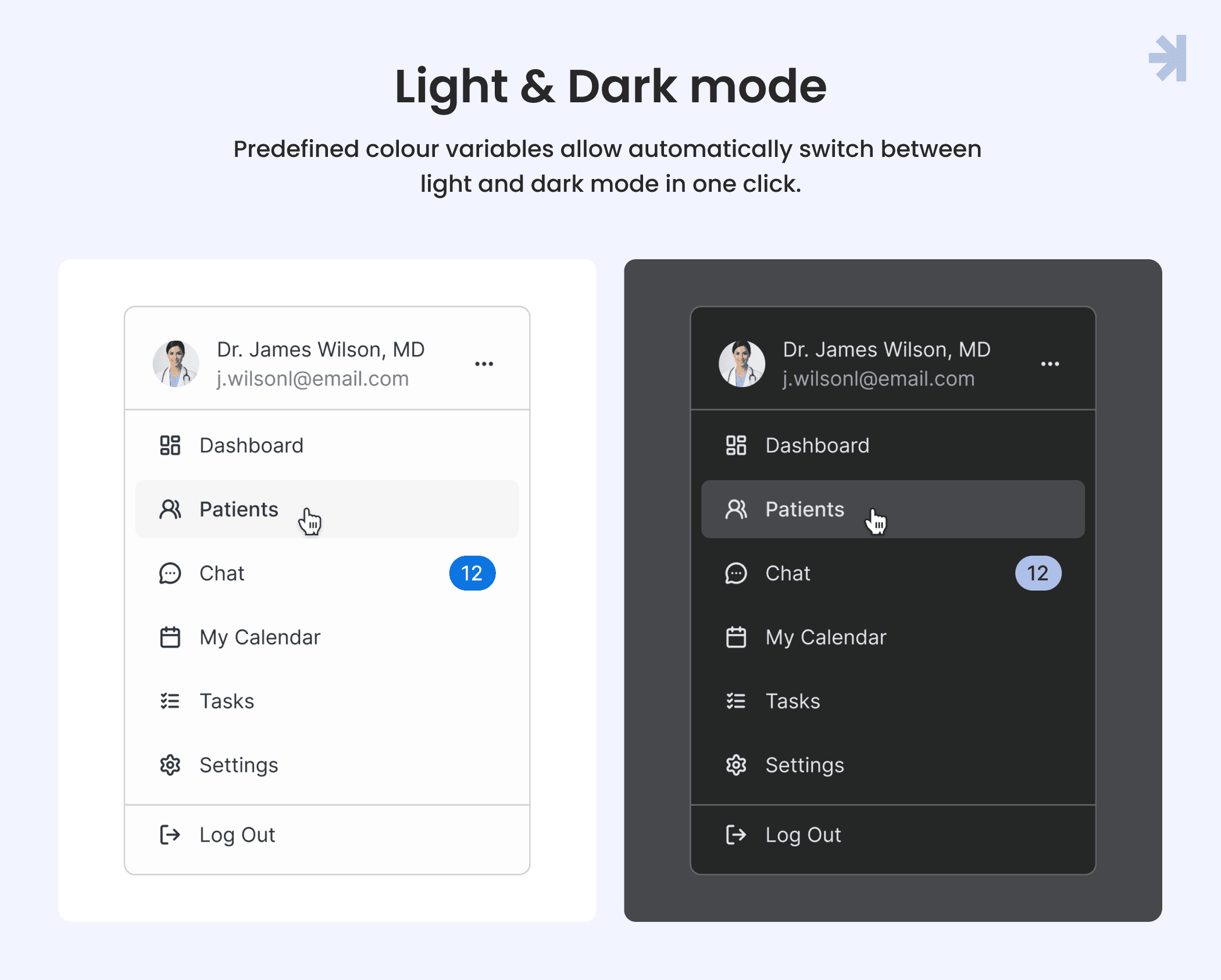
Light / Dark Mode
Healthcare professionals often work long or night shifts, so visual comfort is critical. We designed light and dark modes from the start, not as an afterthought.
Light mode:
- Light neutral shades (0-30) for backgrounds
- Darker neutral shades (50-80) for text and primary content
- Clear contrast hierarchy for readability in bright environments
Dark mode:
- Colors are not simply inverted
- Pure black backgrounds were avoided to reduce eye strain
- Color saturation was slightly reduced for more comfortable long-term viewing
- All color combinations were tested to ensure sufficient contrast and WCAG compliance
This approach ensures both modes remain accessible, legible, and comfortable in real clinical working conditions.
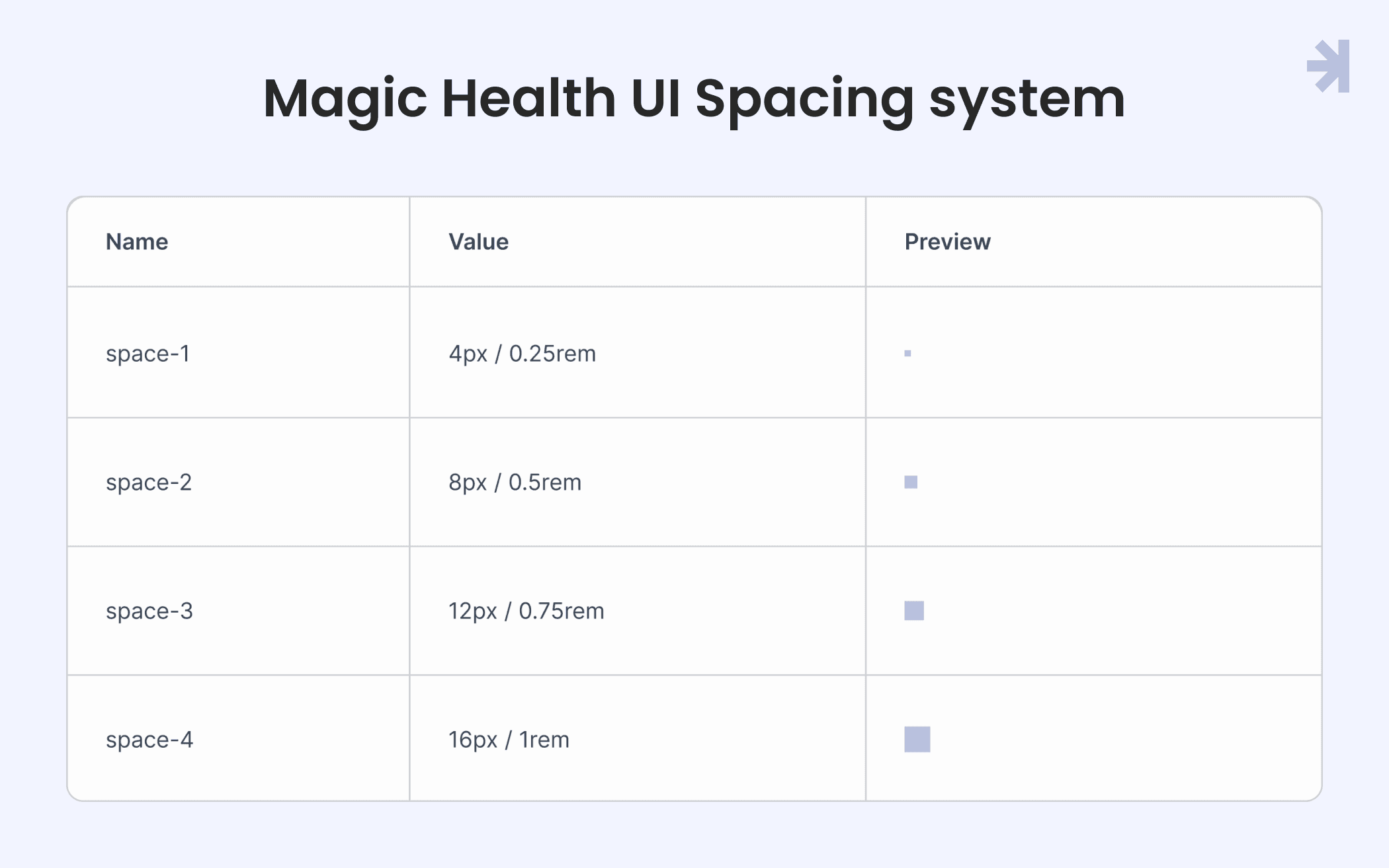
3. Spacing variables
Consistent spacing is critical in healthcare ux design because interfaces often display dense and complex medical data. In Magic Health UI, we use a 4px / 0.25rem grid system as the foundation for all UI components.
Key principles:
- Multiples of 4: All dimensions, padding, and margins are based on 4px increments, ensuring alignment and predictability across the UI kit.
- Hierarchy of spacing:
- Smaller units are used between closely related UI elements (for example, between labels and input fields).
- Larger units create separation between sections, complex components, or groups that require visual distinction (for example, between a patient portal dashboard module and a medical device data panel).
- Scalability: The grid system makes it easy to maintain consistent spacing across multiple healthcare applications while accommodating dynamic content and responsive layouts.
Using defined spacing variables ensures clarity, reduces visual clutter, and improves user interactions for healthcare professionals navigating complex interfaces.
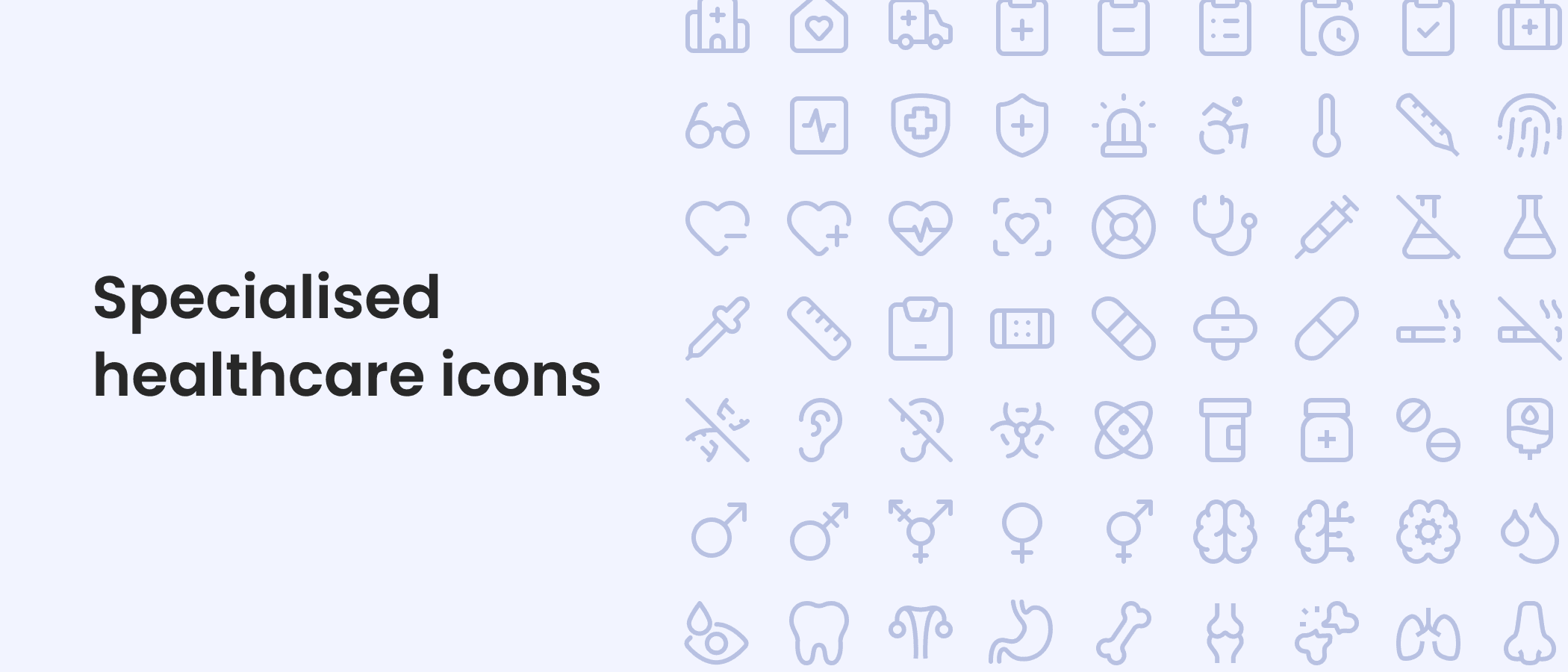
4. Icons
In healthcare interfaces, iconography acts as a universal visual language, helping healthcare professionals quickly interpret patient data and system states under high-pressure conditions. Clear and consistent icons are essential for efficient user interactions.
Key components of our icon system:
- Basic functional icons: Standard icons for common UI components such as buttons, toggles, alerts, and navigation elements. These ensure consistent visual cues across the entire UI kit.
- Specialized healthcare icons: Icons representing medical devices, patient records, vitals, medications, and other domain-specific elements. These are designed to be immediately recognizable to healthcare providers and medical professionals, reducing cognitive load.
- Guidelines for creating new icons: The library includes comprehensive rules for designing new icons.
By using a curated icon set with clear creation guidelines, our Figma UI kit and UI components remain consistent, scalable, and optimized for healthcare UX design across diverse applications and devices.
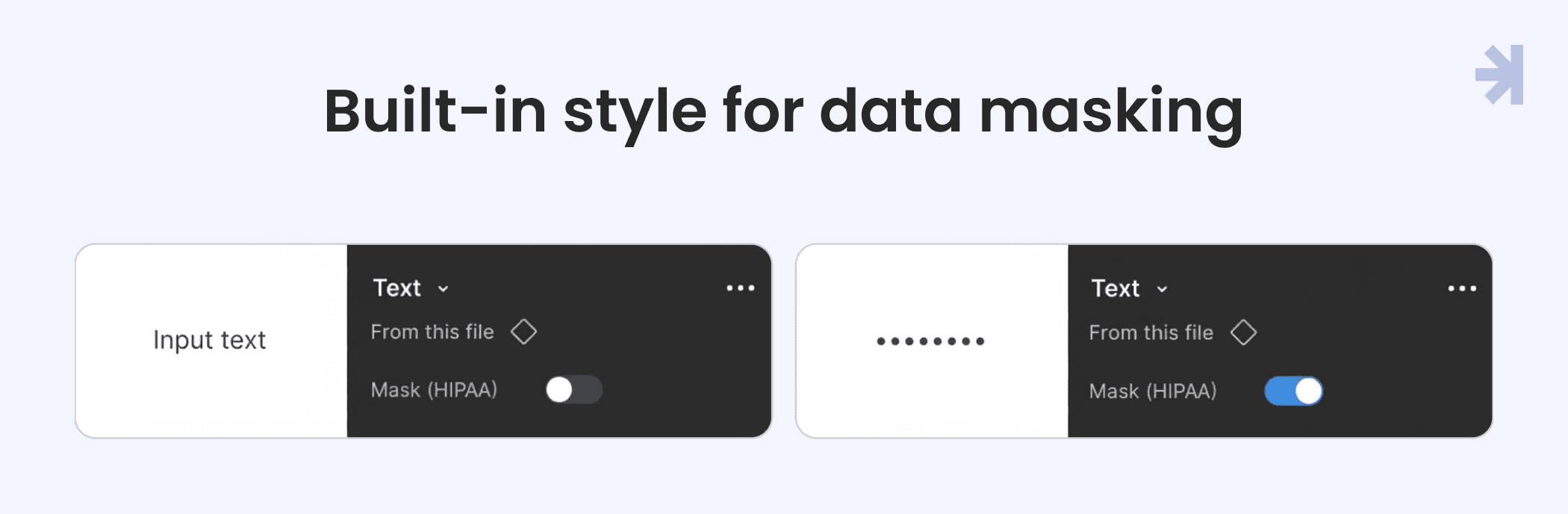
5. Accessibility, HIPAA, and components
Accessibility
In healthcare, accessibility is not just inclusivity. It’s patient safety. Low-contrast alerts or unclear icons can create clinical risks. Our UI components integrate accessibility principles to ensure clear, safe, and usable interfaces for all users.
HIPAA
Components include built-in data masking for sensitive information, such as patient SSNs or lab results. Users must intentionally reveal data with an “eye” icon, reducing accidental exposure of PHI. While the library supports safe UI patterns, full HIPAA compliance requires secure backend systems.
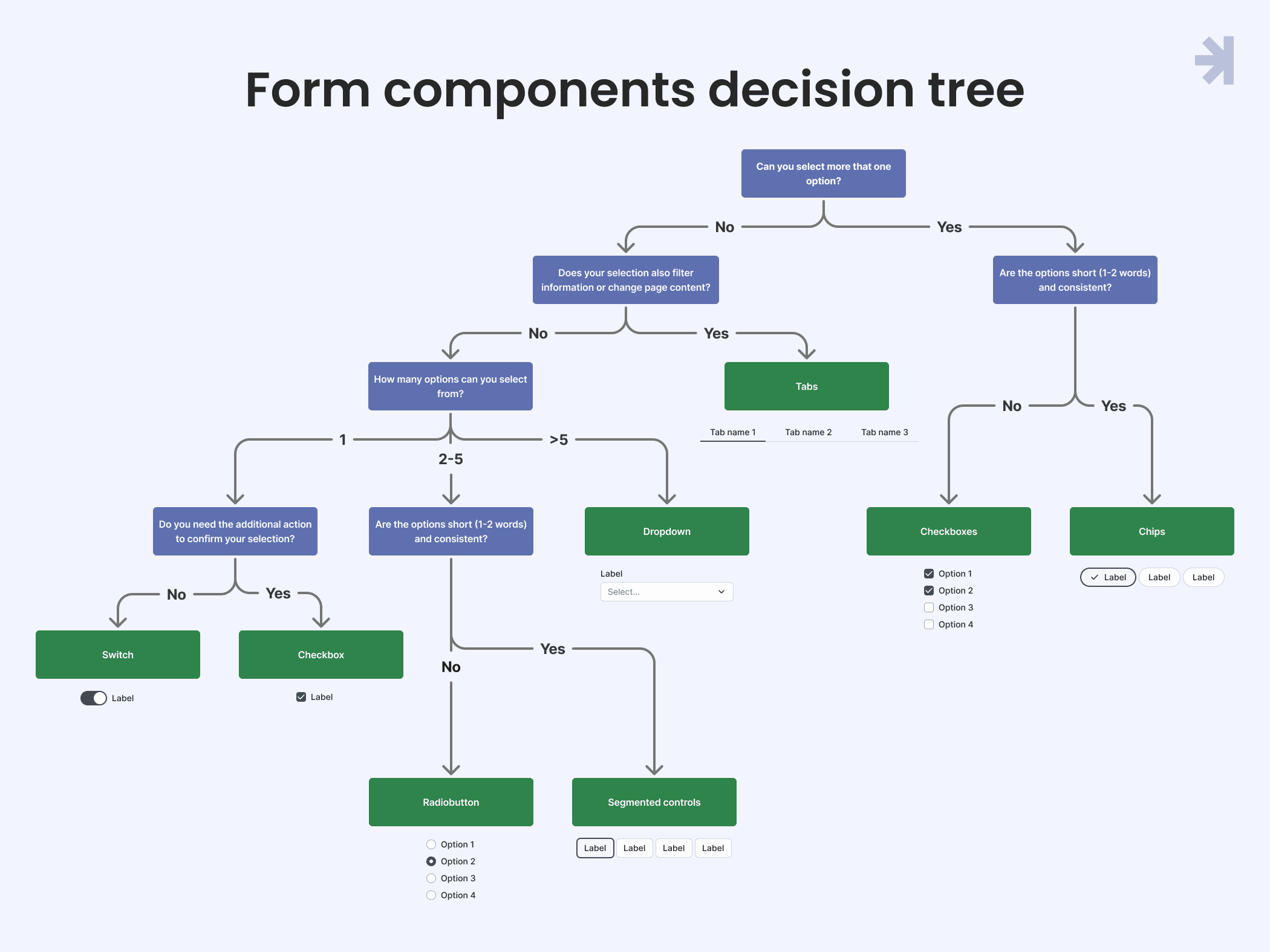
Components Decision Tree
Choosing the right form component can be complex. Our decision tree guides designers and healthcare UX professionals to select the most appropriate control for each scenario, improving usability and reducing errors.
UI Components
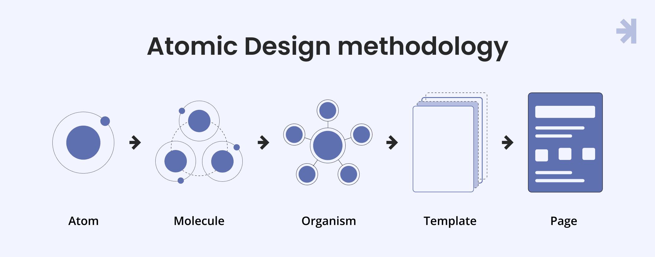
Atomic Design methodology
We use the Atomic Design framework to break complex healthcare interfaces into reusable building blocks:
- Atoms: Basic elements like buttons or inputs
- Molecules: Groups of atoms, e.g., a search bar
- Organisms: Complex structures like headers or dashboards
This approach ensures consistency, scalability, and flexibility across the UI library, while still allowing designers to innovate. Think of it as well-organized LEGO blocks for healthcare UX design.
Dynamic content with Auto Layout
Patient names, lab values, and medical data vary in length. Components built with Auto Layout automatically resize, ensuring responsive, adaptable layouts across tablets, desktops, and other healthcare apps.
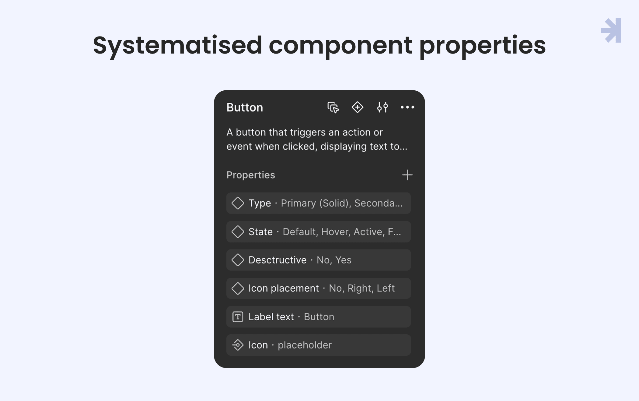
Systematized component properties
Our Figma UI kit uses component properties to make elements dynamic and reusable:
- Variants: Different states, sizes, or types (e.g., Primary/Secondary button)
- Boolean: Toggle visibility of icons or badges
- Text: Editable content directly within instances
- Instance Swap: Replace nested components like icons without breaking the design
States & Accessibility
Each component comes with pre-configured interactive states:
- Hover & Active: Visual feedback during interactions
- Focus States: High-visibility outlines for keyboard navigation
- Disabled States: Clearly indicate restricted actions
Pre-vetted components meet WCAG accessibility standards, with clear labels and descriptive error messages, supporting healthcare professionals in high-stakes environments.
Blueprints for speed: Ready-to-use healthcare templates
Our UI library includes ready-to-use templates that accelerate design for healthcare applications.
Integrated telehealth & Consultation suite
Context-aware interface giving healthcare professionals the right patient data at their fingertips during live consultations.
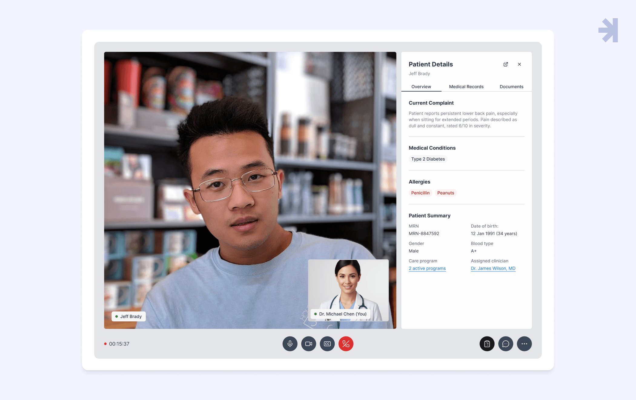
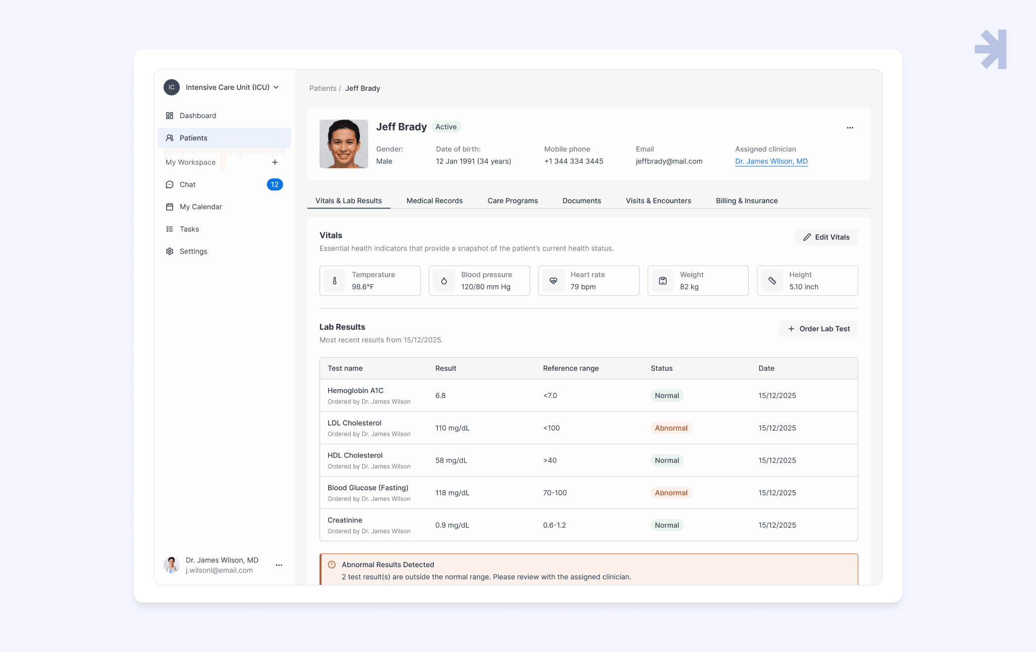
Centralized Patient Health Record (PHR)
Unified command center consolidating medical data, lab results, and patient records into an actionable, tabbed layout.
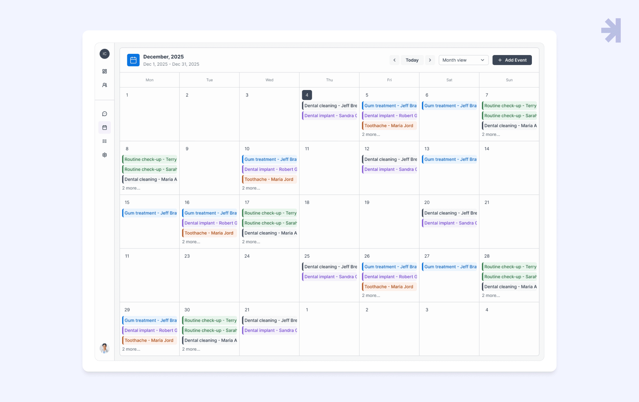
Appointment module
Designed for high-density healthcare settings, balancing clinician availability with patient demand while keeping scheduling clear and efficient.
These templates let UX designers quickly build consistent, scalable healthcare UI components without reinventing core workflows.
Key takeaways
- Healthcare needs domain-specific UI components: General-purpose design systems aren’t enough. Healthcare products face high data density, strict accessibility standards, and legal requirements like HIPAA, requiring specialized UI patterns.
- Accessibility is a foundation: Integrating accessibility across typography, color, spacing, states, and UI components improves usability for everyone and reduces legal, ethical, and clinical risks.
- Clarity and simplicity matter: Healthcare UX design must prioritize predictability, error prevention, and straightforward interfaces using familiar icons, common patterns, and standardized UI elements.
- Consistency accelerates teams: A shared UI library provides a common language, reduces decision fatigue, speeds delivery, and ensures quality, letting teams focus on innovation instead of rebuilding basics.
The wrap-up
By open-sourcing Magic Health UI, we’re helping the healthcare UX community align on a shared foundation for safer, more efficient digital care. This is more than a UI library. It’s a starting point for consistent, scalable healthcare UI components that improve patient experience.
Magic Health UI is a living system, continuously evolving to meet the unique demands of the healthcare sector. Component-based design enables faster, more cost-effective, and scalable development of healthcare applications. Follow our journey as we share updates, improvements, and lessons learned in building better healthcare UX solutions.
Explore Magic Health UI
Dive into the full library, explore reusable UI components, and see how Magic Health UI helps teams design and build accessible healthcare applications faster.
Looking for a partner in healthcare UX/UI?
Need support building healthcare applications with user-friendly UI components? MagicFlux helps UX designers and healthcare professionals create accessible, consistent, and scalable healthcare UI libraries. Reach out to explore how we can help streamline your healthcare UX design projects.

1. What is Magic Health UI?
Magic Health UI is an open-source UI library and Figma UI kit designed specifically for the healthcare sector. It provides reusable UI components and templates that help UX designers and healthcare professionals build accessible, scalable, and consistent healthcare applications.
2. Who can use this UI library?
Magic Health UI is for healthcare UX designers, UX professionals, and healthcare companies or startups building patient portals, telehealth services, or other healthcare apps. It’s suitable for anyone designing healthcare software that needs to comply with accessibility and HIPAA requirements.
3. How does Magic Health UI improve healthcare UX design?
By providing pre-designed UI components, typography, color systems, spacing, and templates, the library ensures consistency, reduces design errors, and speeds up development. This allows teams to focus on patient engagement, user-centered design, and improving patient outcomes rather than reinventing basic UI elements.
4. Are the components HIPAA compliant?
While the library includes built-in data masking patterns and security-conscious UI components, HIPAA compliance depends on the backend architecture and overall system design. Magic Health UI helps prevent human error, which is a leading cause of healthcare data breaches.
5. Can I use Magic Health UI with Figma?
Yes! Magic Health UI comes as a Figma UI kit, enabling UX designers to drag-and-drop UI components, customize variants, and create prototypes for healthcare applications quickly.
6. Does the library support accessibility standards?
Absolutely. Every component is designed with accessibility principles in mind, following WCAG 2.2 standards. This ensures a user-friendly interface for all users, including those with disabilities, and reduces legal and clinical risks.
7. Can this library handle complex healthcare data?
Yes. Components are designed for high-density medical data, including patient records, medical devices data, and electronic health records. The library also supports dynamic layouts to adapt to varying screen sizes and content lengths.
8. Is Magic Health UI suitable for multiple healthcare applications?
Yes. The library is flexible enough to support telehealth platforms, patient portals, appointment modules, and centralized patient health records, making it reusable across different healthcare systems and projects.
9. Why should my team adopt a component-based approach in healthcare UX?
Component-based design ensures consistency, scalability, and efficiency. Teams can reuse UI components across projects, reduce development time, and maintain a high-quality user experience that supports patient safety and better clinical decision-making.
