A healthcare-first UI library for accessible, safe, and scalable medical products.
Magic Health UI helps product teams design and build digital health interfaces faster — without compromising accessibility, clarity, or patient safety.

Built
for real clinical workflows.
Designed
to reduce errors.
Ready
to scale.
Magic Health UI is an open UI component library created specifically for healthcare products. It provides a structured set of reusable components, design tokens, and patterns tailored to medical use cases from EHR dashboards and patient portals to telehealth and scheduling tools. Instead of adapting generic UI kits, teams can rely on components designed for:
The result is a shared UI foundation that helps teams move faster and make better design decisions.
Healthcare teams work under pressure. Interfaces must be clear, predictable, and reliable.

Teams using UI libraries report faster delivery thanks to reusable components and shared patterns. Less time rebuilding basics. More time solving real problems.
Standardized UI systems improve designer and developer productivity, reducing decision fatigue and repetitive work.
Consistent interfaces improve task completion and reduce user mistakes. It is a critical factor in clinical environments where errors carry real risk.
By reducing rework and maintenance, UI libraries can lower UI‑related development costs over time. Magic Health UI focuses these gains where they matter most – in regulated, data‑heavy healthcare products.
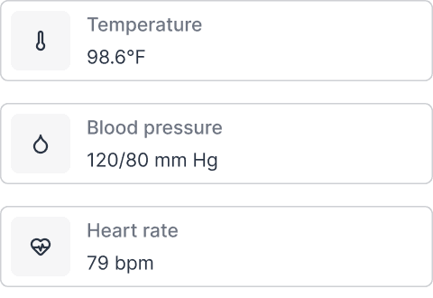
Every component is built with clinical context in mind. Data density, clarity, and speed of understanding come first.
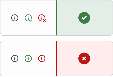
Accessibility is not a feature. It’s a baseline. Magic Health UI follows WCAG‑aligned practices across typography, color, spacing, focus states, and interactions helping teams meet legal requirements and serve all users.
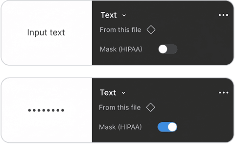
Healthcare interfaces must prevent accidental actions and data exposure. The library includes UI patterns that support safer handling of sensitive information and reduce the risk of human error.
Magic Health UI is structured to scale with your product and your team. Each component is designed to be flexible, reusable, and easy to maintain.

To help teams move even faster, Magic Health UI includes practical templates based on common healthcare workflows.
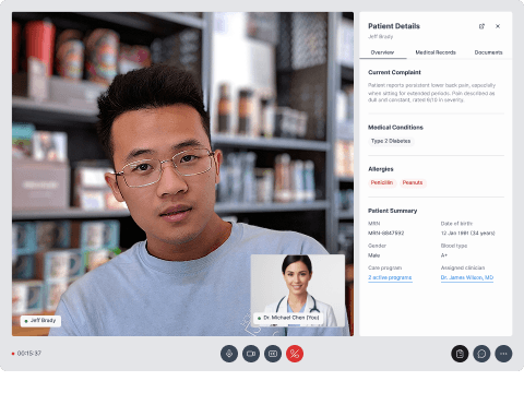
Designed for live consultations, keeping patient context visible without overwhelming the screen.
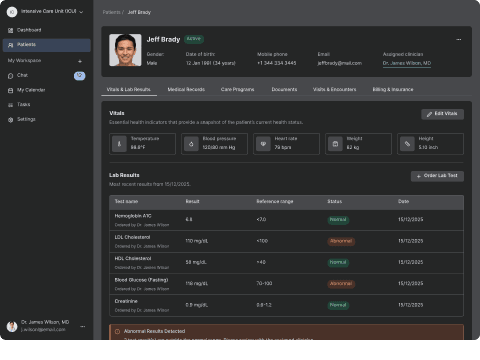
A structured layout for vitals, medications, lab results, and notes optimized for quick clinical review.
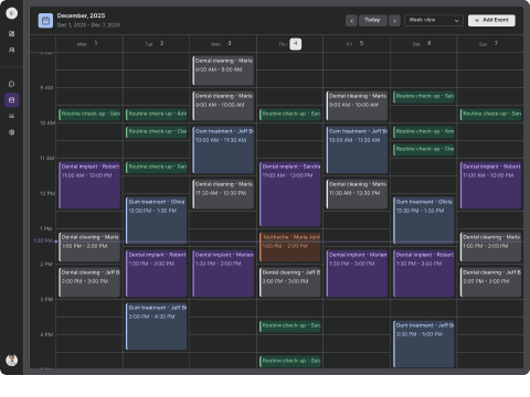
Supports high‑volume scheduling while balancing provider availability and patient needs. These templates combine multiple components into ready‑to‑use flows that speed up prototyping and delivery.
General‑purpose UI libraries are flexible, but healthcare brings extra constraints. Magic Health UI doesn’t replace engineering or compliance work. It supports teams with better UI decisions from day one.
It’s especially useful for EHR systems, telemedicine platforms, patient portals, and clinical dashboards.

Sviat has a medical degree and has studied accessibility and rehabilitation science. He has worked on 20+ projects, focusing on improving UX design and accessibility. Sviatoslav is a lecturer at top Ukrainian universities, collaborates with governmental organizations, and hosts the UX time podcast.