


Most healthcare products aren't built as one product. They're built as a patient portal, a clinician dashboard, and an admin panel, often by different teams at different times. Each piece works fine on its own. Together, they don't feel like a single healthcare experience, and for the people using them, that inconsistency isn't just visual. It slows clinicians down when they're reading data under pressure, confuses patients trying to complete a task, and adds friction for every healthcare professional who has to relearn a slightly different interface each time they open a new tool.
That's the case for a shared healthcare design system: not brand polish, but a working system for how information is presented, how errors and system states are communicated, and how confirmation patterns work, consistently, across every role in the product. As healthcare software keeps expanding into more roles, more tools, and more edge cases, the gap between "each screen works" and "the whole product works" only grows. Design systems are how healthcare tech teams close that gap before it becomes a patient safety problem.
Key takeaways
- Inconsistent interfaces between clinician and patient views increase cognitive overload, not just visual mismatch, and that has a direct line to patient safety.
- A shared design system gives healthcare providers a predictable way to read medical data and confirm actions, even when moving between different healthcare applications.
- Human-centered design in healthcare has to account for diverse users, from healthcare professionals working fast under pressure to patients and older adults who need clear interfaces and plain language.
- Without a shared system, every new feature reinvents the same components, which slows down usability testing and makes onboarding new designers and developers harder.
- As healthcare software scales across more roles and tools, a design system is the fastest way to keep the user experience consistent without slowing product growth.
What is a shared design system in a healthcare product?
A shared design system gives every role in a healthcare product, patients, clinicians, and admins, a consistent way to see status, confirm actions, and read data. It's not one visual layer stretched across different screens. It's the shared logic underneath: the same rules for how urgent information gets flagged, how confirmations work, and how a piece of data gets displayed, no matter which part of the product someone is using.
Most healthcare software wasn't designed this way from the start. It tends to grow the way healthcare organizations do: one tool for scheduling, another for clinical documentation, and another for patient communication, each shipped by a different team on a different timeline. That's a reasonable way to build fast. It's a poor way to end up with a coherent product.
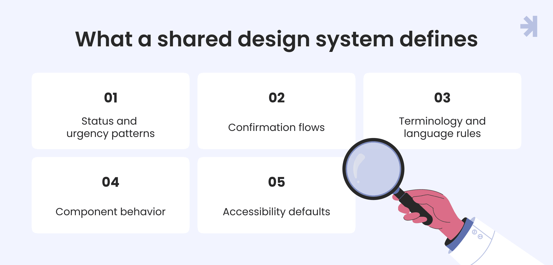
A shared design system typically defines:
- Status and urgency patterns: how critical information is flagged consistently, whether it's a lab result or an appointment reminder.
- Confirmation flows: how users confirm an action, so a clinician and a patient both get the clear and consistent confirmation before an irreversible action.
- Terminology and language rules: when to use clinical medical terminology and when to simplify it for a patient-facing screen.
- Component behavior: how a table, a status badge, or a form behaves the same way across every tool, even if the layout around it looks different.
- Accessibility defaults: built into every component, not layered on at the end.
This is where healthcare UX runs into a problem other industries don't face in quite the same way. In most sectors, inconsistent user interfaces are a usability annoyance. In healthcare, they sit on top of complex systems handling sensitive data, and the people using them are often working under real-time pressure or dealing with something deeply personal.
For UX designers and product teams, this means treating the design system as connective tissue between tools, not a style guide for one app. A component built for a clinician dashboard should follow the same logic as the corresponding component in a patient-facing tool, even if the tone and information density differ. That consistency is what lets healthcare products scale across new features and new roles without user expectations breaking every time someone opens a different part of the product.
As the healthcare industry continues shifting toward more integrated, connected tools, this only becomes more relevant. Digital transformation in healthcare isn't just about adding new digital health solutions. It's about making sure those tools behave predictably enough that doctors and patients can trust what they're looking at.
Why inconsistency in the healthcare sector is a safety issue
Inconsistent UI patterns between roles increase the time it takes a clinician to read and trust what's on screen. That's the real cost, not a mismatched button color. In high-stakes environments, a few extra seconds spent figuring out whether a red label means "urgent" or just "different from the last screen" is a few seconds too many.
Most competitor content frames design consistency as a brand issue: the same fonts, the same colors, and the same look and feel across products. That framing works fine for other sectors. It doesn't hold up in healthcare, where the same inconsistency shows up as a task completion problem for medical professionals trying to do their job under pressure, and as a trust problem for patients trying to understand their own patient data.
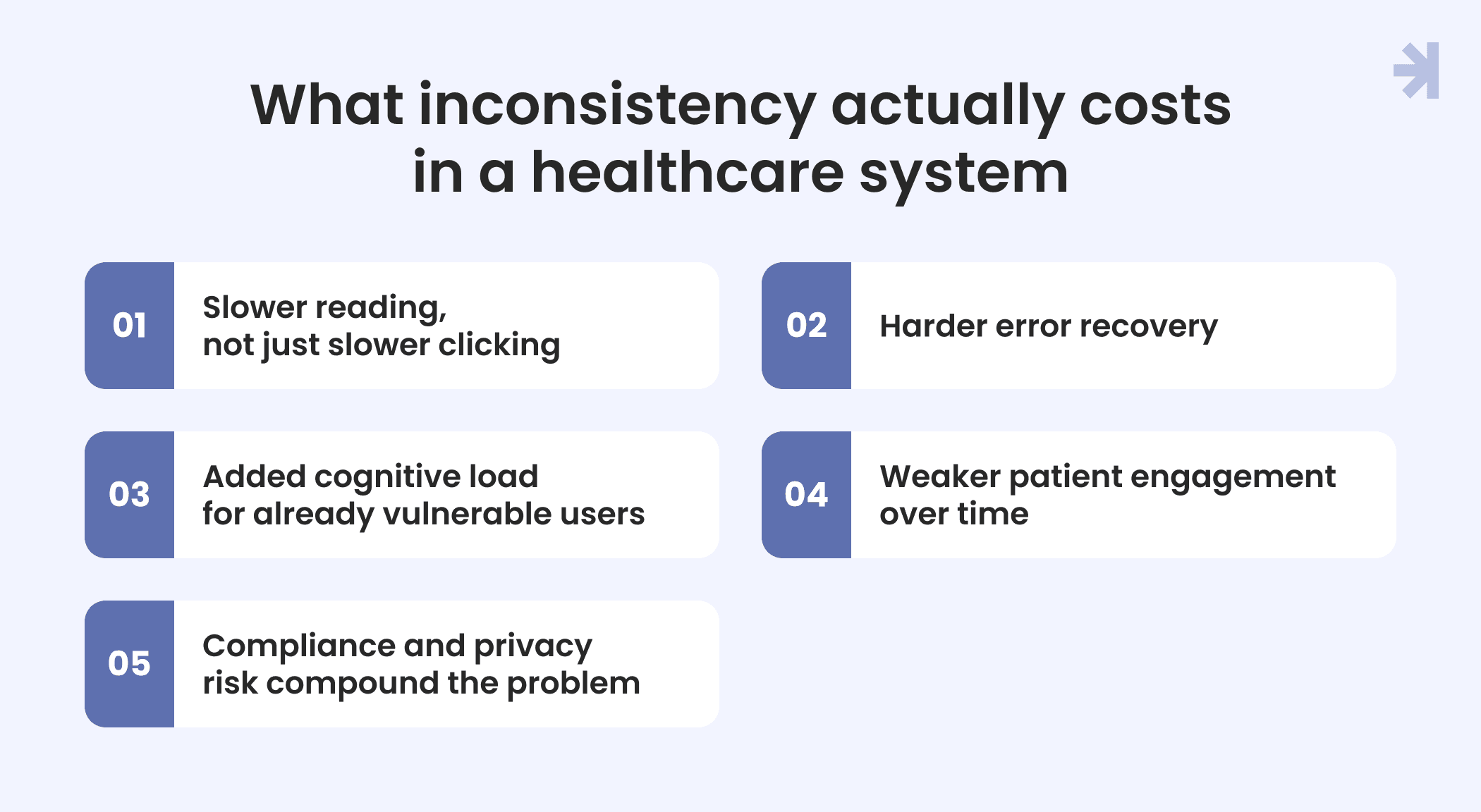
Here's what inconsistency actually costs in a healthcare system:
- Slower reading, not just slower clicking: when a status indicator means one thing in a clinician dashboard and something slightly different in another tool, medical professionals lose the fast pattern recognition good UX design is supposed to give them. They have to stop and verify instead of trusting what they see.
- Harder error recovery: if confirmation flows aren't consistent across healthcare tools, users are more likely to complete an action without fully registering what they confirmed and more likely to struggle to undo it when something goes wrong.
- Added cognitive load for already vulnerable users: patients managing their own patient information are often dealing with unique challenges, stress, unfamiliar medical software, or health conditions that make unfamiliar interfaces harder to parse. Poorly designed, inconsistent screens make that worse.
- Weaker patient engagement over time: when healthcare apps feel unpredictable, users disengage. That directly undermines patient care goals that depend on people actually using the tools they're given.
- Compliance and privacy risk compound the problem: healthcare products already operate under strict regulations, including rules tied to the Health Insurance Portability and Accountability Act. Inconsistent handling of patient privacy cues, like when data is being shared, exported, or viewed, makes it harder for users to make informed choices about their own information.
This is why designing solutions for healthcare can't borrow the generic "consistency equals brand" argument wholesale. The goal isn't just enhancing UX for its own sake. It's giving medical professionals and patients a system they can read quickly and trust, because in this context, that's what improving patient outcomes actually depends on.
What it looks like without a shared healthcare design system
Without a shared system, the symptoms are usually the same, no matter how different the healthcare products are on the surface:
- Duplicated components: three different teams build three different versions of the same status badge, form field, or data table because nobody knew one already existed.
- Inconsistent status indicators: how "urgent," "pending", or "complete" states are represented is defined differently screen by screen, so users can't trust a color or icon to mean the same thing twice.
- Slower QA: testers have to check the same interaction in five different ways because there's no single correct pattern to test against.
- New team members guessing: new designers and developers have no reference for what "correct" looks like, so they either copy whatever's closest or invent something new, adding to the pile.
Each of these looks small on its own. Together, they slow down every part of building digital products, from initial UX research through to shipping.
A few places this shows up in practice:
- Form design drifts across tools. One product validates a field on blur, another on submit, and another not at all. Users hit the same task in a slightly different way every time, and nobody notices until support tickets pile up.
- Data visualization for medical diagnostics ends up inconsistent between products, so a chart or trend line that means one thing in a clinician tool doesn't read the same way in a patient-facing app.
- Screen reader support gets implemented ad hoc, if at all, because there's no shared baseline for accessibility. This particularly hurts users with specific challenges navigating unfamiliar interfaces.
- Emerging trends like augmented reality or virtual reality overlays for medical devices get bolted onto existing products without any real interaction design continuity, because there was never a system to extend in the first place.
None of this is really about missing components. It's about missing rules. Healthcare continues to grow more complex, with more roles, more tools, and more data collection points, and every team building without a shared reference makes that complexity harder to manage, not easier. The result is products that don't keep users engaged, because real users notice when a product doesn't behave the way it did five minutes ago on a different screen. The fix isn't a bigger design team. It's fewer undocumented decisions and a system that gets UX improvements compounding instead of resetting with every new feature.
What designing solutions for healthcare UX actually requires
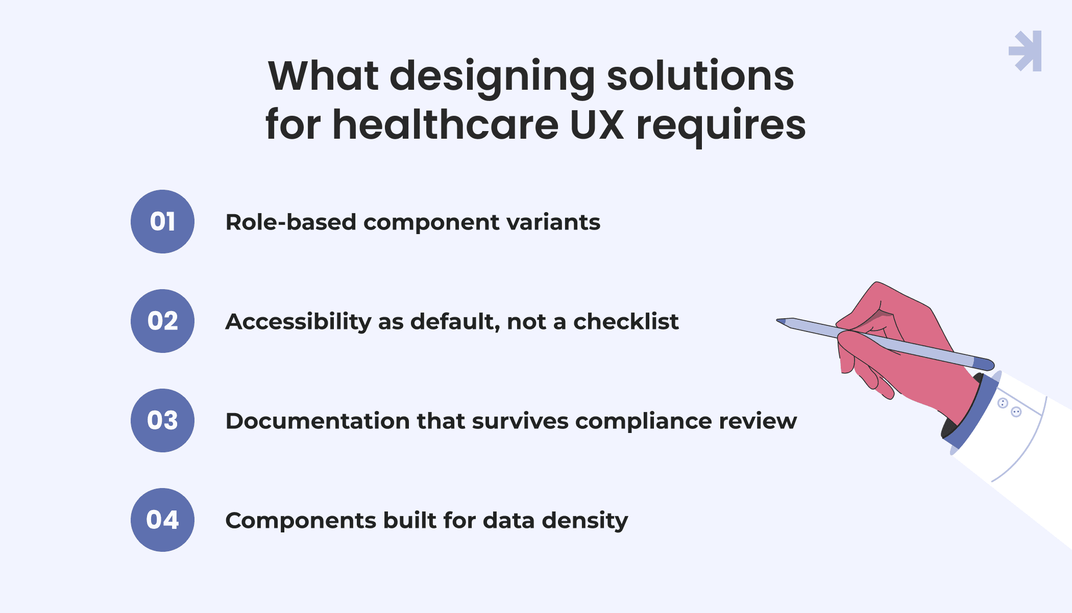
A healthcare design system needs four things a generic one can skip: role-based component variants, accessibility as the default, documentation that survives compliance review, and components built for data density. Everything else is a bonus.
Role-based component variants
Patients and healthcare providers don't just see different screens. They need different versions of the same components. A status indicator that's clear and fast for a clinician reading dozens of records a day can be confusing for a patient checking their own result once. Good healthcare UX design accounts for this by building variants, not separate systems: the same underlying logic, adjusted for who's reading it. This is one of the biggest differences between a generic design system and one meant for healthcare applications, where user interfaces have to flex for very different levels of familiarity and urgency.
Accessibility as default, not a checklist
In most industries, accessibility gets added late. In healthcare apps, that's a real risk. Patients using medical software skew toward older, more diverse, and more vulnerable users than the average consumer product, and healthcare providers themselves are working under time pressure where a poorly contrasted screen or an unlabeled form field slows down patient care. Building accessibility into every component from the start, rather than patching it in later, is what separates a system built for healthcare from one adapted for it.
Documentation that survives compliance review
Generic design systems document how a component looks and behaves. A design system also has to document why a confirmation step exists before sharing patient information, why certain patient data fields have specific display rules, and why a strict rule around consent or disclosure is enforced a particular way in the interface. That documentation isn't just for designers and UX designers. It's what lets the healthcare industry review a product's UX decisions against real regulatory and privacy expectations and lets new team members understand the reasoning instead of just copying the pattern.
Components built for data density
Most digital products are designed to look clean by hiding complexity. Healthcare products often can't. Clinicians and healthcare providers frequently need to see a lot of patient data at once, labs, vitals, history, and medications, without extra clicks that slow down decisions. That means design systems need components purpose-built for dense information: tables, data visualization patterns, and layouts that stay legible under real user expectations for speed, not just aesthetics. A generic system optimized for marketing pages or simple SaaS dashboards usually breaks down here.
Put together, these four things are why "just use an existing design system" rarely works for healthcare. Patients and users interacting with healthcare products aren't a single audience with uniform needs, and the system underneath has to reflect that, not paper over it with one-size-fits-all components.
How to start without a dedicated team
You don't need a dedicated design systems team to start one. You need to stop rebuilding the same component from scratch every time and start with the parts of your healthcare applications causing the most repeated work.
- Start with the component causing the most rework. Look at where your UX designers and engineers keep rebuilding the same thing, a status indicator, a data table, a confirmation flow. That's your starting point, not a full inventory of every screen. Most teams trying to build a design system from scratch stall out because they try to cover everything at once instead of fixing the one pattern actually slowing healthcare UX work down.
- Document the decision behind it, not just the component itself. A button style is easy to copy. The reasoning behind it isn't unless someone writes it down. Note why a pattern works the way it does: why a particular data visualization was chosen for dense patient information, why a confirmation step exists before an action, and why usability testing led to a specific interaction. That context is what makes the component reusable instead of just replicable.
- Loop in engineering before the pattern is finalized. A component that looks right in a design file and breaks in code isn't a system. It's a mockup. Bringing engineers in early, before UX design work is locked, means the pattern actually holds up across your healthcare applications instead of getting reinterpreted differently by every team that builds it.
- Expand only when a second team needs the same component. Don't build for particular needs you're guessing at. Build for the moment a second team hits the same wall the first one did. That's your signal the pattern is real, not a one-off. This keeps the system growing based on actual reuse instead of speculative coverage.
This approach works because it treats a design system as something that grows out of real friction, not a project you schedule and staff separately. Teams without dedicated design systems capacity can still make meaningful UX improvements this way, one documented, engineering-validated component at a time, without slowing down whatever else is on the roadmap.
It also keeps users at the center of the process rather than the system itself. The goal was never the component library. It's making healthcare software behave consistently for the people relying on it, patients checking their own information, clinicians reading data fast, and everyone in between.
A few places this approach doesn't stretch to: if your product involves genuinely different interaction models, like augmented reality overlays for medical devices, for instance, that's less about design system discipline and more about interaction design research from the ground up. Worth knowing where the checklist stops applying.
Conclusion
A shared design system isn't the differentiator on its own, consistency is. When healthcare UX follows the same logic across every role, users spend less time figuring out an interface and more time doing what they came to do, whether that's reading a result or documenting a visit.
Good UX design in healthcare isn't built once and left alone. It holds up because it's grounded in real UX research and ongoing data collection about how people actually use the product, not assumptions made at launch. That's true whether you're designing for medical devices, clinical software, or patient-facing tools.
Get the user experience right, and patient engagement follows. Get it wrong, and no amount of new features will fix what users don't trust.
Where to go from here
If your product has grown past the point where one team can keep every screen consistent, that's usually a design system problem, not a hiring problem. We help healthcare product teams build the shared patterns that hold up across roles, without slowing down what's already on the roadmap.
See how we approach design systems
Not sure where the inconsistency is actually coming from? A UX audit can show you which patterns are causing the most rework before you invest in fixing them.

What is a design system in a healthcare product?
A design system is a shared set of components, patterns, and rules for how a product looks and behaves, consistently applied across every part of it. In a healthcare product, that means the same logic for status indicators, confirmations, and data display across patient, clinician, and admin views, not just a shared visual style.
Why do different user roles need different component behavior, not just different screens?
Because patients and clinicians read information differently. A clinician needs to scan dense data fast and trust it instantly. A patient needs plain language and a slower, clearer path to the same information. A healthcare design system accounts for this with role-based variants of the same underlying component, rather than one-size-fits-all UI.
Can a small team build a design system without a dedicated design ops function?
Yes. Start with the single component causing the most repeated work, document the reasoning behind it, involve engineering early, and expand only when a second team needs the same pattern. This builds a working system gradually, without needing to staff it as a separate project.
Does a design system help with compliance?
It can support it, but it doesn't guarantee it. A well-documented design system makes it easier to show how and why interface decisions were made, which helps during compliance review. Compliance itself depends on the full product, including security, data handling, and organizational processes, not the interface alone.