


Clinical decision support platforms exist to help healthcare providers make faster, safer decisions. In practice, many do the opposite. A clinician staring at a screen full of alerts, most of them low-value, starts clicking through without reading. Not out of carelessness. Because the system trained them to.
This is the paradox at the center of clinical decision support UX: the technology keeps getting smarter (more data points, more machine learning, and more artificial intelligence layered into the workflow) while clinician trust keeps eroding. Poorly structured interfaces bury critical information like vital signs, lab results, and current vitals under alerts that fire at the wrong moment or explain nothing about how they arrived at a recommendation.
Good healthcare UX cannot fix this by making the AI more accurate. Precision medicine and predictive models only help patient outcomes if clinicians actually act on what the system tells them. That means the real design problem sits somewhere else: in alert timing, in visual hierarchy, in how much of the reasoning behind a recommendation is visible before a healthcare professional is asked to trust it.
This article looks at what separates a clinical decision support system clinicians rely on from one they learn to ignore and what UX designers can actually do about it.
Key takeaways
- Alert fatigue is not a training problem. It is a predictable result of poorly designed clinical decision-making workflows, and it directly affects patient safety.
- Clinicians do not need to understand the machine learning behind a recommendation. They need enough visible reasoning to judge whether to trust it in the moment.
- Override is not a failure state. Treating overrides as data instead of noise is part of what makes a system trustworthy over time.
- Good clinical decision support UX depends on timing as much as content: the same alert can build trust or destroy it depending on when it appears in the clinician's workflow.
- Human-centered design in healthcare technology means designing for the healthcare journey a provider is already in, not adding another screen to check.
Why clinicians stop trusting decision support
Electronic health records were supposed to make critical information easier to find. In practice, most healthcare providers experience the opposite: data entry that takes longer than the visit itself, and alerts stacked on top of alerts inside EHR systems that were never designed with information architecture in mind.
This is where alert fatigue starts. Not because clinicians lack judgment, but because the system asks them to sort signal from noise dozens of times a day, with no reliable way to do it. A few patterns show up again and again in the research:
- Every alert treated as equally urgent, so none of them register as urgent
- Alerts firing on data the clinician already reviewed elsewhere
- Recommendations with no visible reasoning, just a flag and a dismiss button
- Health records so dense that a genuinely critical flag looks identical to a routine one
Over time, this produces something researchers call "checkbox medicine". A clinician clears an alert to make it go away, not because they evaluated it and decided it was safe to dismiss. The action looks the same from the outside. The trust behind it is gone.
This matters because clinical decision support platforms play a crucial role in healthcare today, precisely at the moments when a fast, correct decision matters most. A gold standard system doesn't just surface data, it surfaces the right data at the right moment in a form a healthcare professional can act on without decoding it first. When that fails, the cost isn't an abstract UX metric. It shows up as slower decisions, missed flags, and lower confidence in the tools meant to support real patients.
The uncomfortable finding across the research is that this is rarely a content relevance problem. The AI is often technically accurate. The problem is that accuracy alone was never going to be enough to earn trust.
The trust problem is a workflow problem, not a training problem
It's tempting to treat this as an education gap: train healthcare providers to understand the AI better, and trust will follow. The research doesn't support that. Clinicians aren't confused about what artificial intelligence is. They're reacting, correctly, to poorly structured interfaces that ask for trust without earning it.
The real question isn't "Does the clinician understand this recommendation?" It's "Does this recommendation arrive at the right moment in an already busy workflow?" Timing alone determines how an alert lands:
- Too early: interrupts a decision the clinician hasn't gotten to yet, gets dismissed as noise
- Too late: arrives after the decision is already made, gets dismissed as irrelevant
- Too often: trains healthcare professionals to stop looking closely at any of it
- Right on time: becomes part of the decision instead of a disruption to it
This is where a lot of clinical decision support platforms fail before the AI even enters the picture. Medical devices and other systems in a hospital environment already generate a constant stream of patient data and medical data: test results, vitals, flags from other systems, all competing for the same narrow window of clinician attention. Leverage data poorly, and you've added another source of noise. Leverage it well, and the same data becomes an actionable insight delivered once, at the moment it matters.
Emerging technologies in healthcare delivery, including AI-powered diagnostics, tend to get evaluated on accuracy alone. But accuracy was never the trust bottleneck. A good example of this gap: a diagnostic model can meet every specific criterion for clinical validity and still get ignored in practice because the interface presenting it doesn't respect how healthcare professionals actually make decisions under time pressure.
This reframing matters for anyone building healthcare products in this space:
- Operational costs go up, not down, when clinicians route around a system instead of using it
- The gold standard isn't the most technically sophisticated model, it's the one that fits into patient care as it already happens
- Human-centered design means designing for the workflow a provider is already in, not adding a screen they have to check on top of it
What explainability actually needs to look like in the interface
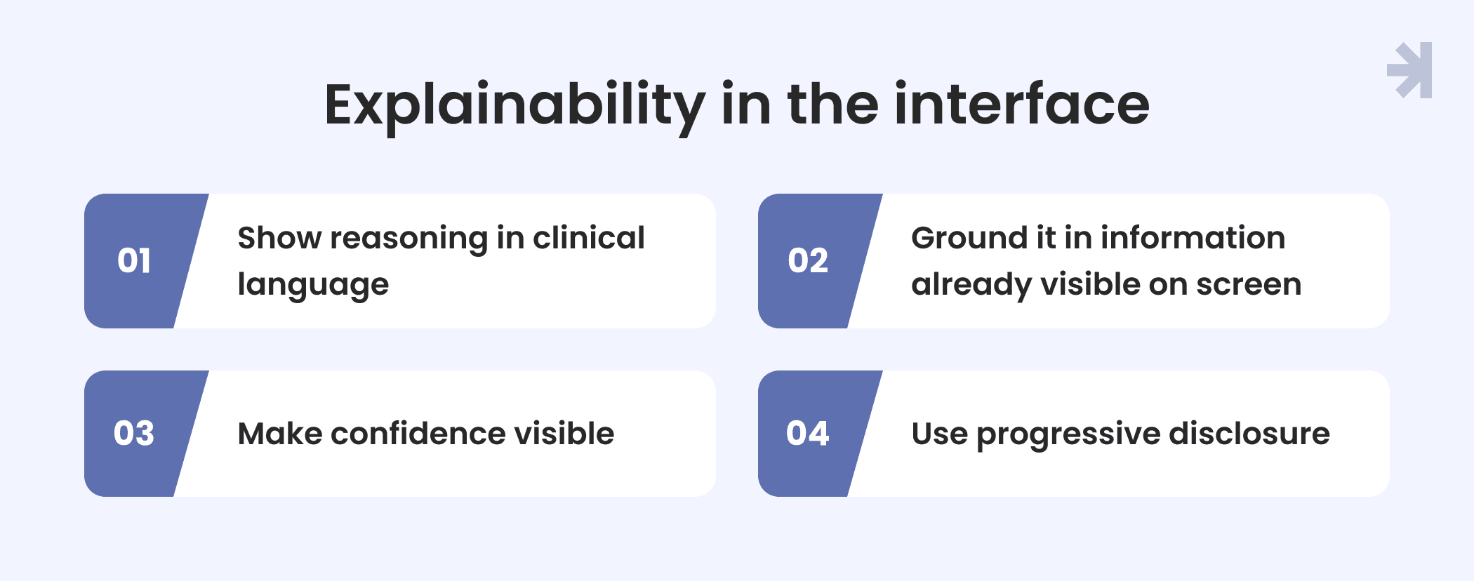
"Explainability" gets treated like a checkbox: add a panel that shows the model's reasoning, and the trust problem is solved. In practice, most healthcare providers don't want to see model internals. They want enough visible logic to judge, in seconds, whether a recommendation fits what they already know about the individual patient in front of them.
This is a real paradigm shift from how a lot of digital products in the healthcare sector have approached AI output so far: present a confident-looking answer and let the user decide whether to trust it blindly. A few principles separate interfaces that build trust from ones that just add noise.
1. Show reasoning in clinical language, not model language
"Elevated risk based on recent lab trend and medication history" lands. A raw confidence score or feature-weight breakdown doesn't.
2. Ground it in patient information already visible on screen
An explanation that references data the clinician can immediately cross-check against the chart is far more useful than one that references an internal score they have no way to verify.
3. Make confidence visible, not implied
A recommendation presented with false certainty gets trusted right up until it's wrong once. A recommendation that shows its own uncertainty gets calibrated trust instead.
4. Use progressive disclosure
Lead with the recommendation and the one-line reason. Let the clinician drill into more detail only if they want it, rather than forcing everyone through the same depth of explanation every time.
New technologies in this space, including AI-powered diagnostics, are graded almost entirely on accuracy in health systems evaluations. But an accurate recommendation with no visible reasoning asks for the same blind trust as an inaccurate one. From the clinician's seat, both look identical until something goes wrong.
The healthcare industry's own research backs this up: explainability isn't primarily a technical feature, it's a UX design concern. The same underlying model can be trusted or ignored depending entirely on how its reasoning is surfaced.
Designing for override, not just compliance
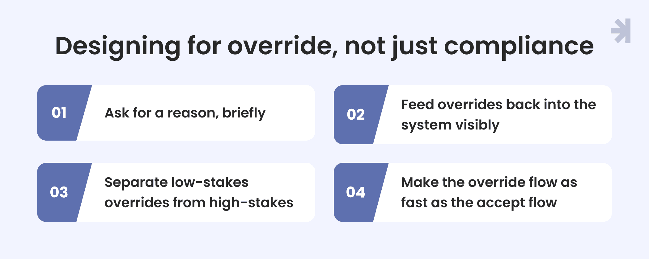
Override gets treated as a failure state in a lot of clinical decision support platforms: something to minimize, a number to drive toward zero. That's the wrong target. A healthcare provider dismissing a recommendation isn't necessarily a design failure. Sometimes it's the correct clinical call. The design failure is when the system can't tell the difference between the two.
Right now, most systems treat every override identically: a click, a dismissal, no record of why. That single design choice throws away the most valuable data the system could be collecting. A few things change when override is designed as part of the workflow instead of an edge case.
1. Ask for a reason, briefly
A short, structured list of override reasons, not a free-text box, gives the system a usable signal without adding friction to an already time-pressured decision.
2. Feed overrides back into the system visibly
When a clinician sees that their correction actually changed something, even in aggregate, the system stops feeling like a black box issuing verdicts and starts feeling like a tool that learns from the people using it.
3. Separate low-stakes overrides from high-stakes ones
Not every dismissed alert carries the same risk. A system that treats a routine override the same as one on a high-risk recommendation is back to the same problem as undifferentiated alerts: everything looks equally important, so nothing does.
4. Make the override flow as fast as the accept flow
If dismissing a bad recommendation takes more clicks than accepting a good one, healthcare providers learn to stop reading closely before deciding either way.
This is the shift that actually rebuilds trust over time. Not fewer alerts, and not more accurate ones. A system where the clinician's judgment visibly shapes what the tool does next, instead of a one-way stream of recommendations they can only accept or ignore.
Designing for trust: A practical way to think about it
There's a pattern worth naming from working on healthcare products with multiple user roles and heavy data density: the teams that get clinical decision support UX right almost never start by asking "How do we make this more accurate?" They start by asking, "What does this interface assume the clinician already knows, and what is it asking them to take on faith?"
That question tends to surface the real problems faster than a usability audit does. An alert that "should" work on paper often fails one of these checks:
- Does it assume knowledge the clinician doesn't have on screen? If the reasoning references a trend in blood pressure, a lab value, or an insulin dose that isn't visible without navigating away, the clinician has to choose between trusting it blind or losing time chasing it down. Both outcomes erode confidence.
- Does it ask for a decision, or just deliver a verdict? Recommendations framed as one-way statements read as commands. The ones framed with visible reasoning and an easy path to disagree read as input to a care plan the clinician is still shaping, not a decision already made for them.
- Would a clinician be able to explain this recommendation to a colleague in one sentence, in plain medical terminology? If the answer is no, the interface hasn't actually made the reasoning legible, no matter how much explainability language is in the UI copy.
None of this requires a more advanced model. Most digital health solutions on the market today already have the data. It requires treating the interface as the place where trust is actually built or lost, not as a delivery mechanism for whatever the model outputs. That's the shift that separates decision support tools clinicians route around from ones they actually rely on.
A practical framework for evaluating your own CDS UX
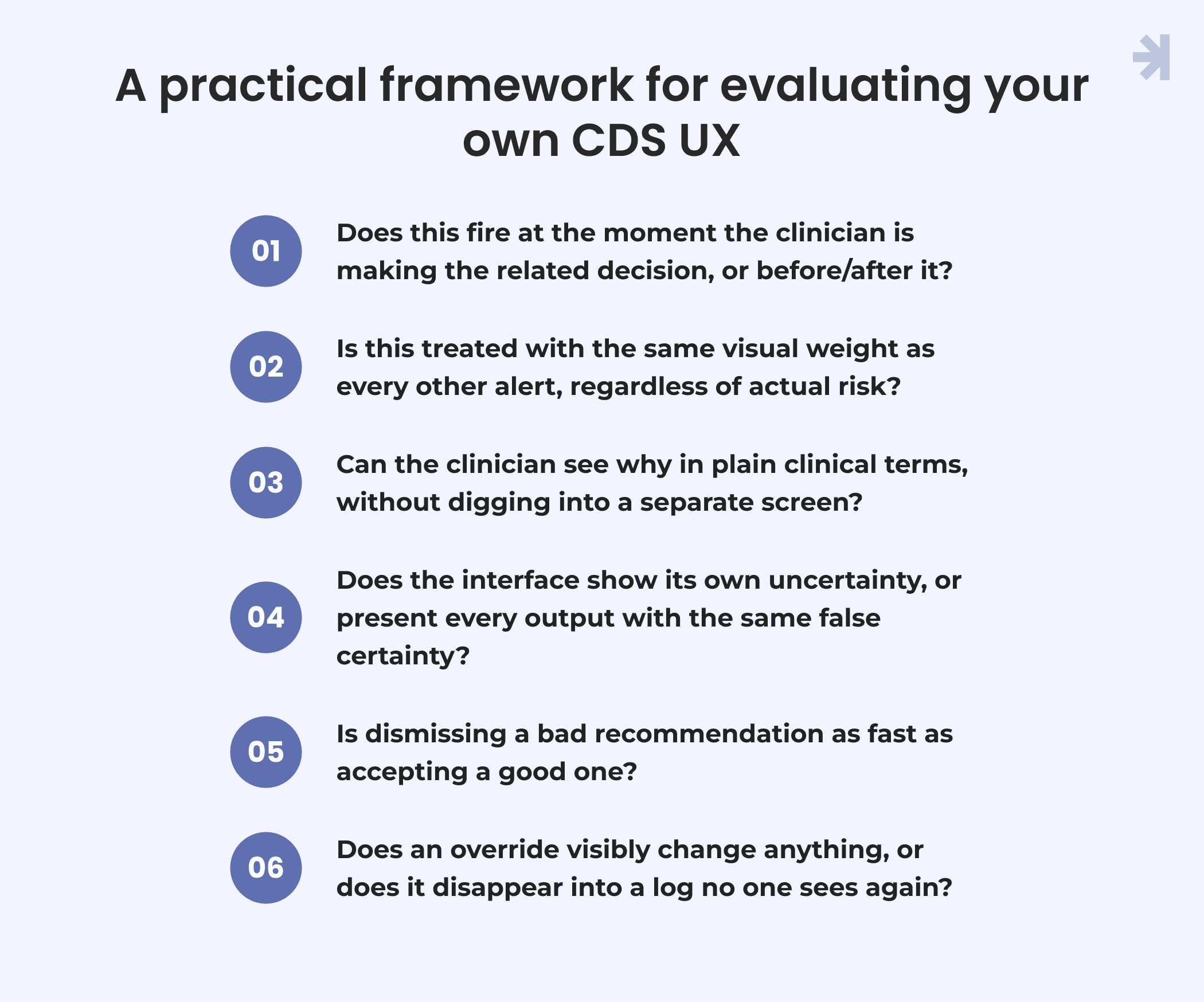
If you're building or auditing a clinical decision support platform, these questions cut through most of the noise faster than a full usability audit. Run any alert or recommendation, whether it touches a care plan, a medication dose, or a vitals trend like blood pressure, through them:
- Timing: Does this fire at the moment the clinician is making the related decision, or before/after it?
- Signal vs. noise: Is this treated with the same visual weight as every other alert, regardless of actual risk?
- Reasoning: Can the clinician see why in plain clinical terms, without digging into a separate screen?
- Confidence: Does the interface show its own uncertainty, or present every output with the same false certainty?
- Override friction: Is dismissing a bad recommendation as fast as accepting a good one?
- Feedback loop: Does an override visibly change anything, or does it disappear into a log no one sees again?
A system that fails several of these isn't a bad model wearing a good interface. It's usually a good model wearing an interface that never earned the trust it's asking for.
Conclusion
Clinical decision support doesn't fail because the underlying AI is wrong. It fails because the interface asks clinicians to trust it before it's earned that trust: alerts that arrive at the wrong moment, recommendations with no visible reasoning, and overrides that vanish into a log no one reads. None of that is a training problem. It's a design problem, and it's one UX can actually fix.
The path forward isn't a more accurate model or a longer disclaimer. It's an interface that respects clinical judgment: the right alert at the right moment, reasoning shown in plain medical terminology a clinician can act on, and an override path that feeds back into the system instead of disappearing. Whether the recommendation touches a care plan, a medication dose, or a vitals trend like blood pressure, the same principle holds: trust is built in the interface, not assumed from the model behind it.
As digital health solutions take on more of the day-to-day decision-making inside clinical workflows, this is the part of the healthcare industry most likely to get overlooked, not because it's technically hard, but because it's easy to mistake for a solved problem once the model works. It isn't solved until the clinician using it actually trusts what they're looking at.
Better healthcare UX for clinical decision support platforms starts with an audit
If healthcare providers on your team are dismissing artificial intelligence recommendations without reading them, that's rarely a training gap. It's usually a sign the interface is asking for trust it hasn't earned yet, and that gap has real consequences for patient safety and patient outcomes.
A UX audit can show you exactly where that trust breaks down in your healthcare products and what to fix first.

What is clinical decision support (CDS)?
Clinical decision support is technology built into clinical workflows, often inside an EHR or a standalone platform, that surfaces alerts, recommendations, or relevant data to help healthcare providers make faster, more informed decisions at the point of care.
Why do clinicians ignore CDS alerts?
Not because they don't care. It's usually because the alerts arrive at the wrong moment, carry no visible reasoning, or get treated with the same urgency as routine notifications. Once clinicians learn that most alerts aren't worth stopping for, they start dismissing all of them, including the ones that matter.
What is alert fatigue in healthcare?
Alert fatigue happens when clinicians are exposed to so many alerts, many low-value or poorly timed, that they start dismissing them automatically rather than evaluating each one. It's a well-documented pattern in clinical decision support research and a direct risk to patient safety, since real dismissal without evaluation can mean a genuinely important flag gets missed.
How can UX design reduce alert fatigue?
By prioritizing alerts based on actual clinical risk instead of treating them all equally, timing them to match the moment a decision is actually being made, and making the reasoning behind a recommendation visible instead of asking for blind trust. Reducing the number of alerts helps, but timing and relevance matter more than volume alone.
What makes an AI recommendation explainable to a clinician?
Reasoning shown in clinical language rather than model terms, a visible sense of how confident the system actually is, and the ability to check that reasoning against data already in front of the clinician. Explainability that requires digging into a separate screen or interpreting a raw confidence score rarely gets used in practice.
How to design a clinical decision support system?
Start with the clinician's existing workflow rather than the model's output. Design alert timing around the decision point, make reasoning visible in plain language, treat overrides as signal rather than failures, and separate low-stakes flags from high-stakes ones instead of presenting every alert with the same visual weight.