Case studies

/

Trace Task

Trace Task

A productivity app that helps teams stay on track without the chaos

A mobile-first task management tool designed for real-world teams. With simple checklists, photo-based updates, and AI that verifies work in real time, it cuts down on confusion, saves time, and keeps everyone focused on what matters.

Client Industry:

Productivity

Task Management

Tags:
Mobile app
AI
Design system
B2B SaaS
Web app
Simplifying work with smart UX design

A productivity app redesigned with smart, mobile-first UX to simplify complex workflows and make task management effortless for everyday users.

Users completed daily reports faster, with fewer errors

As the app used simple checklists and photo uploads, workers no longer had to rely on paperwork or complicated steps.

Reporting became faster, driving higher productivity

Clear cues and AI checks reduced manual review, giving managers more time for important work.

About the client & product

Trace Task is an early-stage startup building a mobile-first productivity app for field teams and managers. Their goal was to create a simple, intuitive tool that helps teams keep an eye on tasks without the usual chaos of paper reports, missed updates, or confusing platforms.

About the client & product

Project context

  • B2B SaaS tool for mobile apps and browser access, still in the idea phase when we joined.
  • Most users weren’t tech-savvy but needed a simple way to track, complete, and report tasks.
About the client & product

The core challenge

Manual reporting, verbal updates, and long feedback loops were slowing everyone down. Field workers lacked a clear view of what needed to be done, while managers had no fast way to verify progress. The client wanted to replace all of that with a single platform easily accessible on mobile devices, built to guide users through tasks step by step, and smart enough to use AI to verify completed work automatically.

About the client & product

Our team supported the client with:

  • Secondary research into user needs and existing tools
  • UX strategy and wireframes that simplified complex processes
  • UI design that focused on accessibility, micro interactions, and clarity
  • A reusable design system built on shadcn/ui
  • Prototypes to test and fine-tune features before development
  • Ongoing collaboration with developers to ensure smooth handoff and implementation

The challenge

Trace Task came to us with a clear goal: build an app that helps teams track and complete tasks without the usual confusion and delays. But turning this into a seamless experience wasn’t simple. The biggest challenge was designing for users who weren’t tech-savvy and often worked on mobile devices in fast-paced environments.

They needed an app that was intuitive and easy to navigate, something that didn’t rely on hidden gestures or long instructions but used clear visual cues to guide every step.

Research & Discovery

From the very beginning, our focus was on understanding the real users of Trace Task and their specific needs. Users relied on mobile apps but weren’t always comfortable with complex tools. They needed an app that made it easy to discover and complete tasks without confusion. We learned that users wanted an intuitive experience that gave real-time feedback, helping them stay focused and avoid mistakes. Managers needed quick access to important information to track performance and improve efficiency.

Our design approach centered on:

01

Creating simple screens and clear templates that guide users through each task step-by-step.

02

Using images, icons, and visual cues for better understanding and engagement.

03

Building features that adapt to user preferences and support smooth input on mobile devices.

04

Designing a seamless process across mobile and web apps, so customers could access the app anytime.

Key user personas

Field workers
Field workers

Non-technical users who rely on mobile apps to complete daily tasks efficiently. Visual guidance and clear instructions were essential to help them adapt quickly.

Managers
Managers

Business users who access dashboards on websites to monitor progress in real time, identify issues, and decide on improvements.

UX/UI design process

To create an app that truly works for its users, we focused on a clear, step-by-step design process. Every screen, flow, and interaction was carefully crafted to make complex tasks simple and improve the overall user experience across mobile apps and web platforms.

UX strategy & Flows

We started by mapping out clear, simple navigation and task flows to make sure users could move through the app effortlessly. Many users rely on mobile apps and prefer straightforward interactions, so we designed step-by-step checklists and guided screens that remove guesswork.

Certain flows, like task completion and photo uploads, needed extra simplification because users often struggled with too many options or unclear next steps. We focused on keeping these screens clean and focused on essential features, so users could quickly discover what to do next and complete tasks efficiently.

UI design & Visual language

Our visual design prioritized accessibility and responsiveness across mobile and web platforms. We used a consistent color scheme and clear icons to improve usability and create an engaging experience.

Microinteractions played a big role in giving users real-time feedback, small animations and changes when tasks were marked done or photos uploaded helped users feel confident and in control.

We also created a reusable design system based on shadcn/ui, customizing components for a cohesive brand feel throughout the app.

Design systems & Implementation support

To keep development efficient and consistent, we built a design system with reusable components and templates. We also kept in mind the importance of managing design files and assets efficiently within the design system to streamline workflows and provide easy access for the team. This approach helped designers and developers maintain quality while speeding up feature creation.

Throughout the process, we worked closely with developers via daily stand-ups and shared prototypes. This collaboration provided smooth handoffs and allowed us to adapt the designs based on technical feedback.

Key solutions & highlights

01

Simplified checklists with visual guidance

The problem:

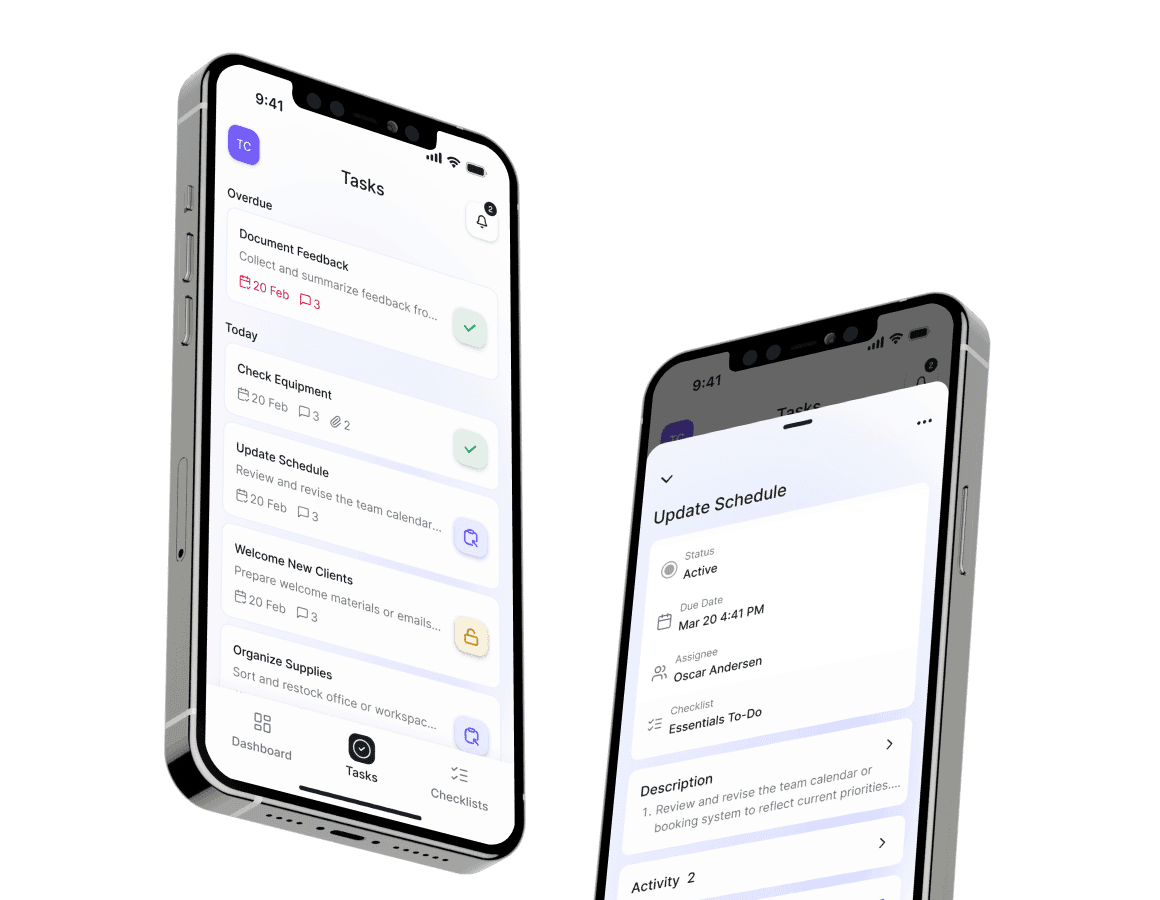
Users found complex task lists overwhelming, slowing down their work, and causing confusion.

Our solution:

We created clean, engaging screens with step-by-step checklists, action icons, and color-coded task states to help users instantly recognize actions without relying solely on text.

Benefit:

Users adapted quickly, reducing errors and saving time on every work session.

reduced errors

and saved time

reduced errors

02

Photo uploads for quick reporting

The problem:

Manual reports were time-consuming and prone to mistakes, creating extra workload for both workers and managers.

Our solution:

We integrated an easy photo upload feature directly into the app, so users could attach images to confirm completed work without extra steps.

Benefit:

This cut down reporting time significantly, increasing overall productivity.

cut down

reporting time

cut down

03

Custom design system

The problem:

Without reusable components, updates and new features were slow to develop and hard to keep consistent.

Our solution:

We built a design system with reusable templates and components that designers and developers can easily adapt.

Benefit:

This improved the app’s quality and sped up improvements, saved the team valuable resources, and provided a seamless experience across screens.

saved

the team resources

saved

Outcomes & Results

Outcomes & Results

Since the app’s launch, Trace Task has made a real difference for its users and the business. More people are actively using the app, finding it easy to use in their daily work.

Outcomes & Results

The onboarding process became smoother, with new users able to get started quickly and confidently without lengthy training. This has led to higher user retention and positive feedback.

Outcomes & Results

Users appreciate how the app’s simple design and helpful features reduce their workload and make reporting faster and less stressful. The photo upload functionality has been a big hit, saving time and reducing errors.

Outcomes & Results

Overall, the app has successfully addressed the core challenges, helping teams work more efficiently and giving the business a strong foundation for growth and improvements.

icon

Lessons & reflections

More case studies

Got an idea? Let’s talk!

Sviatoslav Nytka
Sviatoslav Nytka
Design Lead
linkedin

Sviat has a medical degree and has studied accessibility and rehabilitation science. He has worked on 20+ projects, focusing on improving UX design and accessibility. Sviatoslav is a lecturer at top Ukrainian universities, collaborates with governmental organizations, and hosts the UX time podcast.

We use cookies to personalize content and ads, to provide social media features and to analyze our traffic. Check our privacy policy to learn more about how we process your personal data.