



A patient's health record rarely lives in one place. Lab results sit in one system, medication history in another, wearable data somewhere else entirely, and the primary care physician's notes in a fourth. Health data interoperability is supposed to solve this: get these systems talking to each other so a clinician isn't piecing together a patient's story from five different logins.
But making systems exchange data is only half the problem. The other half is what happens on screen once that data arrives. A clinician looking at a dashboard doesn't need proof that the interoperable systems worked. They need to know which number is current, which source to trust, and what to do when two records disagree. That's a UX problem, not a data exchange problem, and it's the one most healthcare products still get wrong.
This article looks at what health data interoperability actually requires from a product experience, where fragmented systems and data silos break trust for the people using them, and how to design a view that stays usable even when the underlying data isn't clean.
Key takeaways
- Solving interoperability at the data layer doesn't automatically make the resulting information usable. That's a separate, and often harder, design problem.
- Fragmented systems create real usability risks: conflicting values, unclear sources, and missing context that can lead to slower decisions or medical errors.
- Care coordination depends on clinicians trusting what they see. Trust comes from design choices like source labeling and freshness indicators, not just from the data being technically available.
- Different roles need different views of the same underlying data. A missing value means something different to a nurse than it does to an administrator.
- Designing for interoperability means designing for the messy, in-between state where systems are connected but the data still doesn't fully agree with itself.
Data exchange vs. Data usability: What interoperability really requires
Most conversations about health data interoperability happen at the systems level. Standards like Fast Healthcare Interoperability Resources, or the United States Core Data for Interoperability, exist to give electronic health records, medical devices, and health information systems a shared language. When these standards work, a patient's data can move between healthcare organizations without being retyped, re-entered, or lost in a fax machine.
That's real progress. But it solves data exchange, not data usability.
Once electronic health information actually reaches a screen, someone still has to make sense of it. A secure data exchange between two legacy systems can hand a clinician a complete, technically correct patient record that's still confusing to read: three different timestamps, two conflicting medication lists, and no clear signal about which system is the source of truth. The data flowed. The product still failed the person using it.
This is where interoperability becomes a UX problem. Health information exchanges and health information technology give a product access to more data from more sources. What a product does with that access, how it presents it, what it hides, what it flags as uncertain, is a design decision, not a technical one.
A useful way to separate the two:
- Data exchange asks: can this system receive electronic health data from another system?
- Data usability asks: can the user looking at that data trust it, act on it, and understand where it came from?
Healthcare products can score well on the first question and still fail badly on the second. That gap is usually invisible in a systems diagram and very visible the moment a clinician stares at a screen trying to figure out why two systems disagree about a patient's current medications.
The rest of this article stays focused on that second question: what interoperability means for the people actually looking at the data, not the systems moving it.
Where healthcare data interoperability breaks down for users
Health Insurance Portability and Accountability Act rules, along with newer efforts from the National Coordinator's Office and the Trusted Exchange Framework, were built to push healthcare systems toward nationwide interoperability. The intent is straightforward: give healthcare providers, health plans, and healthcare professionals access to relevant data no matter which system originally captured it. In theory, this should improve patient outcomes across the healthcare industry.
In practice, many healthcare organizations are still working with a mix of legacy EHR systems, imaging systems, and other medical systems that were never designed to talk to each other. Even where data sharing technically works, healthcare data interoperability still runs into resource constraints, existing systems that resist change, and organizational interoperability gaps between teams that own different pieces of a patient's own data. That's before anyone looks at what happens on screen. Interoperability problems rarely show up as an error message. They show up as small inconsistencies that force the person using the product to stop and investigate, or worse, to guess.
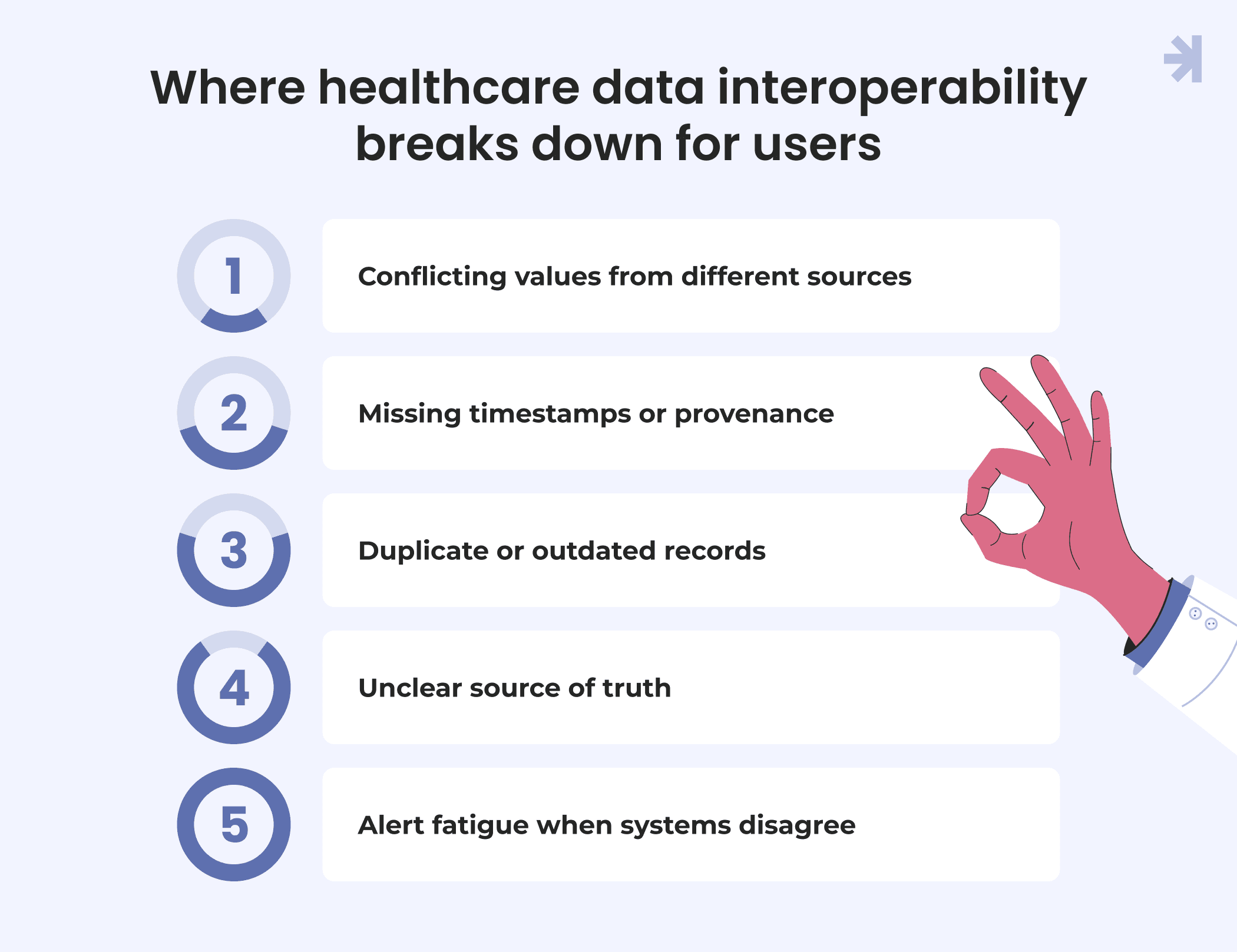
Conflicting values from different sources
When patient data flows in from multiple providers, it's common for the same field to hold different answers depending on where it came from. One system shows a patient's weight from last week. Another shows a value from three months ago, still displayed as current. Without clear labeling, both look equally valid on screen, even though only one reflects reality. This is a data quality problem as much as a design one, but the product is what decides whether the user ever notices.
Missing timestamps or provenance
A lab result without a visible date, or a medication list without a clear indication of which system it came from, forces the clinician to either trust it blindly or dig through multiple systems to confirm it. Neither is a good use of a physician's time during a patient visit, and it chips away at data completeness in a way that's hard to catch after the fact.
Duplicate or outdated records
Disparate systems tend to produce duplicates rather than clean merges. A patient's health record might list the same diagnosis twice, entered by two different providers, with slightly different wording. To a system, these look like two separate data points. To a clinician, it's unclear whether this represents one condition or two.
Unclear source of truth
When multiple systems can all receive data and write to a patient's record, someone has to decide which entry wins when two disagree. If the product doesn't make that decision visible, users make their own judgment call, often the wrong one, based on whichever system happens to be open.
Alert fatigue when systems disagree
Some products respond to data conflicts by flagging everything as an alert. The result is a wall of warnings that healthcare professionals learn to click through without reading, because most turn out to be minor formatting differences rather than genuine safety issues. This is one of the more serious risks tied to interoperability in healthcare: technically accurate clinical and administrative data, presented in a way that trains people to stop paying attention to it, with real patient safety consequences.
None of these problems come from bad intentions or bad engineering. They're what happens when healthcare data moves faster than the design work needed to make sense of it. Artificial intelligence and predictive tools are increasingly layered on top of this same data to support disease management and healthcare operations, which raises the stakes further. A model built on incomplete or conflicting inputs won't quietly correct for it. It will produce a confident answer from bad data, and confident wrong answers are harder to catch than obvious ones.
Health data interoperability creates the opportunity to transform healthcare with a more complete patient record. Whether that opportunity turns into improved patient outcomes and better patient care, or into more places for medical researchers and clinicians alike to lose trust in the data in front of them, depends entirely on the product layer built on top of it.
Designing a unified view when the underlying data isn't unified
This is the part of health data interoperability that rarely gets discussed alongside the technical side, but it's exactly why healthcare interoperability is important to product teams, not just IT departments. Getting provider access and patient access to clinical data solved is only step one. Step two is designing something a person can actually trust once that data shows up on screen, especially when it's still incomplete, delayed, or in conflict with itself.
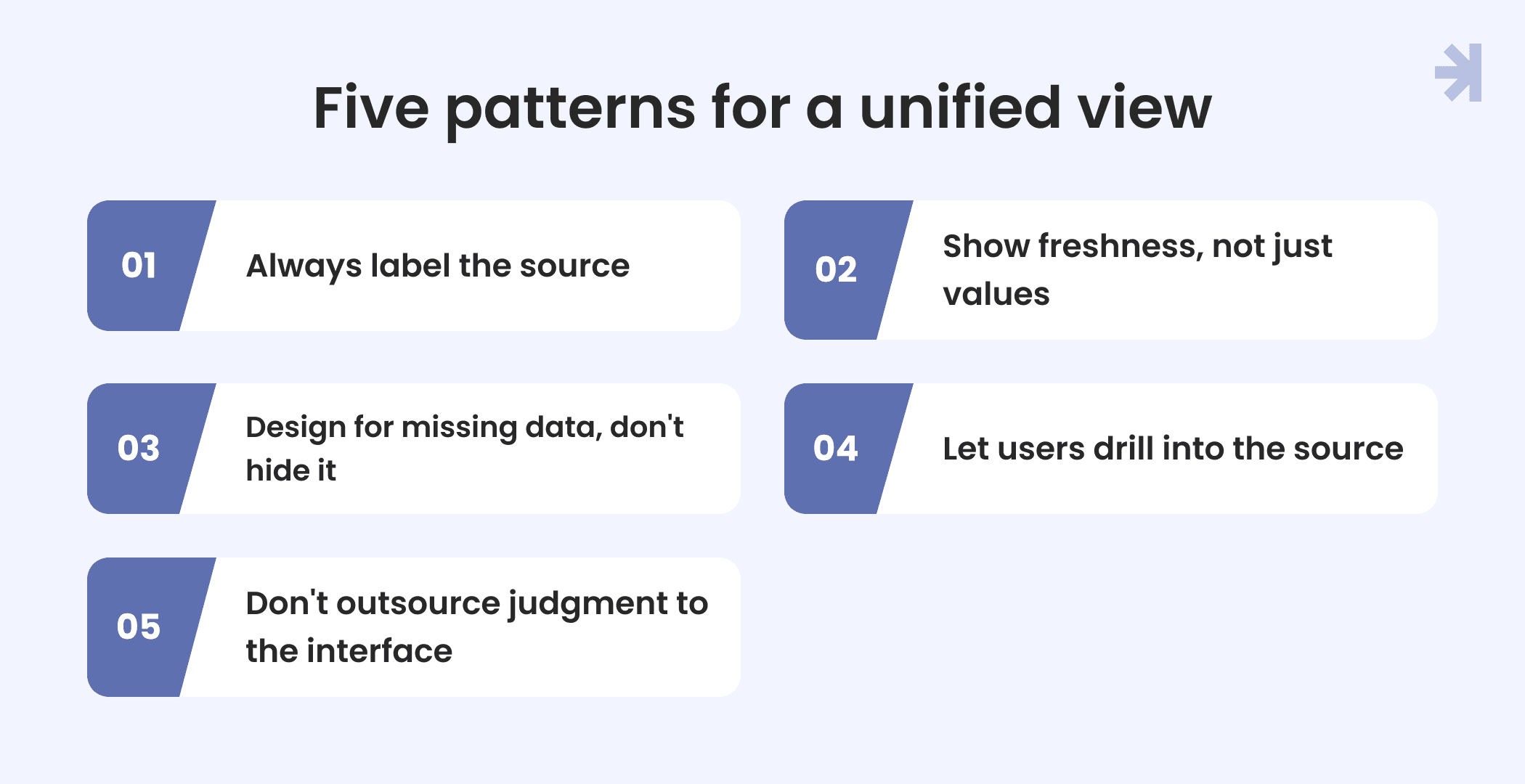
A few patterns hold up well across different health systems and different types of healthcare information, regardless of how many source systems feed into them.
Always label the source
If clinical data on screen came from a specific EHR, imaging system, or lab feed, say so. A small label does more for trust than any amount of backend validation because it lets the person looking at the data judge its reliability themselves instead of having to take the system's word for it.
Show freshness, not just values
A number without a timestamp asks the user to assume it's current. That assumption breaks constantly in interoperable systems, where different feeds update on different schedules. A visible "last updated" marker, even a simple one, turns a silent risk into something the user can account for.
Design for missing data, don't hide it
When a field is empty because a system hasn't sent that data yet or because access to electronic health information requests are still pending, don't quietly leave a blank space or, worse, default to zero. Make the gap visible. A clearly labeled "not yet available" tells the user something true. A blank field lets them assume something false.
Let users drill into a single source when something looks wrong
When two systems disagree, most products either pick one silently or show both without explanation. A better pattern is to let the user open up the underlying detail: which system reported which value and when. This matters most for larger health systems working across multiple health data classes, from medication records to imaging reports to administrative billing data pulled in for things like Medicaid services reporting. Different data classes carry different risk levels, and the product should reflect that instead of treating all fields as equally trustworthy.
Don't outsource judgment to the interface
Some teams try to solve data conflicts by defaulting to "most recent wins" or "primary provider wins" without telling the user that's the logic in play. This can work, but only if it's visible. A clinician who knows the rule can catch it when the rule is wrong for a specific case. A clinician who doesn't know the rule exists has no way to catch anything.
None of these patterns require solving interoperability at the systems level first. They're product decisions that can be made regardless of how mature the underlying data exchange is, and they matter more, not less, when the technical resources needed to fully unify a health system's data are still years away. Waiting for perfect data before designing for trust is not a realistic option for most healthcare organizations. Designing for the mess that's already there is.
The organizations that get this right tend to treat health outcomes and interface design as connected problems, not sequential ones. A cleaner data pipeline helps. A clearer interface on top of it is what actually changes what a clinician does in the moment.
Multi-role complexity
Interoperability problems don't land the same way for everyone using a product. The same missing or conflicting patient data creates a different kind of risk depending on who's looking at it, and healthcare data interoperability efforts often stop at getting data exchange working, without asking how that data needs to change shape for each role.
For doctors and clinical staff
Care coordination depends on physicians trusting what's in front of them during a visit. A doctor pulling up patient data from EHR systems that draw on multiple healthcare organizations needs to know, quickly, whether a medication list or lab result reflects the most current picture. This is the highest-stakes version of the problem: a wrong assumption here affects patient care directly, not just workflow efficiency.
For nurses and care teams
Nurses often work with the same underlying core data as physicians but at a different point in the process, administering medication, coordinating handoffs, and tracking a patient across shifts. For this role, the interoperability question is less "Is this value correct?" and more "Has anything changed since the last person looked?". A product that surfaces recent updates clearly serves this role better than one that just displays the current state.
For administrators
Administrative staff dealing with healthcare data interoperability are usually working with billing, scheduling, or compliance-related data pulled from legacy systems that weren't built with today's data sharing standards, like the United States Core Data for Interoperability Framework, in mind. Here, the risk isn't usually a clinical error. It's inefficiency: duplicate records, mismatched patient identifiers, or manual reconciliation work that a better-designed system should have caught.
For patients
Patients interacting with interoperability in healthcare, often through a portal pulling data from several healthcare systems, don't care about health information technology or which national coordinator initiative made the connection possible. They care about seeing accurate, current information about their own care, and they lose trust quickly when what they see doesn't match what a doctor told them in the room.
The mistake many products make is treating healthcare interoperability as a single problem with a single interface solution. A dashboard designed to satisfy a physician's need for clinical depth will overwhelm a patient. A patient-facing view simplified for clarity will frustrate a nurse who needs more detail during a shift change. Efforts like the Trusted Exchange Framework solve the data exchange layer once, but the interface layer still needs to be solved separately and differently for each role interacting with that same underlying data.
This is also where a shared design system earns its value. Instead of building four disconnected interfaces from scratch, a well-structured system lets a team reuse the same underlying components and the same data trust patterns, while adjusting depth and framing for each role.
Case in point
Tiro.health is a medical documentation platform used by doctors, nurses, and administrative staff, three roles with different needs pulling from the same underlying patient data. The project is a useful example of what multi-role interoperability actually looks like at the interface level, not just the data layer.
Doctors needed to move through documentation quickly without losing clinical accuracy. Administrative staff needed a different kind of efficiency: faster form creation and fewer manual corrections. Both roles were working with overlapping data, but neither needed to see it the same way.
Rather than building separate systems for each role, the design was built around a shared, WCAG-compliant design system. The same underlying components and data trust patterns stayed consistent across the platform, while the interface adapted to each user role and what they needed to accomplish in that moment.
The results reflect what happens when interface design and data structure are treated as one problem instead of two separate ones:
- 20% faster medical form completion for doctors
- 30% reduction in form creation time for junior administrative staff
- 25% faster development time, made possible by reusing the shared design system instead of building custom interfaces for each role
None of these outcomes came from solving data exchange alone. They came from designing an interface layer that respected how differently each role needed to interact with the same clinical information.
A practical checklist for evaluating interoperability UX
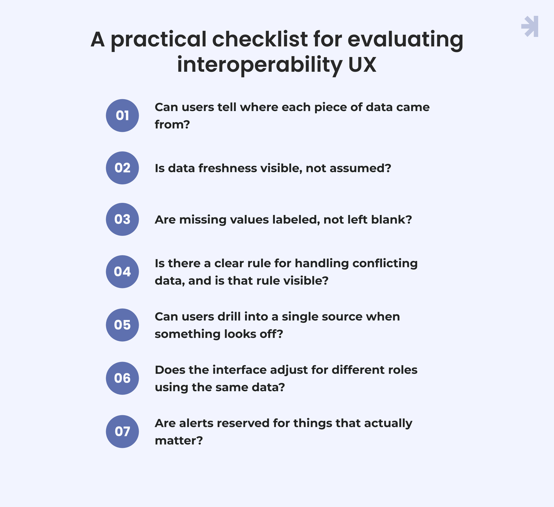
Use this as a quick audit for any healthcare product pulling data from multiple systems, whether that's a clinical dashboard, a patient portal, or an internal admin tool.
1. Can users tell where each piece of data came from? If a value on screen doesn't clearly indicate its source system, users have no way to judge how much to trust it.
2. Is data freshness visible, not assumed? Every time-sensitive value should show when it was last updated. If it doesn't, the interface is asking users to assume it's current.
3. Are missing values labeled, not left blank? A blank field and a "not yet available" field look the same to a system. They mean very different things to a person making a decision.
4. Is there a clear rule for handling conflicting data, and is that rule visible? If the product picks one value over another automatically, users need to know the logic exists so they can catch it when it's wrong.
5. Can users drill into a single source when something looks off? A summary view is useful until it isn't. Give users a way to see the underlying detail without leaving the screen entirely.
6. Does the interface adjust for different roles using the same data? A doctor, a nurse, and an administrator working from the same patient record shouldn't be looking at the same level of detail for different reasons.
7. Are alerts reserved for things that actually matter? If every data conflict triggers a warning, warnings stop meaning anything. Reserve them for genuine safety or accuracy issues.
If a product can't answer most of these clearly, the data exchange might be working fine while the actual user experience is quietly falling apart.
Conclusion
Health data interoperability is often measured by whether systems can exchange information. That's an important milestone, but it's not the same as building something people can actually use with confidence. A clinician staring at a screen doesn't benefit from knowing that a data standard was implemented correctly. They benefit from knowing which number is current, where it came from, and what to do when two sources disagree.
The products that get this right treat the interface as part of the interoperability problem, not something that comes after it's solved. They label sources, show freshness, make gaps visible instead of hiding them, and design differently for the doctor, the nurse, the administrator, and the patient looking at the same underlying data for different reasons.
Getting the systems to talk to each other is the easier half of this problem. Designing something trustworthy on top of what they say is the half that actually determines whether the product helps or gets in the way.
Connected data isn't the same as trustworthy data
If your product pulls patient data from multiple systems and you're not sure whether the interface is helping clinicians trust it or just adding another screen to double-check, a UX audit can show you exactly where that trust breaks down and what to fix first.
We've done this kind of work with multi-role healthcare platforms before. See how we approached it for Tiro.health, where reconciling data across doctors, nurses, and administrative staff meant designing one shared system that worked differently for each role.

What is healthcare interoperability?
Healthcare interoperability is the ability of different healthcare systems, like EHRs, imaging systems, and pharmacy platforms, to exchange patient data with each other. The goal is for healthcare organizations to access a more complete picture of a patient's care, regardless of which system originally captured the data.
Why does interoperability in healthcare matter for UX, not just IT?
Getting systems to share data is a technical achievement, but it doesn't automatically make that data usable. Someone still has to look at the result, often a clinician mid-visit, and decide whether to trust it. If the interface doesn't clearly show where data came from or how current it is, interoperability can create confusion instead of clarity, even when the underlying data sharing is working correctly.
How does poor interoperability UX affect care coordination?
Care coordination depends on different people, doctors, nurses, and administrators, working from a shared, trustworthy view of a patient's data. When healthcare data arrives without clear labeling or timestamps, each person may end up working from a slightly different version of the truth, which slows down coordination and increases the chance of errors.
Do all healthcare organizations need the same interoperability UX approach?
No. Healthcare systems vary widely in size, patient population, and the number of source systems they integrate. A large hospital network managing data sharing across dozens of departments has different UX needs than a smaller clinic connecting to a handful of external systems. The underlying design principles, source labeling, freshness indicators, and visible conflict handling apply broadly, but how they're implemented should match the organization's actual complexity.
Is solving healthcare interoperability at the technical level enough on its own?
Not for patient care outcomes. Standards and frameworks solve whether data can move between systems. They don't solve whether a clinician can quickly understand and trust what they're looking at. Products that treat the interface as a separate, secondary concern tend to end up with technically connected systems that are still frustrating or risky to use.