



Most healthcare apps don't fail because they lack features. They fail because patients hit friction at the exact moment they can least handle it: filling out a form before an appointment, trying to read a lab result, or figuring out what to do after a visit ends. Good healthcare UX design isn't about adding more. It's about making the next step obvious.
This matters more in healthcare than in most other sectors. Patients aren't browsing. They're often anxious, unfamiliar with medical terminology, or managing a health issue that won't wait. A confusing screen in a shopping app costs a sale. A confusing screen in a healthcare app can mean a missed appointment or a patient who gives up and calls the office instead.
We saw this while designing a patient-facing healthcare app that brought appointment booking, digital check-in, provider communication, and follow-up care into one connected experience. The results didn't come from adding functionality. They came from removing friction, clarifying information, and designing for real patients, not an idealized user. This article breaks down what actually worked.
Key takeaways
- Patients don't disengage because an app lacks features. They disengage when the next step isn't clear.
- Booking, check-in, communication, and follow-up work best as one connected patient journey, not four separate product areas.
- In a real healthcare app redesign, this approach led to about 35% faster appointment booking, 30% less time spent navigating health information, and 25% higher task completion across key patient journeys.
- Diverse users, including patients with limited digital confidence or accessibility needs, should shape the design from the start, not get addressed later.
- Good healthcare UX builds trust through consistency and clear handling of patient data, not through more screens or options.
Why healthcare UX design is harder to get right
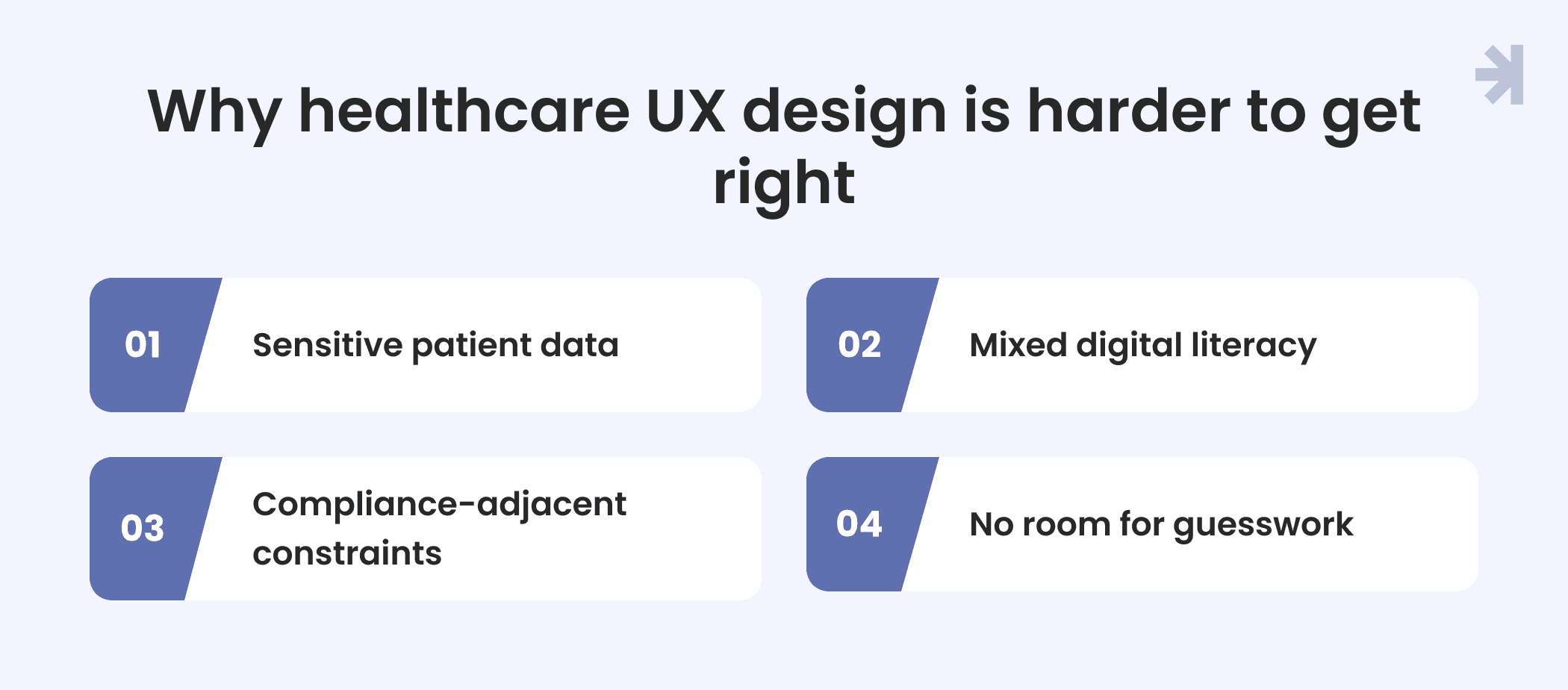
Healthcare mobile app design carries constraints that most digital products never have to deal with.
Sensitive patient data
Every screen showing an appointment, a message from a provider, or a piece of health information is also handling something the patient has a right to keep private. That shapes how much gets shown at once and how it's structured, without turning the interface into a legal disclaimer.
Mixed digital literacy
A healthcare app has to work for someone who manages their whole life on their phone and for someone who's never used a portal before. Designing for the average user isn't enough. Designing for the widest range of real patients is the actual job.
Compliance-adjacent constraints
Design decisions can't happen in isolation from how a health system operates, what a provider has to document, or how information moves between systems. That doesn't mean design should center on regulation. It means every flow has to hold up under real-world constraints, not just look clean in a mockup.
No room for guesswork
In most digital products, a confusing flow leads to a support ticket. In a healthcare app, it can mean a missed appointment or a patient who gives up and calls the office instead. High-stakes environments don't forgive ambiguity the way lower-stakes products can.
This is why good healthcare UX takes more than applying general UX principles to a new sector. It requires UX designers who understand the particular needs of healthcare professionals, healthcare providers, and patients at the same time, without letting any one of them dominate the experience.
The four moments that make or break a patient's experience
Most products in the healthcare sector treat booking, check-in, communication, and follow-up as four separate features, built at different times, with different interaction patterns. Patients experience them as one connected journey. When the connections between those moments break down, that's where enhanced patient engagement turns back into disengagement.
Booking
Often the first real interaction a patient has with a healthcare tool. If finding the right person, choosing a time, and confirming an appointment takes too many steps, patients drop off before the journey even starts. This is a clear usability testing target: watch real patient behavior here, not assumptions about it.
Check-in
A confusing check-in flow creates friction right before a patient needs to focus on the visit itself. It's also where a patient portal collects a lot of complex information, so clarity and accessibility standards both matter here, not just speed.
Communication
Messages from healthcare providers, care updates, and health information all need a consistent home. Good data visualization helps here too. When digital health solutions scatter this across different channels, patients either miss what matters or have to work to find it.
Follow-up
What happens after a visit shapes whether patient engagement continues. Unclear next steps here undo a lot of the work done earlier in the journey.
None of these moments hold up in isolation. A fast booking flow that's disconnected from check-in just moves the real-world friction downstream instead of removing it. Human-centered design across all four moments, backed by UX research and consistent design systems, is what makes healthcare delivery feel like one healthcare experience instead of four disconnected tools bolted onto the same healthcare systems.
What actually reduces friction
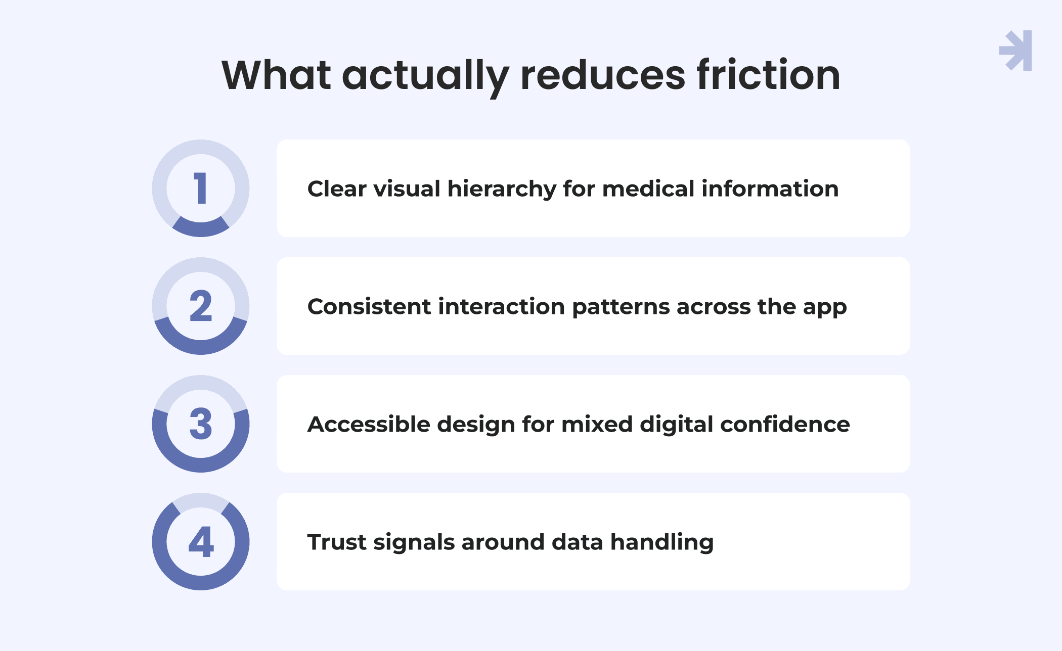
None of this comes down to adding a feature. It comes down to a small set of design principles, applied consistently across every screen in the healthcare product.
- Clear visual hierarchy for medical information. Patients scan for what matters most: an upcoming appointment, a new message, or a result they're waiting on. Data visualization and a strong information architecture help complex information become scannable instead of overwhelming, especially when medical terminology is involved.
- Consistent interaction patterns across the app. When booking, check-in, communication, and follow-up all behave differently, patients have to relearn the interface at every step. Shared design systems and interaction design patterns let patients build confidence once and carry it through the whole healthcare experience.
- Accessible design for mixed digital confidence. Accessibility standards aren't a compliance checkbox here. They're what makes a healthcare tool usable for the full range of real patients, including those with less digital confidence or specific accessibility needs. This is where good UX research earns its keep: understanding patient behavior across genuinely different user groups, not just the easiest ones to design for.
- Trust signals around data handling. Patients are more willing to engage with a healthcare app when they understand how their data is being used and feel confident it's handled carefully. This doesn't require heavier interfaces. It requires being clear and consistent about it, in plain language, at the moments it matters.
Individually, none of these principles is complicated. Applied together and tested with usability testing against real patient behavior, not assumptions, they're what actually separates a healthcare app patients stick with from one they quietly stop using.
What this looks like in practice
These principles aren't theoretical. Our product designers applied them while designing a patient-facing healthcare app that brought booking, check-in, communication, and follow-up into one connected user experience, and the results tracked closely with each principle above.
Simplifying the booking and check-in flow, rather than adding to it, led to about 35% faster appointment booking. The gain didn't come from a new tool or emerging technology. It came from removing steps and applying a clearer interaction pattern to a flow patients were already struggling through across genuinely varied healthcare settings.
Bringing patient data into one structured, consistently visualized view, instead of spreading it across different digital interfaces, led to about 30% less time spent navigating health information. This is the visual hierarchy and data visualization principle in practice: the same information, made easier to scan and understand, whether the underlying build leans on web design or native mobile patterns.
Applying consistent interaction patterns and clearer content across communication and follow-up, the moments most shaped by mixed digital confidence and accessibility needs, led to about 25% higher task completion across key patient journeys. Patients weren't given more capability. They were given a clearer path through tasks they already needed to complete, which matters directly for patient safety, not just convenience.
Across all three results, the pattern holds. None of the improvement came from adding to the product. It came from deep research into where patients actually disengaged and from a senior UX designer's eye for the unique challenges of a high-stakes digital experience, rather than chasing emerging trends for their own sake. The usability testing results told a consistent story: reduce friction at the points patients are most likely to disengage, and engagement follows.
Common mistakes to avoid
Most of the friction we see in healthcare mobile app design comes back to a handful of recurring mistakes, not a lack of effort.
- Dense screens. Cramming complex information onto a single screen feels efficient during design reviews and overwhelming to a real patient trying to use it. Medical terminology, appointment details, and health information all compete for attention, and without a clear visual hierarchy, patients default to skimming or giving up.
- Inconsistent patterns. When booking looks and behaves differently from check-in, which looks and behaves differently from communication, patients can't carry what they've learned from one part of the app to the next. Every screen becomes a fresh problem to solve, which is exhausting in a healthcare setting where patients are already managing something harder than the interface.
- Feature creep mistaken for engagement. Adding more functionality is often treated as a proxy for improving engagement, but it rarely is. More options mean more decisions, more screens, and more chances for a patient to lose the thread of what they came to do. The goal isn't to give patients more to interact with. It's to help them do the thing they came for and move on.
The pattern across all three mistakes is the same: they optimize for what looks complete rather than what a real patient can actually use. Testing against real patient behavior, not internal assumptions, is usually what surfaces them before they ship.
The takeaway for teams building or rebuilding a patient-facing app
If there's one thing worth carrying forward from this, it's that good healthcare UX design rarely comes from adding something new. It comes from removing what gets in a patient's way.
Before adding a feature, a new flow, or another screen, it's worth asking a simpler question first: is the core experience, booking, check-in, communication, and follow-up, as clear and connected as it can be? For most healthcare products, the answer is no, and the fix isn't more functionality. It's a clearer visual hierarchy, more consistent interaction patterns, and design decisions made around real patients rather than an idealized one.
Teams that get this right treat the patient journey as one connected experience from the start, test it against real behavior rather than assumptions, and build the underlying design system to support that consistency as the product grows. That's what turns a healthcare app from something patients tolerate into something they actually use.
See how we applied these principles in a real project.
Our Luma case study breaks down the full design process behind this patient-facing healthcare app, including the research, the key screens, and the results.
Building or rebuilding a patient-facing product of your own? Our team designs healthcare tools that patients actually use, from initial research through a scalable design system.

What makes healthcare mobile app design different from other product design?
What makes healthcare mobile app design different from other product design? Healthcare mobile app design has to account for sensitive patient data, a wide range of digital literacy, and high-stakes tasks where confusion has real consequences, not just inconvenience. General UX principles still apply, but they have to be applied more carefully, with less room for guesswork than in most other sectors.
How do you design a healthcare app for patients with different levels of digital literacy?
Start with human-centered design and usability testing across genuinely diverse users, not just the most tech-comfortable ones. Clear visual hierarchy, consistent interaction patterns, and accessibility standards do more for mixed digital confidence than adding onboarding screens or extra guidance.
Does adding more features improve patient engagement?
Not on its own. In our experience, patients engage more when the core journey, booking, check-in, communication, and follow-up, is clear and connected, not when more functionality is layered on top of an already confusing experience.
What are the most common UX mistakes in patient-facing healthcare apps?
Dense screens that cram in complex information, inconsistent interaction patterns across different parts of the app, and feature creep mistaken for genuine engagement. All three tend to optimize for what looks complete rather than what a real patient can actually use.
How long does it take to design a patient-centered healthcare app?
It depends on the scope of the healthcare product and how much of the patient journey is being redesigned. A focused redesign of a few key flows takes less time than building a full design system from scratch, but rushing usability testing to save time is one of the more common ways friction ends up shipping anyway.