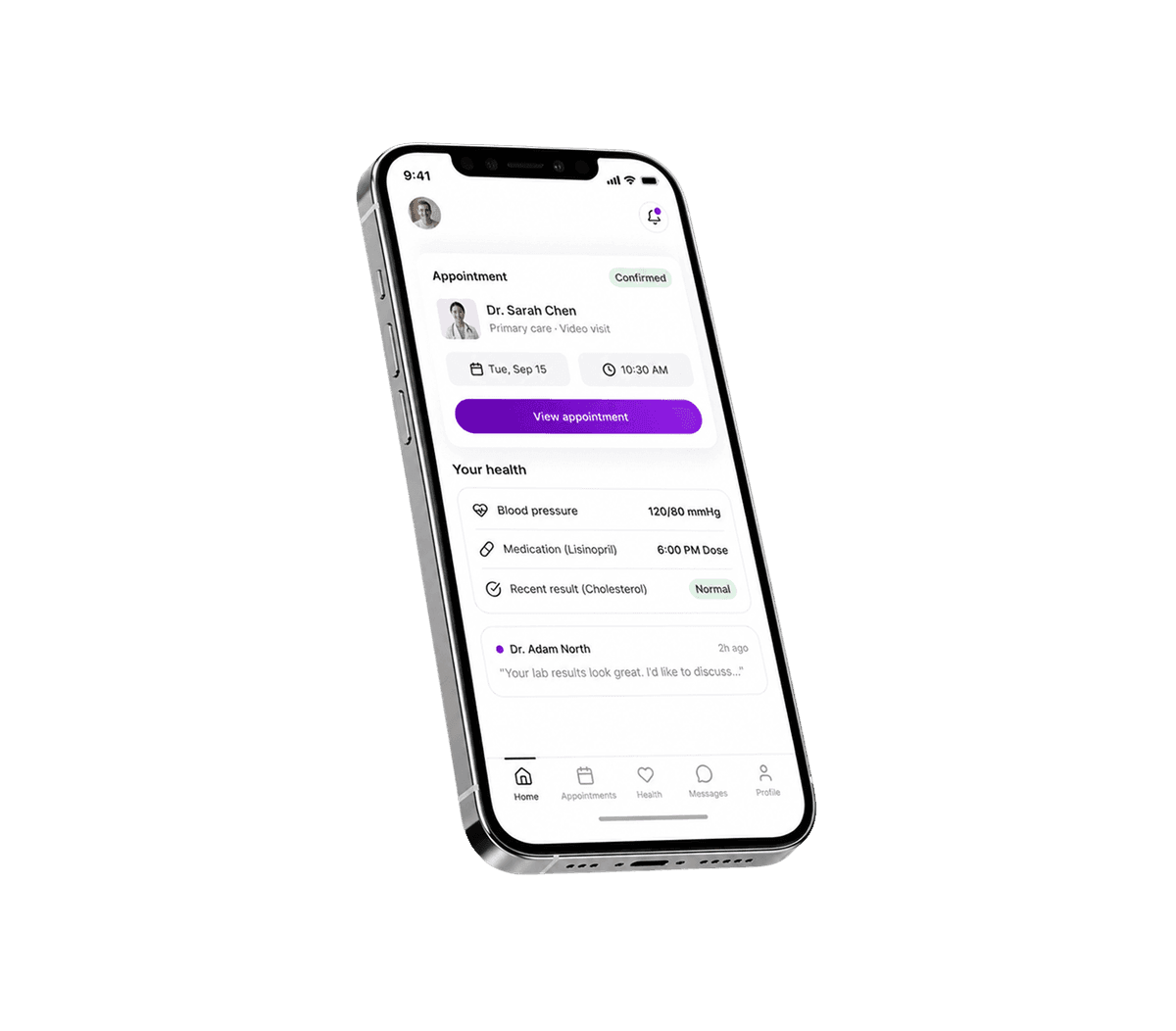
A simplified booking flow helped patients find healthcare providers, choose available times, and confirm appointments with fewer steps.
A unified patient portal brought appointments, messages, health records, and care information into one intuitive digital interface.
Human-centered design, usability testing, and a clearer visual hierarchy made core tasks easier to complete across diverse user groups.


Patients often have to navigate multiple healthcare tools, disconnected digital interfaces, and complex medical information just to complete simple tasks. Luma needed a clearer, more intuitive experience that reduced friction, supported different user groups, and made essential healthcare information easier to access.

01
Clear content and visual hierarchy help patients understand complex healthcare information and what to do next.
02
Even small issues in booking or finding information can cause frustration, so we focused on simplifying key patient journeys.
03
Patients stay more engaged when they understand how their data is used and feel confident about their privacy.
01
We made core tasks like booking appointments and checking upcoming care easy to complete.
02
We focused on meaningful interactions that keep users informed and engaged without adding unnecessary features.
03
We designed clear, consistent experiences for users with different needs and levels of digital confidence.
The product was designed around diverse patient needs rather than a single user profile.

People booking appointments, checking visits, and keeping track of their care.

Users who need simple navigation and clear guidance when using digital healthcare products.

People who may need additional support, including users with visual or cognitive accessibility needs.
01
UX strategy & Flows
We mapped the key journeys to understand user needs and simplify interactions across the product. The focus was on creating clear experiences that work within the broader health system without adding unnecessary complexity.
02
UI design & Visual language
We created a clear visual language that makes medical data easier to understand while keeping the experience approachable and consistent. The interface was designed with diverse needs in mind, including visually impaired users.
03
Design system & Implementation support
We created reusable key components to give the product a consistent foundation and support future digital transformation. The system was designed to help UX designers and developers scale the experience as the healthcare product evolves.
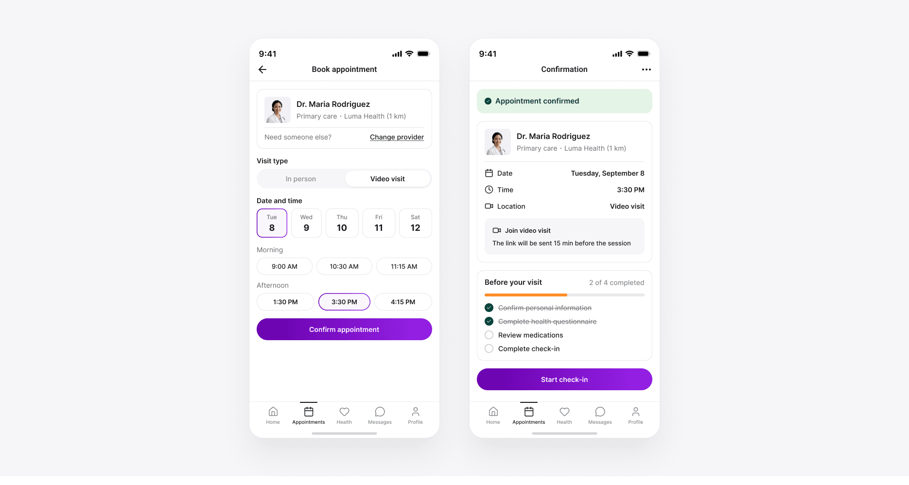
Patients had to move through multiple steps to book an appointment and complete check-in. Complex flows created friction and made everyday healthcare interactions harder to navigate.
We redesigned the booking and check-in experience around user needs, using UX research and usability testing to simplify the flow. Clear interaction patterns and a stronger information hierarchy helped users understand each step and complete tasks with less effort.
A clearer user experience that reduces friction and supports stronger patient engagement throughout the healthcare journey.
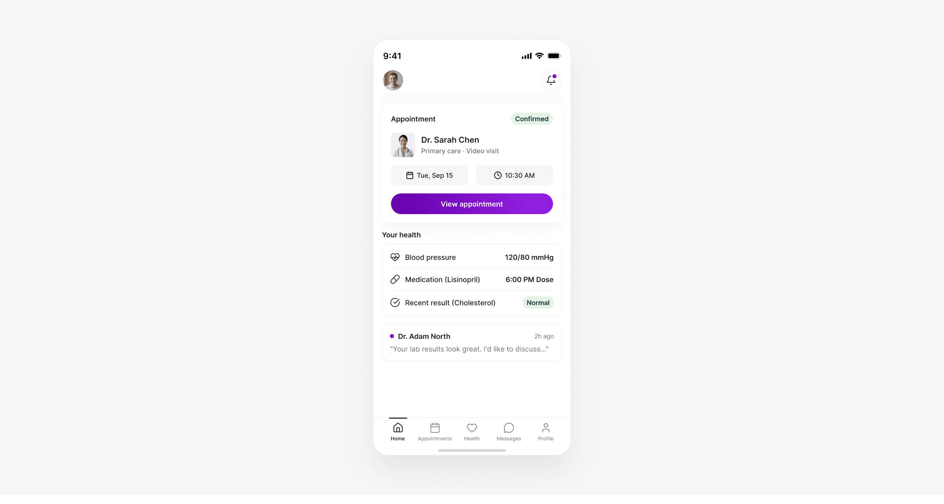
Important patient data was spread across different sections of the product, making it harder for users to find relevant health information and understand their care journey.
We brought key information into a more structured experience, using data visualization to make complex information easier to scan and understand. Our UX designers created consistent patterns for presenting patient data across the healthcare product.
A clearer user experience that helps users find relevant information faster and stay engaged with their healthcare.
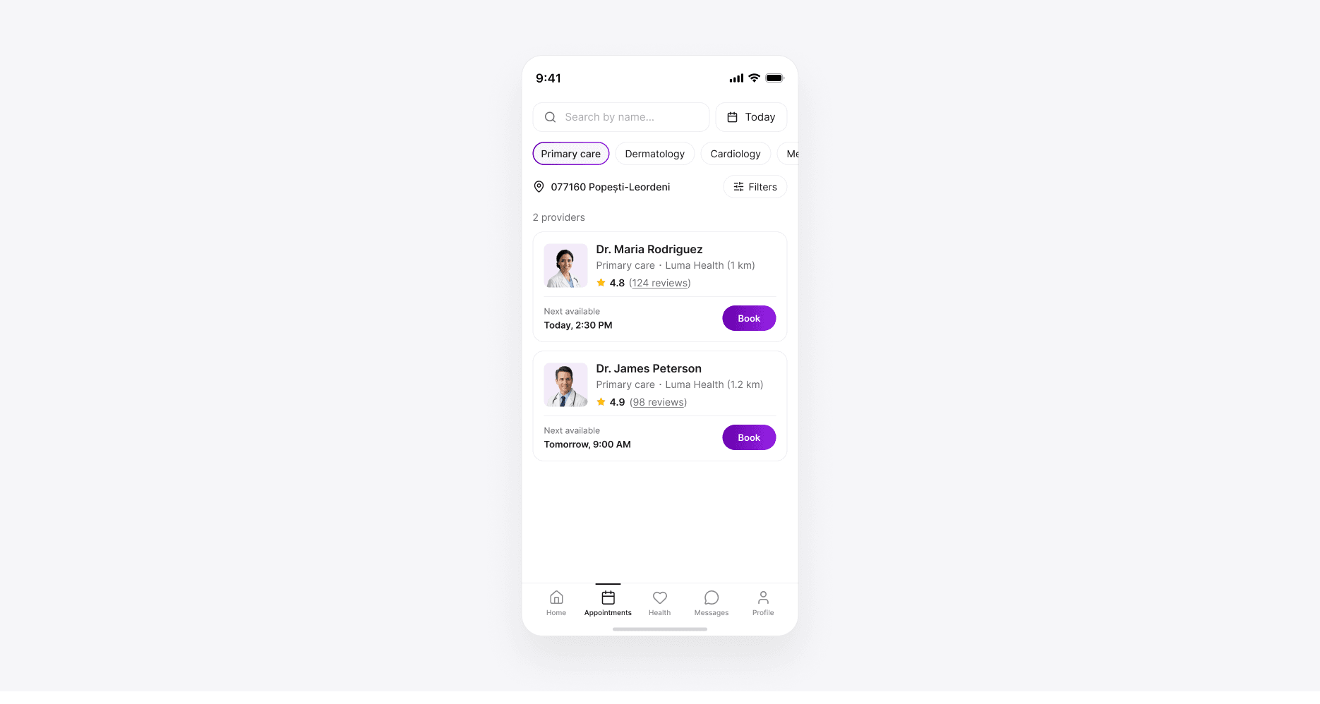
Different users have different user needs when interacting with healthcare products. Complex interfaces can create additional friction, particularly for users navigating important communication and follow-up information.
We applied healthcare UX design principles to create clearer communication and follow-up journeys. Our team used consistent interaction patterns, readable content structures, and design systems to make the experience easier to navigate.
A more consistent user experience that supports patient engagement and helps users complete important healthcare tasks with greater confidence.

Sviat has a medical degree and has studied accessibility and rehabilitation science. He has worked on 20+ projects, focusing on improving UX design and accessibility. Sviatoslav is a lecturer at top Ukrainian universities, collaborates with governmental organizations, and hosts the UX time podcast.