



Most billing flows in the healthcare industry are built on one simple idea: patients want to see what they owe and pay as fast as possible. So product teams put the balance at the top, add a big "Pay now" button, and remove everything in between.
It sounds like good design. In practice, it often fails.
A medical bill is not like a utility bill or an online order. It is deeply personal. It connects to a diagnosis, a treatment, or a hard moment in someone's life. The stakes are high, and the numbers rarely explain themselves. Patients see a total that doesn't match the original cost. They see insurance terms they don't recognize. They aren't sure if the bill is final or if another one is coming.
So they pause. They call support. They wait until they feel sure. Sometimes they don't pay at all. This is the gap we saw when redesigning Aven, a patient billing platform. The team assumed patients mainly wanted speed. Our research showed that patients needed to understand why they owed an amount before they felt comfortable paying it.
For digital health products, billing is an essential part of the user experience. It is often the last touchpoint in a patient journey, and it shapes how patients remember everything before it. Getting it right is about building trust, not just collecting payments.
Key takeaways
- Patients hesitate to pay when they don't understand what they owe, why they owe it, or whether the bill is final.
- The fastest path to “Pay now” is not always the best one. The right amount of context makes payment feel safer.
- Clear cost breakdowns, plain language, and visible payment plans help patients act with confidence.
- In our Aven redesign, patients spent 30% less time understanding medical costs and completed payments in 20% fewer steps.
Why patients hesitate to pay: The unique challenges of healthcare billing
Paying a bill should be simple. In most other industries, it is. You see the amount, you know what you bought, and you pay.
Healthcare billing works differently. The amount a patient owes depends on a chain of decisions they never see: what the provider charged, what the health insurance plan covered, what was applied to the deductible, and what is left over. By the time the bill arrives, the logic behind the number is often invisible.
That creates specific challenges that a "Pay now" button can't solve.
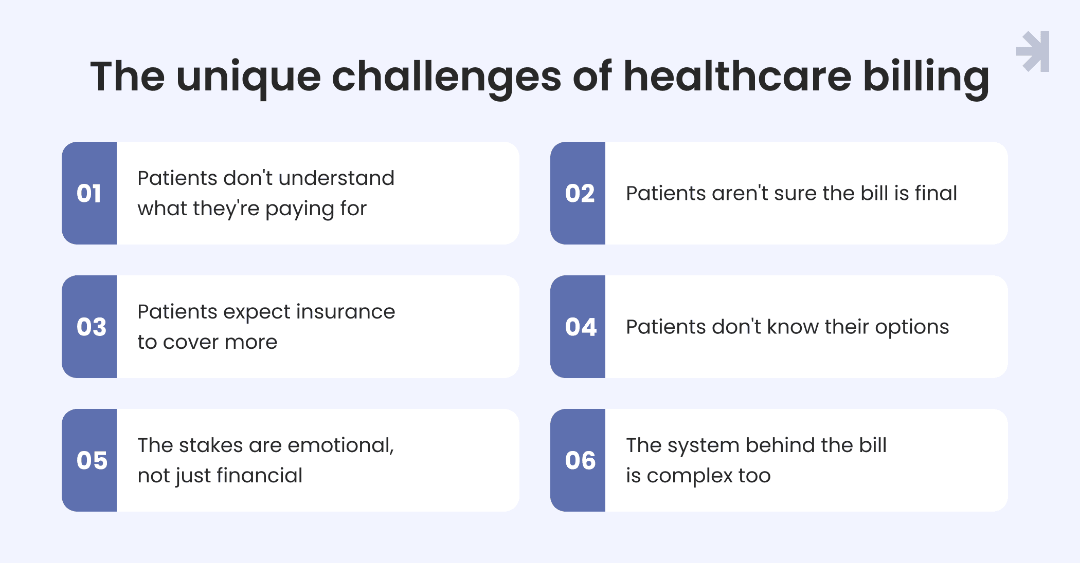
Patients don't understand what they're paying for
Confusion is the most common problem. In a YouGov survey for AKASA, 38% of US adults said medical bills were somewhat or extremely confusing. Their top frustration was not knowing what they were being billed for.
Medical terminology makes this worse. Terms like "allowed amount", "adjustment", or "patient responsibility" mean something specific to billing teams. To patients, they are noise.
Patients aren't sure the bill is final
Uncertainty is its own barrier. In the same survey, 20% of respondents said they didn't know if the final bill would match their estimate, and 24% were frustrated by bills arriving weeks after their visit. When patients suspect another bill might follow, or that a mistake was made, waiting feels like the safer choice.
Patients expect insurance to cover more
Many patients are surprised by what they owe. In the Undue Medical Debt 2025 Pulse Survey, nearly one in three respondents said their biggest cost challenge was bills they thought insurance would cover. When the number doesn't match expectations, patients want an explanation before they pay.
Patients don't know their options
Some patients can't pay the full amount at once. If payment plans or financial assistance are hard to find, they assume there is no option at all. In the Undue survey, the most common reason people didn't apply for financial assistance was simply not knowing it existed.
The stakes are emotional, not just financial
Healthcare costs often arrive during stressful times. Patients may be recovering, managing a chronic condition, or caring for a family member. Many are users who have little energy left for dense screens and unclear next steps. A confusing bill adds stress at the moment people can least handle it.
The system behind the bill is complex too
Product teams face their own constraints. Billing data depends on how the healthcare system connects services, providers, insurance plans, and payment rules. Every health system can structure bills differently. And because billing includes sensitive financial and health information, it operates under strict regulations. In the US, that includes the Health Insurance Portability and Accountability Act (HIPAA).
Good healthcare UX has to work within all of this. The goal is not to hide the complexity. It is to explain it in a way patients can follow.
The assumption that breaks billing in healthcare products
Many healthcare products treat billing as a transaction. The goal is to get patients from notification to payment in as few taps as possible. Anything that slows them down gets removed.
The logic makes sense on paper. Fewer steps should mean more completed payments. But this approach assumes patients already understand their bill and just need a fast way to pay it. For most users, that isn't true.
What the "pay fast" model gets wrong
When a billing flow shows only a balance and a payment button, it asks patients to trust a number they can't verify. Patients who feel unsure don't move faster. They stop. They leave the app, call the billing office, or put the bill aside until later.
The cost shows up on both sides. Patients feel stressed and uncertain. Healthcare organizations and healthcare providers deal with more billing questions, more support calls, and slower payments. A flow designed to save time ends up creating more work for everyone.
What we learned from real users
We saw this assumption firsthand when working on Aven, a patient-facing billing platform. The team initially believed patients mainly wanted to see their balance and pay quickly. It was a reasonable starting point, and one we expected to confirm.
UX research with real users told a different story. Patients wanted to understand why they owed an amount before they felt comfortable paying it. They wanted to see the charges, what insurance covered, and how the final number came together. Only then did paying feel like the right next step.
We also found that payment plans mattered more than expected. Patients who couldn't pay the full balance at once needed to see their options early, not buried after the payment screen.
Context builds confidence
The biggest surprise from user feedback was how patients responded to added information. We expected them to prefer the shortest possible experience. Instead, they valued having enough context to understand their costs before taking action.
The right amount of information didn't make the experience feel more complex. It made it feel more trustworthy.
That is the shift at the heart of good billing UX. The question is not "How do we make payment faster?" It is "What does a patient need to know before they feel ready to pay?"
What good healthcare UX looks like for patient billing
Good billing UX doesn't hide complexity. It organizes it. The goal is to help patients move through three questions in order: What do I owe? Why do I owe it? What can I do next?
Here is how healthcare UX design can answer each one.
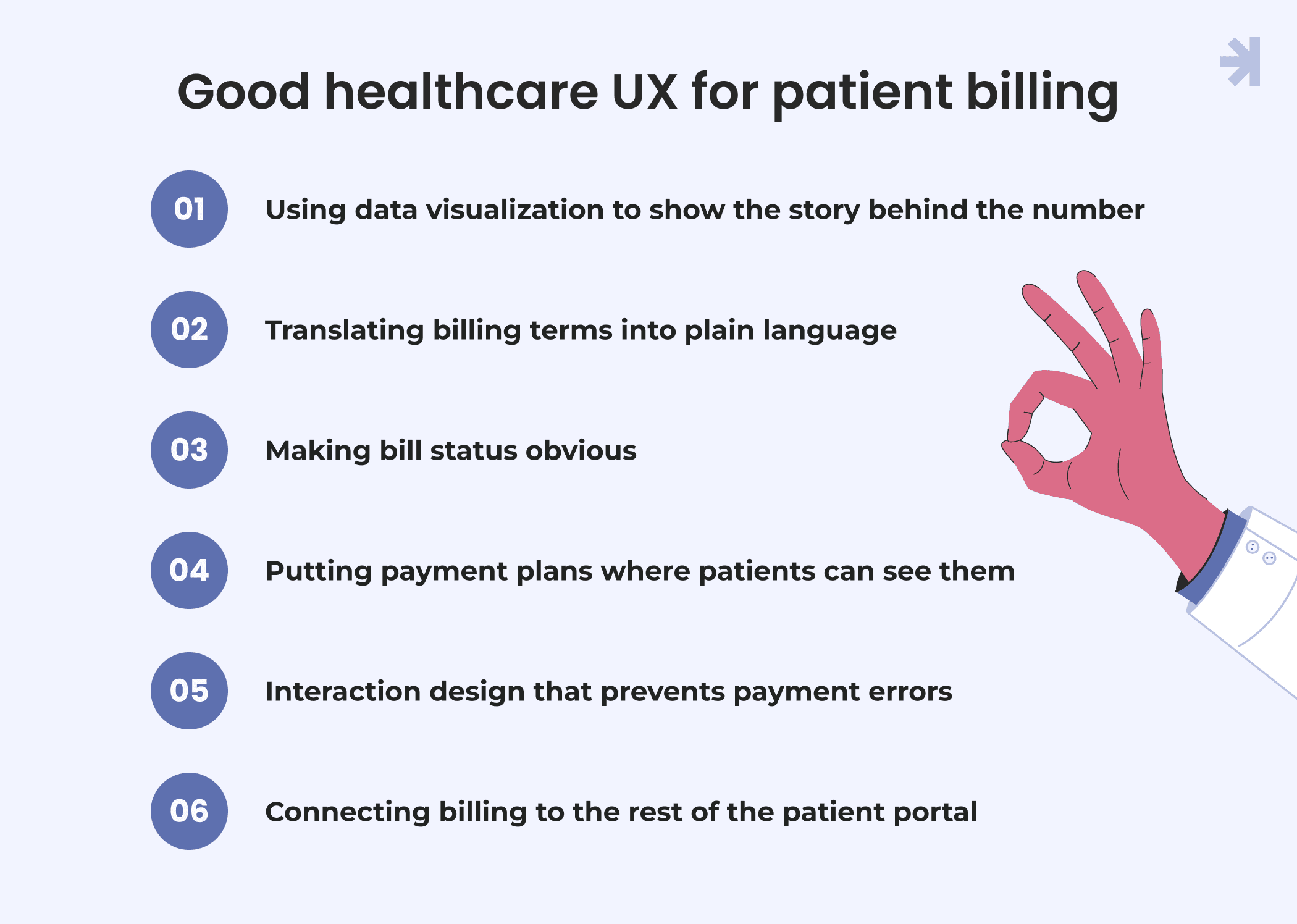
Using data visualization to show the story behind the number
A single balance tells patients what they owe, but not why. Data visualization can close that gap by showing how the final amount came together.
A clear cost breakdown works best in three layers: total charges, insurance coverage, and what the patient owes. When patients can see each step, the final number stops feeling random. They can check it, question it, or accept it with confidence.
Visual hierarchy matters as much as the data itself. The amount due and payment status should stand out first. Supporting medical data, such as individual services or dates, should be available without crowding the main view. Good usability here means patients can scan the summary in seconds and open the details only when they need them.
Translating billing terms into plain language
Medical terminology is one of the biggest barriers in billing. Terms like "deductible", "coinsurance", or "adjustment" are familiar to billing teams, but many patients can't explain them with confidence. Plain language fixes this without removing information. Use everyday words in labels and headings. Add short explanations next to complex terms, through tooltips or inline notes, instead of sending patients to a separate glossary. Where a term must stay, explain what it means for the patient's bill specifically.
This helps everyone, but it matters most for patients with lower health literacy and for older adults, who may be managing more bills and more insurance paperwork than anyone else.
Making bill status obvious
Uncertainty about status is a major reason patients delay payment. Is this bill final? Is insurance still processing it? Has a payment gone through?
Every bill should show a clear status, such as pending insurance, ready to pay, paid, or overdue. Use consistent labels, colors, and icons across the product so patients learn the pattern once. Pair color with text or icons so status is never communicated by color alone.
Clear status helps reduce errors, like paying a bill that will change after insurance processes it or paying the same bill twice. In healthcare, avoiding mistakes is part of patient safety culture, and billing is no exception.
Putting payment plans where patients can see them
Patients who can't pay the full balance often assume there is no other option. If payment plans appear only after they try to pay, many never get that far.
Show payment options alongside the balance, not behind it. Present them as a normal choice, not a last resort. Explain what each option means in simple terms: how much, how often, and for how long.
Visible options keep users engaged instead of pushing them to put the bill aside. And when patients have questions a screen can't answer, give them a clear way to reach the right person, whether that is a billing team, a support chat, or a financial assistance contact.
Interaction design that prevents payment errors
Payment is the moment where mistakes are most costly, so interaction design has to support accuracy as much as speed.
Keep the flow short, but not blind. Show a review step with the amount, the bill it covers, and the payment method before patients confirm. Define clear states for every outcome: processing, confirmed, and failed. After payment, show a confirmation patients can save or come back to later.
Remove steps that don't add clarity. Good task completion comes from fewer decisions, not fewer explanations. Done well, this helps patients save time and still feel in control.
Billing flows also handle sensitive data, including payment details and patient data linked to care. Mask account information, confirm before sensitive actions, and explain clearly how payment information is used. Visible care for patient privacy is part of what makes patients willing to pay through the product at all.
Connecting billing to the rest of the patient portal
Billing rarely works in isolation. Patients move between bills, payment history, insurance details, and visit records. When these live in separate places, patients have to piece the story together themselves. A well-designed patient portal connects them. From any bill, patients should be able to see the related visit, the insurance claim, and past payments. Navigation should be predictable, with the same patterns for every provider or service.
This makes billing part of patient management, not a separate chore. It also supports patient engagement. When financial information is easy to find and understand, patients are more likely to return to the portal and use its other healthcare tools. For digital products in healthcare, billing is often the feature that decides whether patients trust the rest of the experience.
Human-centered design for patients with different needs
There is no single "typical patient" in healthcare billing. People open the same bill with different levels of financial knowledge, health literacy, time, and ability. A flow that works for one patient can leave another stuck.
Human-centered design starts by accepting that range. Instead of designing for an average user, it designs for diverse users and tests with them.
Different levels of financial and health literacy
Some patients understand deductibles and coinsurance well. Others are seeing these terms for the first time. Billing UX has to work for both without slowing down the experienced user or overwhelming the new one.
Layered information helps here. Show a clear summary first, with deeper details one tap away. Patients who want the full breakdown can find it. Patients who just need the essentials aren't forced through it. Patients with recurring costs
For patients managing ongoing care, billing is not a one-time task. They may have several bills from different services or providers at once, and they need to track what is paid, what is pending, and what is still due.
For these users, consistency matters most. Bills should look and behave the same way, whatever service they come from. A clear history and a single view of all open balances help patients stay organized without keeping their own records on the side.
Patients who are stressed or vulnerable
Many patients open a bill during a difficult time. They may be recovering, managing a chronic condition, or handling costs for a family member. Vulnerable users need interfaces that are calm, predictable, and easy to recover from if they make a mistake.
Tone matters too. Clear, neutral language about balances and overdue payments helps patients feel informed instead of pressured.
Patients with different abilities
Accessibility is a core part of billing UX, not an extra. Financial information has to work for everyone, including people with disabilities and older adults who may have changes in vision, dexterity, or memory.
That means readable text sizes, strong color contrast, and status that never relies on color alone. It means screen reader support for balances, tables, and charts, so a cost breakdown makes sense when read aloud. It also means large tap targets and forms that are simple to complete on any device.
Testing with the people you design for
Assumptions about users are easy to make and hard to spot. The Aven project showed this clearly: the team's belief that patients wanted speed above all changed once we listened to real patients.
Regular usability testing keeps a billing product human-centered as it grows. Watching patients read a bill, find a payment option, or complete a payment reveals friction that no internal review will catch.
How we redesigned billing for a healthcare tech platform
Aven is a digital healthcare platform that helps patients manage medical bills, insurance costs, and payments in one place. We joined as the product was scaling. The core billing functionality was already in place, but the experience was becoming harder to navigate and understand.
The challenge
Patients struggled to understand what they owed, what their insurance covered, and why the final amount differed from the original cost. Bills, payment history, insurance details, and payment options were spread across multiple screens. Payment plans were hard to discover, and inconsistent UI patterns made the experience feel fragmented.
On the business side, frequent billing questions showed that patients couldn't interpret their financial information on their own.
Our design process
We started with UX research and user interviews to understand how patients actually manage healthcare costs. That research reshaped the project's direction: patients needed context before action, not just a faster way to pay.
From there, our UX designers restructured the experience around a clear journey: understand the bill, review the details, and decide what to do next.
- Clear financial overview: We organized balances, insurance coverage, and patient responsibility into simple, easy-to-scan sections, using data visualization to explain how costs came together.
- Unified information: We brought bills, payment history, and insurance details into one structured view, with predictable paths between them.
- Simpler payment flow: We removed unnecessary steps and made payment options and payment plans visible earlier, with clear states for pending, confirmed, and failed payments.
We validated these decisions through usability testing, and we worked closely with developers to keep design quality high through implementation.
A foundation for future healthcare solutions
As with every project, we built a design system alongside the redesign. It includes reusable components for billing, insurance, payments, and financial summaries, plus standardized patterns for displaying sensitive financial and health information. Accessibility was considered throughout.
This gives the team a consistent base for new payment and patient engagement features as the technology behind the product grows.
The results
The UX improvements made billing easier to understand and faster to act on:
- 30% less time spent understanding medical costs
- 25% faster access to billing information
- 20% fewer steps to complete a payment
What to measure after a billing redesign in healthcare apps
A billing redesign is only as good as the change it creates. Before launch, agree on what success looks like and how you will track it. Otherwise, it's hard to tell whether the new experience actually helps patients or just looks cleaner.
Here are the metrics that matter most for billing in healthcare apps.
Understanding
- Time to understand a bill: How long does it take patients to find the amount due, see what insurance covered, and explain the balance in their own words? This is the clearest signal that your cost breakdown is working.
- Time to find key information: How quickly can patients locate a specific bill, a past payment, or insurance details? Long search times point to navigation problems.
In the Aven redesign, these two measures showed the biggest shift: patients spent 30% less time understanding medical costs and reached billing information 25% faster.
Action
- Steps to complete a payment: Count the steps from opening a bill to seeing a confirmation. Fewer steps help, as long as patients still review what they are paying.
- Task completion rate: What share of patients who start a payment actually finish it? Drop-off points show exactly where the flow loses people.
- Payment plan uptake: If more patients choose a payment plan after the redesign, it may mean options are easier to find, not that patients are struggling more.
Support load
- Billing inquiries: Track calls, emails, and chats about bills. A drop in questions about what a charge means or whether a bill is final is a strong sign that the product explains itself.
- Repeat questions: Look at the topics that still come up. They show you what to fix next.
Trust and engagement
- Return visits to the patient portal: Patients who understand their bills are more likely to come back and use other features.
- User feedback: Numbers show what changed. Short surveys, interviews, and usability sessions show why. Ask patients how confident they felt before paying, not just whether they paid.
Looking beyond the bill
Billing metrics can connect to bigger goals. Cost confusion and fear of debt can make patients delay or avoid care. When billing becomes clearer and payment options are easier to find, it removes one barrier between patients and the care they need.
That link is hard to measure directly, and it's worth being careful with claims. But for teams building digital health solutions, it's a reminder that billing UX can support patient outcomes, not just revenue.
Billing is part of patient care
It's easy to think of billing as something that happens after care. The appointment is over, the treatment is done, and the bill is just paperwork.
Patients don't experience it that way. For them, the bill is part of the same journey. A clear, fair, understandable bill makes the whole experience feel more trustworthy. A confusing one can undo the goodwill built by doctors, nurses, and other medical professionals during the visit.
As healthcare continues to move online, billing is becoming one of the most visible parts of digital transformation. Patients who once received paper statements now open bills in apps and portals. That shift is a chance to do better: to explain costs clearly, show options early, and give patients control over how they pay.
Where billing UX is heading
Emerging trends point in the same direction. AI tools are starting to explain charges in plain language, answer common billing questions, and help patients find the right payment option. Used well, AI-powered features can take routine questions off billing teams and give patients answers when they need them.
But technology alone won't fix a billing experience that isn't built on clear information and real patient needs. The fundamentals still matter most: clear hierarchy, plain language, visible options, and flows that prevent errors.
Making healthcare billing clearer
Good billing UX is not about making everything minimal. It is about making complex information easier to understand and important tasks easier to complete. When patients understand what they owe, why they owe it, and what they can do next, they pay with confidence. Healthcare professionals spend less time explaining bills. And organizations build the kind of trust that keeps patients coming back.
Making healthcare billing clearer is part of patient care. It deserves the same attention as every other part of the experience.
Is your billing flow losing patients at the payment step? Book a UX audit, and we'll show you where patients get stuck and what to fix first.
What is patient billing UX?
Patient billing UX is the design of how patients view, understand, and pay their medical bills in digital products. It covers everything from how costs are broken down to how payment options are presented. Good patient billing UX helps patients understand what they owe, why they owe it, and what they can do next.
What should a patient payment portal include?
A patient payment portal should include a clear summary of balances, a breakdown of charges and insurance coverage, and a visible status for each bill. It should also show payment options, including payment plans, alongside the balance. Payment history, confirmations, and a clear way to contact support make the patient portal complete.
How do you explain insurance coverage on a bill?
The clearest approach is to show the bill in three layers: total charges, what insurance covered, and what the patient owes. Use plain language instead of billing terms, and add short explanations next to terms like "deductible" or "coinsurance". A simple visual, such as a stacked bar, can make the breakdown easier to scan.
Should payment plans be shown upfront?
Yes. Patients who can't pay the full balance often assume there is no other option if payment plans are hidden. Showing plans next to the balance presents them as a normal choice and keeps patients from putting the bill aside. In the Aven project, research showed that payment plans deserved more visibility than the team first expected.
Why does billing UX matter for the healthcare sector?
Billing is often the last touchpoint in a patient journey, and it shapes how patients feel about the whole experience. Confusing bills lead to delayed payments, more support requests, and lower trust. For healthcare organizations, clearer billing means fewer questions, faster payments, and patients who feel confident using their digital tools.