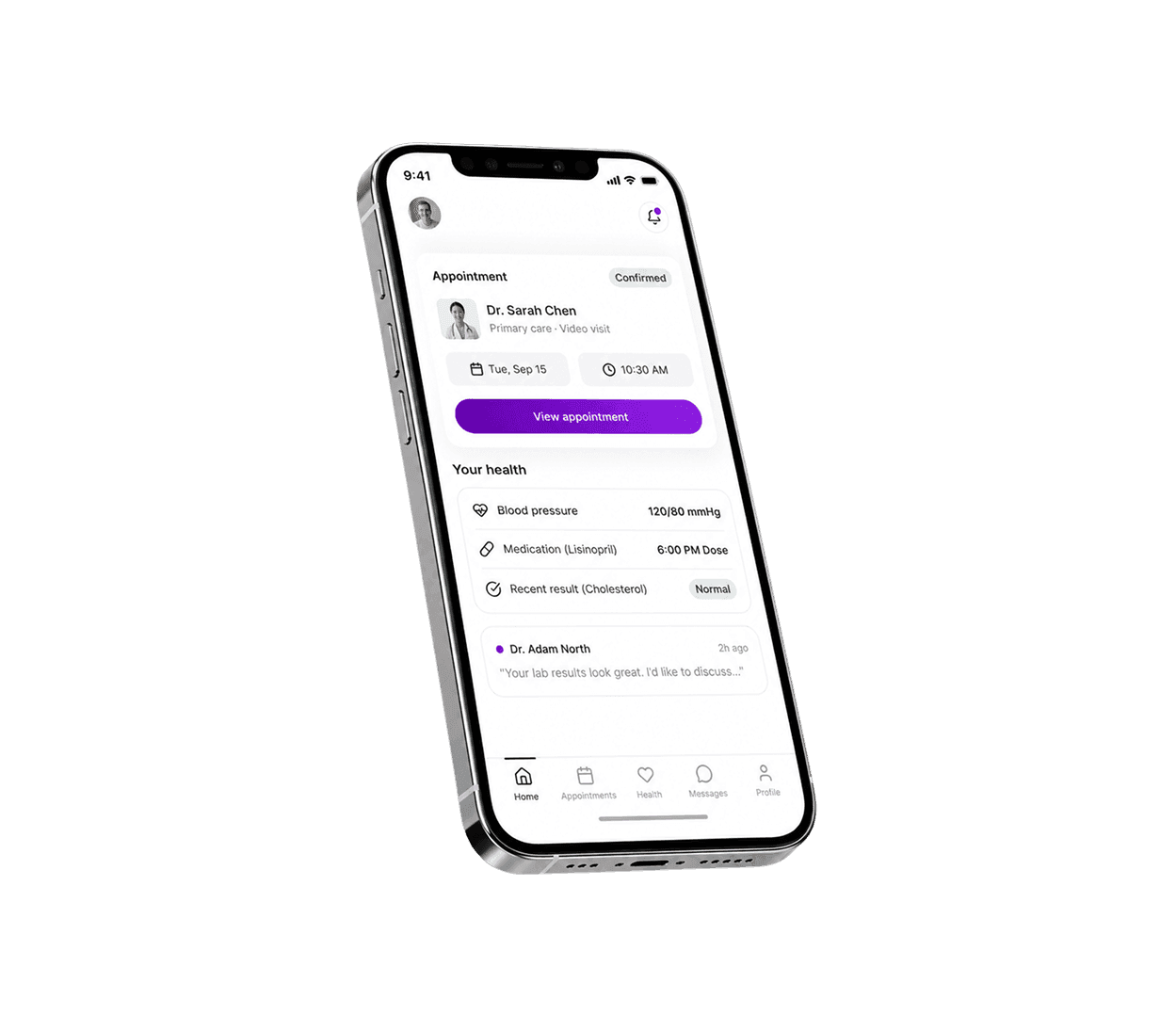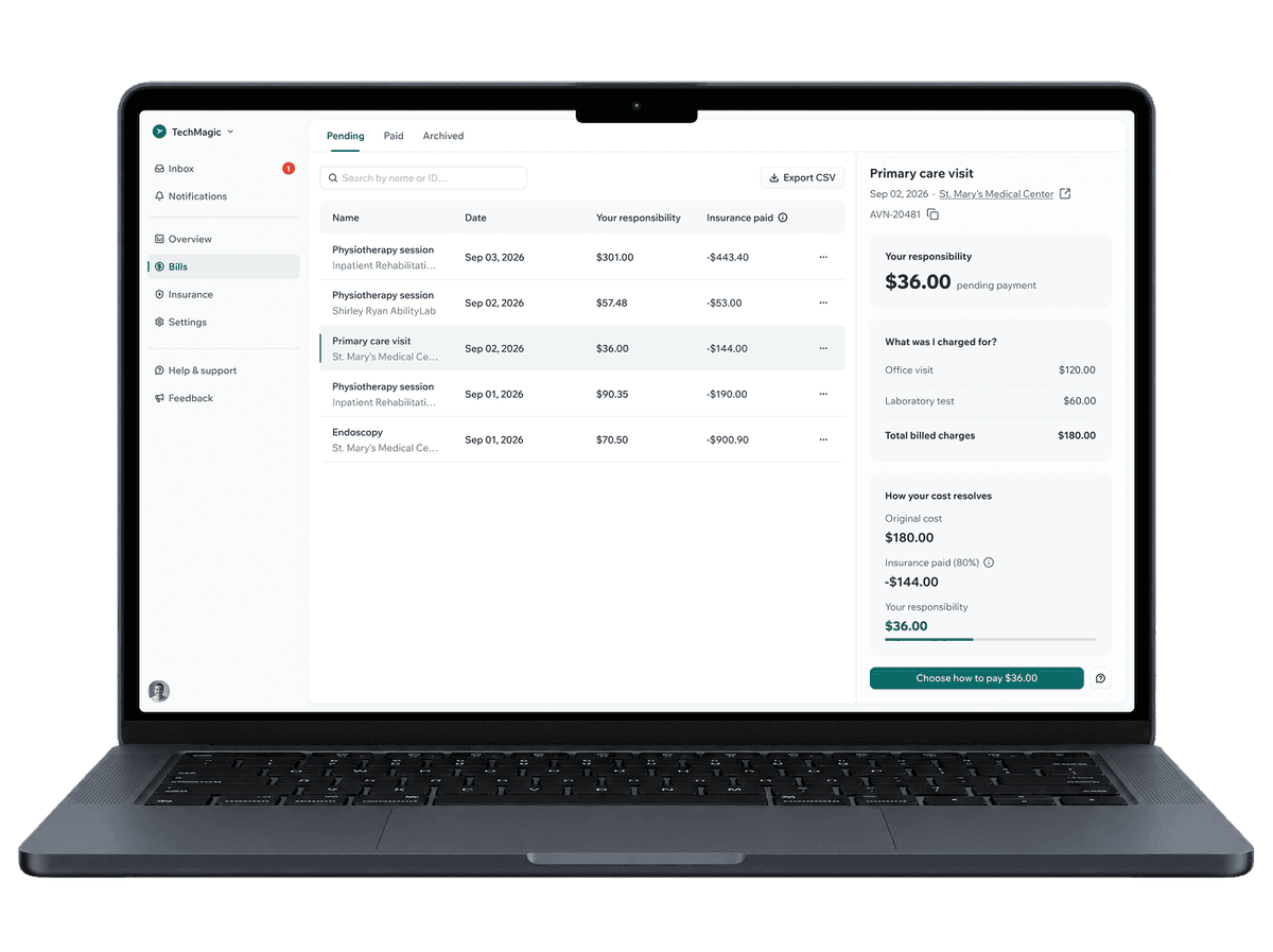
A simplified overview helps patients quickly find balances, payments, and insurance information.
Clear cost breakdowns show total charges, insurance coverage, and patient responsibility, reducing cognitive overload.
A simpler payment flow brings payment options and plans together, making it easier for patients to understand their bill and pay.


Patients were struggling to understand what they owed, why they owed it, and what their insurance covered. Complex billing information, unfamiliar terminology, and fragmented payment flows created cognitive overload and made an essential part of the healthcare experience harder to navigate.

01
Patients needed more than a balance. They wanted to understand the charges, insurance coverage, and final cost.
02
When patients weren’t sure whether a bill was final or what would happen after payment, they were more likely to pause or seek help.
03
Medical costs can already be stressful. Dense interfaces, unfamiliar terminology, and unclear next steps added unnecessary cognitive load.
01
We focused on making balances, insurance coverage, and patient responsibility easy to scan and understand.
02
Payment options, payment plans, and next steps needed to be visible without making the experience feel overwhelming.
03
We created clear paths between bills, payment history, insurance information, and payment actions.
We focused primarily on patients managing their own healthcare costs, with different levels of financial and healthcare literacy.

Users who need to review charges, understand insurance coverage, and pay outstanding balances.

Users managing multiple bills or ongoing healthcare services who need a consistent way to track and manage payments.
01
UX strategy & Flows
We mapped the key patient and administrative workflows to understand where the healthcare system created unnecessary complexity and frustration.
02
UI design & Visual language
The visual language focused on usability, accessibility, and clear communication of health data and financial information.
03
Design system & Implementation support
We built a reusable foundation to support consistency and make future development more efficient.
Patients had difficulty understanding their healthcare costs and finding the information they needed, causing unnecessary frustration during an already stressful healthcare experience.
We introduced a clearer financial overview that organized key information into simple, easy-to-scan sections.
Patients could understand their costs faster and manage their healthcare tasks with less effort.
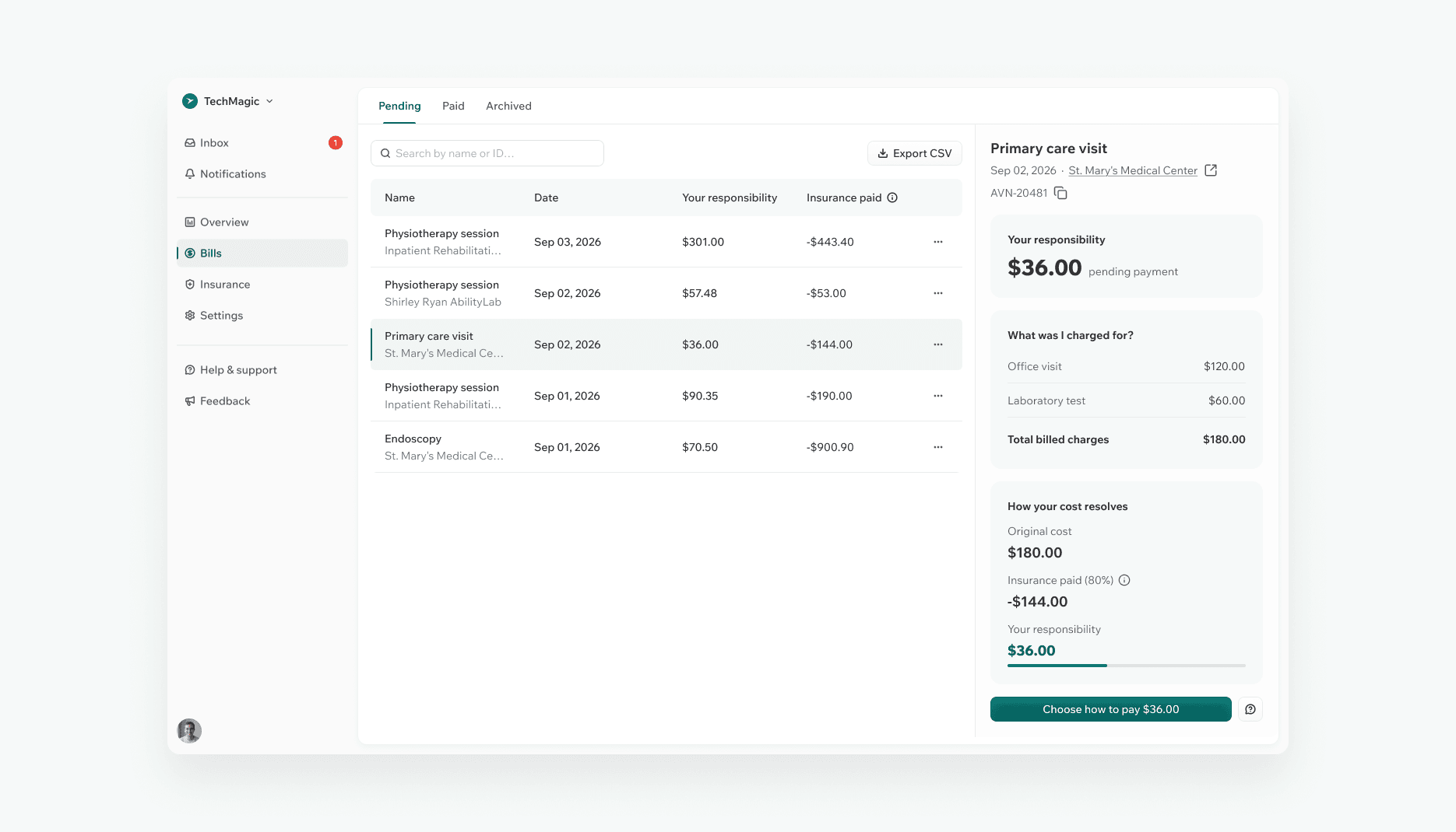
Important information was spread across different sections of the software, making routine administrative tasks harder to complete.
We brought essential information into one structured view, making key actions and resources easier to find.
A more predictable experience helped users avoid frustration and spend less time searching for information.
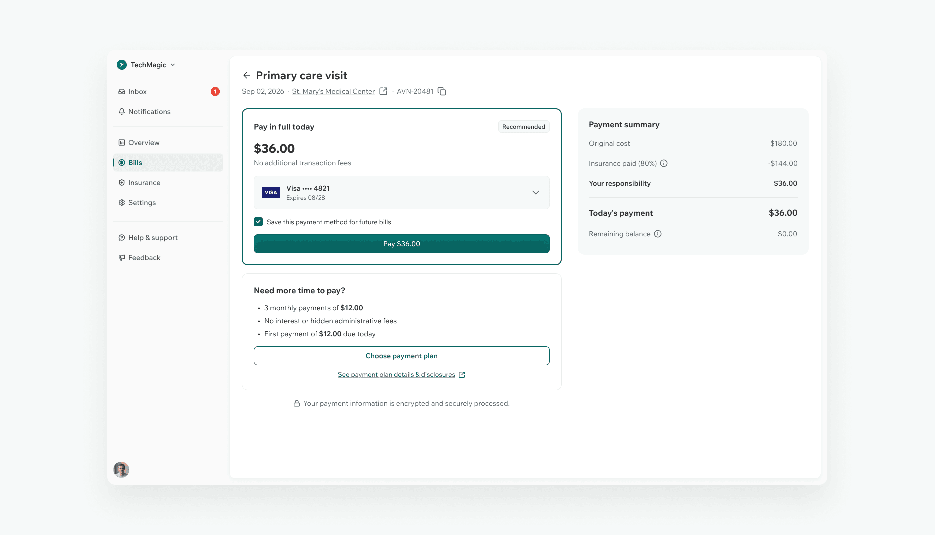
The payment process included unnecessary steps and made it difficult for users to understand their available options.
We simplified the flow and made key actions more visible, helping users move through the process with greater confidence.
The new experience reduced friction and made it easier for patients to complete an important healthcare task.

Sviat has a medical degree and has studied accessibility and rehabilitation science. He has worked on 20+ projects, focusing on improving UX design and accessibility. Sviatoslav is a lecturer at top Ukrainian universities, collaborates with governmental organizations, and hosts the UX time podcast.