



Most SaaS products don't lose users because of a bad feature. They lose them before a single feature gets used.
A user signs up, lands inside the platform, and within minutes makes a quiet decision: this feels complicated, or this feels clear. That decision, made before they've seen half the product, shapes whether they come back tomorrow or quietly churn by day 30.
The cause is almost never pricing, marketing, or missing functionality. It's the onboarding experience. Specifically, the UX patterns that create friction at exactly the moment a new user needs momentum.
In this article, we'll break down the four patterns that kill early retention in SaaS products, what better onboarding UX looks like in practice, and how to diagnose where your own product is losing people.
Why the first 30 days are decisive
Most SaaS products don't lose users because they lack features. They lose them because users never reach the moment where the product's value becomes clear.
In the SaaS industry, user retention is often decided during the first session. A user signs up, enters the platform, explores the interface for a few minutes, and quickly decides whether the product feels intuitive or unnecessarily complex. That experience shapes the entire user journey.
This is why SaaS UX design plays such an essential role in software as a service products. Strong onboarding UX helps users understand the core value fast. Weak UX creates friction before the product experience even begins.
We've seen teams pour budget into features, campaigns, and launch prep while their onboarding quietly loses the users they worked to acquire.
A common example is project management software. A user signs up expecting collaboration and fast organization. Instead, they land inside a dashboard filled with features, navigation items, settings, and empty states that provide little guidance.
The functionality exists. The clarity doesn't. This is where good UX design changes the experience completely.
The best UI/UX design focuses on helping users achieve one meaningful outcome first instead of exposing the entire platform immediately. That's what separates SaaS products that foster engagement from products users abandon after the first session.
The four UX patterns that kill early retention
Most SaaS products don't lose users because of one major UX failure.
They lose them through small friction points that break momentum during the first session. These patterns appear across products of all sizes and usually come from poor onboarding structure, unclear guidance, and unnecessary complexity.
1. Empty state design with no context
One of the most common problems in SaaS products is the empty slate experience.
A user signs up, enters the platform, and sees an empty dashboard with no guidance, no example data, and no clear action to take next. From a UX design perspective, the issue isn't missing features. It's missing context.
Many SaaS teams assume users will naturally understand the product structure because the internal team already knows the system inside out. But new users don't have that mental model yet.
A project management platform with empty tables and navigation panels may look clean to the development team. To users, it often feels directionless or confusing. Good SaaS UX design handles empty states differently.
Instead of showing nothing, strong onboarding design creates direction through:
- Example content
- Suggested actions
- Progress indicators
- Contextual guidance
- Clear next steps
The goal isn't to explain the entire product. The goal is to reduce uncertainty during the first interaction. This is where experienced designers usually focus first during a project audit because empty states shape the entire first impression of the product experience.
2. Feature-first onboarding instead of value-first onboarding
Many SaaS products treat onboarding like a product presentation.
Users are immediately introduced to every major feature, section, integration, and setting before they experience any actual value from the platform. This usually happens because teams want to showcase the full functionality of the product as quickly as possible.
But from a UI/UX design perspective, that approach creates friction instead of momentum. Users don't care about advanced features during the first session. They care about solving one problem successfully.
Strong UX focuses on helping users reach a single meaningful outcome first. That's the moment where the product starts feeling useful instead of complicated.
For example:
- A collaboration platform should help users invite teammates quickly
- A reporting tool should help users generate the first dashboard
- A CRM should help users create the first pipeline
That's the activation moment. Once users experience value, they're far more willing to explore additional features later. The best design agencies structure onboarding flows around momentum, not feature exposure.
This is where user personas and understanding the target audience become essential inside the design process. Different users enter products with different expectations, business goals, and workflows. Good onboarding adapts to that reality instead of forcing every user through the same one-size-fits-all flow.
3. Cognitive overload during the first session
Some onboarding experiences feel like every internal department added something to the interface independently.
Tooltips appear everywhere. Pop-ups interrupt workflows. Banners compete for attention. Feature announcements appear before users complete basic setup. Nothing feels prioritized.
This usually happens gradually as SaaS companies evolve. Marketing wants visibility for upgrades. Developers add onboarding prompts for new features. Teams promote advanced functionality. Support teams add guidance layers.
Over time, the interface becomes overloaded with competing actions and messages. The problem isn't only visual complexity. It's cognitive complexity.
Users enter a new product with limited attention and zero familiarity with the system. Every additional choice increases friction during the most fragile part of the user journey.
Good UX design solves this through information hierarchy and progressive disclosure. Instead of exposing the entire product immediately, the interface reveals complexity gradually as users move deeper into the experience. The best design doesn't feel empty. It feels focused. That's a major difference.
Strong UI/UX design creates interfaces that guide attention intentionally instead of overwhelming users with functionality all at once.
4. No clear progress or momentum
One of the fastest ways to lose users is making onboarding feel endless. Many onboarding flows don't communicate progress clearly enough.
Users don't know:
- How many steps remain
- Whether they're doing things correctly
- What happens next
- How close they are to completing setup
Without momentum, onboarding starts feeling like work instead of progress. This becomes especially damaging in complex SaaS products where setup naturally requires multiple stages, collaboration, permissions, or data configuration. Good onboarding UX creates a visible sense of advancement throughout the entire process.
That usually includes:
- Progress bars
- Step indicators
- Completion states
- Success confirmations
- Guided next actions
These small UI design decisions have a major impact on how users emotionally experience the platform. When users feel progress, they continue. When the process feels static or unclear, they leave.
This is why the best SaaS UX design agencies focus heavily on onboarding flow structure during product audits and redesign projects. Small improvements in clarity and momentum often improve retention faster than shipping entirely new functionality.
What good onboarding UX looks like in practice
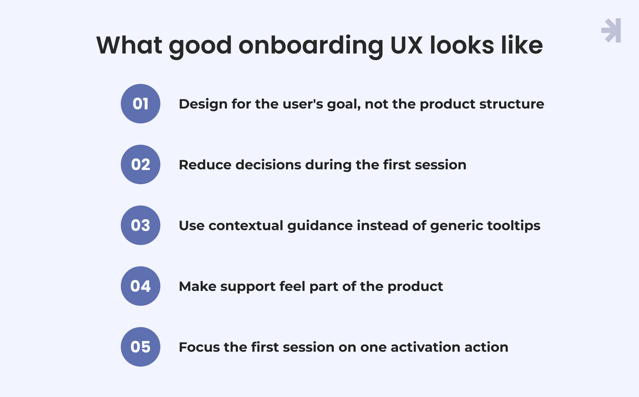
Good onboarding UX doesn't try to explain the entire product during the first session. It focuses on helping users achieve one meaningful outcome as quickly as possible.
Design for the user's goal, not the product structure
Most products are built around internal logic – features, settings, modules, permissions. But users don't enter a platform to explore the architecture. They enter with a specific goal: track my team's work, generate my first report, set up my first pipeline.
A reporting tool that opens to a blank canvas with 14 chart types and a toolbar full of options puts the product's structure first. A reporting tool that opens with one prompt "what do you want to measure first?" puts the user's goal first. The functionality is identical. The experience is completely different.
Reduce decisions during the first session
Friction in onboarding rarely comes from one big obstacle. It comes from dozens of small decisions stacked on top of each other before the user has completed anything meaningful.
A user who has to choose a workspace name, invite teammates, select a plan tier, configure notifications, and pick a template all before seeing the product work hasn't started using the product. They've filled out a form. Strip the first session back to the single action that gets a user to their first result. Everything else can come later.
Use contextual guidance instead of generic tooltips
Long product tours and generic tooltip sequences interrupt the experience at the worst possible time, right when a user is trying to do something. Most users dismiss them immediately.
Better onboarding introduces guidance only when a user actually needs it. A project management tool that shows a hint when someone creates their first task – "add a due date to keep your team aligned" – is helpful because it's relevant. The same message shown on login to a user who hasn't created anything yet is just noise.
Make support feel part of the product
Users shouldn't need to open a new tab, search a help centre, or email support to understand what to do next. That break in context, leaving the product to understand the product, is a momentum killer.
The best SaaS onboarding embeds guidance directly into the interface. An inline explanation next to a confusing field, a tooltip that appears the first time a user reaches a complex step, a persistent "what's next" panel during setup – these keep users moving without pushing them out of the flow.
Focus the first session on one activation action
We redesigned the onboarding flow for a B2B SaaS platform where the original setup process ran to nine steps across multiple screens, with interruptions for feature announcements and upsell prompts before users had completed basic configuration.
We reduced it to four steps, removed everything that didn't directly contribute to the first activation action, and made that action the entire focus of the first session. Drop-off at the point where users had previously abandoned the flow decreased significantly, not because the product changed, but because users finally had a clear path to follow.
That's the pattern. When users feel momentum, they continue. When the process feels like work before they've seen any value, they leave.
How to diagnose your own onboarding UX
Most SaaS companies already feel when something is wrong with the early product experience.
Users sign up but disappear quickly. Clients stop responding after the first session. Support and feedback start revealing the same confusion points again and again.
The challenge is identifying exactly where the experience breaks down.
A good starting point is asking a few simple questions:
- Where is drop-off highest during the first session?
- What percentage of users complete the key activation action?
- What does a user see immediately after logging in?
- Is the next step obvious without explanation?
- How many steps does it take to reach the core value of the product?
- Does the interface feel intuitive or unnecessarily complex?
These questions often reveal issues that teams stop noticing internally over time.
That's why UX audits are such an essential part of the design process. A proper audit doesn't just review the interface visually. It analyzes how users move through the product, where friction appears, and which parts of the experience create hesitation or confusion.
At MagicFlux, we approach UI/UX design audits as a practical diagnostic process rather than a generic design review.
The goal isn't to create another presentation for stakeholders. The goal is to identify the exact friction points affecting retention, clarity, and early engagement and give teams a clear direction for improving the experience.
Conclusion
If your SaaS product is losing users in the first 30 days, the cause is almost always somewhere in the four patterns described above. The harder part is knowing exactly which one is affecting your product and where in the flow it's happening.
That's where a UX audit starts.
At MagicFlux, we map the exact points where users lose momentum, get confused, or drop off and give you a clear direction for fixing them. Not a generic report. A practical diagnosis of your specific product, with concrete next steps.
If early retention is a problem you're ready to solve, let's talk about your product.
Also, check out our "Is your product losing users because of UX?" checklist to identify the problems early.
How long does it take to see results after improving onboarding UX?
Most onboarding UX improvements start showing results within two to four weeks, because they directly affect decisions new users make in their first session. Larger structural changes, like redesigning the full activation flow, take longer to implement but typically have a bigger impact on retention over time. A UX audit is usually the fastest way to know which changes will make the most difference for your specific product.
Do we need a full redesign, or can we improve onboarding without rebuilding the product?
Improving SaaS onboarding rarely requires a full product redesign. The four patterns described in this article – empty states, feature-first onboarding, cognitive overload, and unclear progress – are usually fixable without touching the core product architecture. What's needed is a clear diagnosis of where users are losing momentum, followed by targeted UX improvements to those specific points. That's a different scope to a full redesign, and it moves much faster.
How do we know if our onboarding UX is the real cause of early churn?
The clearest signs that onboarding UX is driving early churn are: users signing up but disappearing before completing setup, support teams repeatedly hearing the same confusion points, and activation rates that stay low despite strong sign-up numbers. If users are signing up but disappearing before completing setup, if your support team keeps hearing the same confusion points, or if your activation rate is lower than it should be – those are signals. A UX audit maps the exact friction points in your onboarding flow and shows you where users are dropping off and why. That gives you something concrete to act on rather than assumptions.