


Telehealth used to be the hard part. Getting a stable video call, a clear picture, and audio that didn't cut out. Most platforms have solved that by now.
The harder problem is what happens around the call. A patient finishes a video visit and isn't sure if they're done or if something else needs to happen. A symptom check leads to a booked appointment, but the notes from the first step never make it to the doctor in the second. A patient uses one app for virtual visits and a completely different one for in-person scheduling, and nothing connects the two.
This is where UX for telehealth actually breaks down today. Not in the call itself, but in the handoffs between virtual and in-person care, between one channel and the next, between the patient's view of what happened and the clinician's.
Good telehealth UX design treats the full patient journey as one connected experience, not a series of separate tools that happen to serve the same person.
Key takeaways
- Video call quality is no longer the main UX problem in telehealth. Handoffs between virtual and in-person care are.
- Patients disengage most often at the transition points: after a consult, between channels, or when they're unsure what to do next.
- Multi-role products (patients, clinicians, administrators) need role-specific views built on one shared workflow, not separate disconnected systems.
- Designing for continuity means designing the moments between visits, not just the visits themselves.
- A practical audit of your own hybrid journey can surface these gaps before patients do.
Where patient experience breaks in hybrid journeys
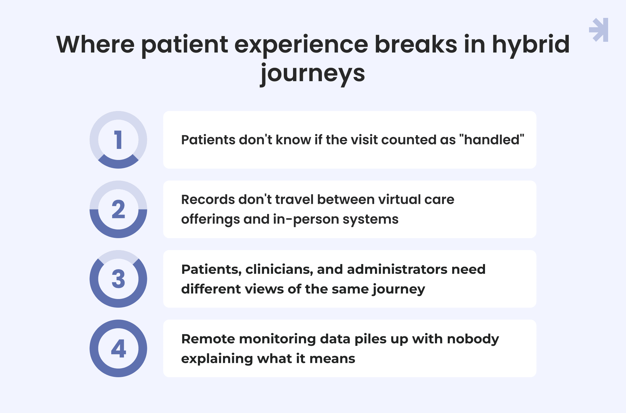
Hybrid care doesn't usually fail because one piece is badly designed. It fails at the seams, where one part of the patient experience hands off to the next. Four gaps show up again and again across telehealth platforms and telehealth apps.
1. Patients don't know if the visit counted as "handled"
A video consult ends and the patient is left guessing. Did the provider order anything? Should they expect a follow-up message? Do they need to book another appointment, or is this resolved?
In-person visits usually end with a clear next step: a printed summary, a follow-up card, or a nurse explaining what happens next. Virtual visits often just end. The call disconnects and the patient is on their own to figure out what comes next.
This uncertainty is one of the biggest drivers of poor patient engagement on a telehealth app, not because the treatment was wrong, but because the ending wasn't clear. A user-friendly close to the visit, even something as simple as a clear summary screen, does more for patient experience than a longer feature list ever will.
2. Records don't travel between virtual care offerings and in-person systems
A patient might complete an intake form online, have a video consult, then show up in person a week later. If those three touchpoints run on different systems that don't talk to each other, the patient ends up repeating their symptoms, their history, and their concerns every single time.
This isn't just frustrating. It signals to the patient that nobody on the other end has the full picture, which makes it harder to build trust in the care itself. From a UI/UX perspective, this is an information architecture problem as much as an interface one: the underlying system needs to support one continuous record across every touchpoint, not three separate ones stitched together after the fact. Providers feel this gap too. Disconnected access to patient history slows them down and puts clinical outcomes at risk.
3. Patients, clinicians, and administrators need different views of the same journey
A single interface rarely works for everyone involved in hybrid care. A patient needs plain guidance and clear next steps. A provider needs clinical context and history. An administrator needs status, scheduling, and exceptions.
When a product tries to serve all three with one generic user interface, everyone gets a worse experience. Clinicians wade through patient-facing language to find what they need. Patients see clinical detail that means nothing to them. The fix isn't three separate products. It's one shared workflow with role-based views, so information entered once is visible to everyone who needs it in the form that's useful to them. This is where usability and accessibility have to be designed in from the start, not layered on after the fact.
4. Remote monitoring data piles up with nobody explaining what it means
Many hybrid care journeys now include some form of remote patient monitoring: blood pressure readings, glucose logs, and data from wearable devices. Patients are asked to log numbers, often in something close to real time, but they're rarely told what those numbers mean for them specifically.
A chart full of data points isn't useful on its own. Patients disengage from monitoring not because logging is hard, but because it feels pointless when nothing comes back to them. Good functionality here means turning raw data into a message the patient can actually act on, not just a display for the clinical team.
UX design for the handoff moments, not just the touchpoints
If the gaps in hybrid care show up at the seams, the fix has to live there too. This isn't about adding more features to a telehealth platform. It's about creating the specific moments where one part of the journey passes to the next.
1. Give patients clarity right after the consult
The moment a video visit ends is the highest-leverage moment in the whole journey, and it's often the most neglected. A simple, clear close does more for the patient experience than any extra feature could:
- A plain-language summary of what happened and what it means
- A visible next step, even if the next step is "nothing, you're done"
- Confirmation that the record is saved and where the patient can find it later
This doesn't need complex rebuild. It needs to exist. Patients shouldn't have to guess whether a visit "counted," and doctors shouldn't have to field the same question by phone an hour later.
2. Make the next step one tap away
If a patient needs a follow-up, whether that's another virtual visit, an in-person appointment, or a lab test, the booking step should be immediate and obvious from the summary screen itself. Not a separate login. Not a phone call. Not a different service tacked onto the same website.
The pattern that works: surface the recommended next action directly where the patient is already looking, right after the consult, with the booking flow pre-filled based on what just happened. The fewer steps between "I need to do this" and "it's done," the more likely the patient follows through. This is one of the more critical metrics for any telehealth product team to track: how many patients complete the recommended next step versus how many drop off after the call ends.
3. Build one history, not three
Whatever the underlying technology looks like on the backend, the patient (and the care team) should experience one continuous record. A patient's video consult notes, their in-person visit history, and any async messages or forms should all live in a single, chronological view.
This is a data architecture decision as much as a UI one, but the UX implication is clear: nobody involved in the journey, patient or provider, should have to ask "wait, did that already get mentioned?" If a patient told the intake form about a symptom, the clinician should see it without the patient repeating themselves. This single-history approach also matters for compliance, since a fragmented record is harder to account for than one continuous, auditable trail.
4. Set expectations before the visit starts
A meaningful share of virtual visit friction happens before the call even connects: patients are unsure if their computer or camera works, unsure how long they'll wait in a virtual waiting room, and unsure what to have ready. A short pre-visit check solves most of this:
- A quick device and connection test, run before the scheduled time, not during it
- A short checklist of what to have on hand (ID, current medications, specific symptoms)
- A clear sense of what to expect: how long the visit will take, what happens if the provider runs late
None of this requires essential new features or a rebuild. What it requires is treating the moments before and after the visit as part of the designed virtual care experience, not just the video call itself.
Multi-role complexity: UI/UX for patients, clinicians, and admin at once
Most telehealth products started with one user in mind: the patient. As hybrid care has matured, that single-role thinking has become one of the biggest sources of friction in the industry. A telehealth service today isn't used by one type of user. It's used by multiple types of users, often at the same moment, looking at the same underlying visit.
1. Why one-size-fits-all UX can't serve everyone
Take a single video visit. The patient needs plain language, a sense of what's happening, and a clear next step. The clinician needs full clinical context, history, and the ability to act quickly during the interaction itself. An administrator needs visibility into scheduling, status, and anything that needs follow-up on the business side.
Build one generic screen to serve all three, and everyone loses something. Clinicians spend time filtering out patient-facing language to find what they actually need. Patients see clinical detail that means nothing to them and creates more anxiety than clarity. Administrators end up working around a view that wasn't built for their job in the first place.
This is a common mistake healthcare organizations make when trying to move fast: they focus on getting one interaction working, then bolt on views for other roles later. The result is rarely a coherent product. It's three half-built experiences stitched together.
2. The fix: one shared workflow, role-based views
The better approach treats the underlying workflow as singular and the view as the variable. Information entered once, whether by the patient, the clinician, or an administrator, should travel through the system and reach everyone else who needs it, shaped for their specific job.
In practice, this looks like:
- Patients see plain-language guidance, next steps, and their own history, without clinical jargon or admin-facing detail.
- Clinicians see full context, prior visit notes, and the ability to act on what they're seeing without wading through patient-facing framing.
- Administrators see scheduling, status, and exceptions across the business without needing clinical detail they can't act on anyway.
This approach has a direct effect on business outcomes too. When roles are designed this way, feedback loops get shorter: a clinician's note is immediately visible to the patient's next step, and an administrator can spot a scheduling problem before it becomes a client complaint. That's a meaningful driver of patient retention, since a service that feels coordinated across roles is one patients trust enough to keep using.
3. Designing for this from day one, not retrofitting it later
The teams that get this right treat multi-role design as a strategic focus from the start of development, not an afterthought once the core product works for patients. Retrofitting role-based views onto a single-role system is possible, but it's slower and more expensive than designing for it from the beginning, and it usually shows in the interaction quality.
For any team building or scaling a telehealth product, this is worth determining early: who are the actual roles interacting with this system, and what does each of them need to see to do their job well? Getting that answer right shapes everything that follows, from the video call interface used during a consult to how a follow-up gets routed after it ends.
Case in point
Tiro.health is a medical documentation platform built for exactly the kind of multi-role complexity described above: doctors, nurses, and administrators, all working from the same underlying system, all needing something different from it.
It's worth being clear about what this case study is and isn't. Tiro.health isn't a telehealth platform. But the core design problem it solved, multiple roles sharing one workflow without stepping on each other, is the same problem hybrid telehealth teams are focusing on when they try to connect virtual and in-person care. The lesson translates directly.
The problem wasn't a missing feature
Before the redesign, the platform's documentation process worked, but it didn't work well for everyone using it. Doctors were spending more time on forms than the clinical interaction justified. Junior staff creating new forms were doing so slowly, often duplicating structure that already existed elsewhere in the system. None of this was a case of the product lacking a feature. It was a case of one shared process not being designed with each role's actual job in mind.
This is worth stating plainly because it's a pattern that shows up across healthcare products: teams assume the fix is to create a new tool or add a channel, when the real fix is redesigning how the existing workflow serves each person using it.
The design decision: role clarity within one system
Rather than building separate tools for doctors, nurses, and administrators, MagicFlux's approach centered on a shared, WCAG-compliant design system that let each role interact with the same underlying documentation workflow through a view built for their job.
Doctors got a documentation flow built around the pace of a clinical interaction. Junior staff creating forms got structure they could reuse instead of building from scratch each time. The underlying data stayed connected across roles, so nothing had to be re-entered or reconciled after the fact.
The result
The outcomes reflect what happens when role clarity is solved at the design level rather than by adding more tools:
- 20% faster medical form completion for doctors
- 30% reduction in form creation time for junior staff
- 25% faster development time, driven by a shared, WCAG-compliant design system that the whole team could build from
None of this came from a bigger feature set. It came from designing one workflow that served three different roles well, instead of three disconnected experiences that happened to touch the same data.
Why this matters for hybrid telehealth
The parallel to hybrid care is direct. A telehealth product facing the same kind of role complexity, patients, clinicians, and administrators isn't going to solve it by adding another channel or another dashboard. The fix is the same one Tiro.health needed: one shared workflow, with views built around what each role actually needs to see and do.
For any company evaluating what to build next, this is a useful way to determine where the investment should go. A new feature can look like progress on the surface. But if the underlying workflow doesn't serve every role well, the costs show up later: in support tickets, in staff time, and in patients who disengage because the experience feels disconnected. Solving the workflow itself tends to have a bigger effect on the business than any single new capability.
A practical checklist for auditing your own hybrid journey
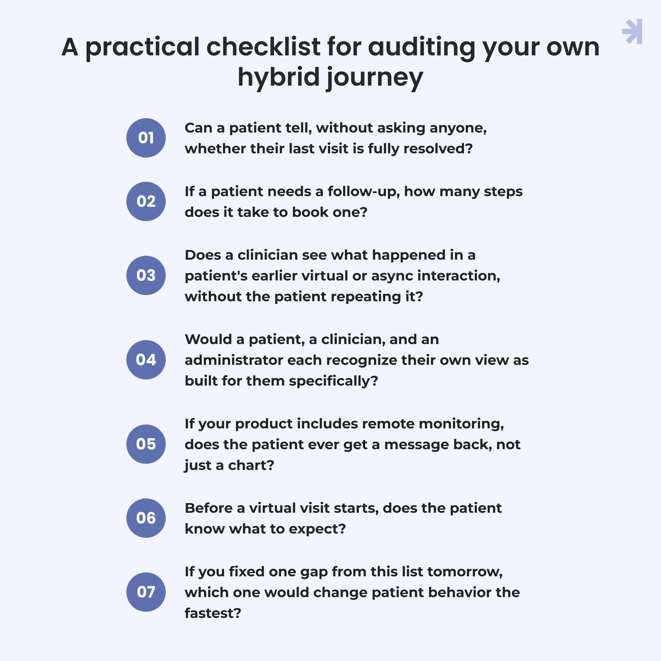
Most teams don't need a full redesign to find these gaps. They need to look at their own product with the right questions in mind. Here's a practical checklist, built around the patterns above, that any team can run through in an afternoon.
1. Can a patient tell, without asking anyone, whether their last visit is fully resolved? Open your own product right after a video consult ends. Is there a clear summary and a clear next step, or does the screen just go quiet?
2. If a patient needs a follow-up, how many steps does it take to book one? Time it. If booking a next step means logging into a different system, finding a different number, or starting from scratch on your site, that's a handoff that's losing patients today.
3. Does a clinician see what happened in a patient's earlier virtual or async interaction, without the patient repeating it? Pick a real patient record and trace it across touchpoints. If information has to be re-entered or re-explained anywhere along the way, the record isn't actually unified yet.
4. Would a patient, a clinician, and an administrator each recognize their own view as built for them specifically? Sit each type of user in front of the same product. If any of them is scrolling past information meant for someone else's job, the workflow is still serving one role at the expense of the others.
5. If your product includes remote monitoring, does the patient ever get a message back, not just a chart? Check whether logged data results in something the patient can act on or whether it just accumulates on a dashboard nobody explains to them.
6. Before a virtual visit starts, does the patient know what to expect? Look for a device check, a rough sense of wait time, and a short list of what to have ready. If none of that exists before the scheduled time, expect friction the moment the call is supposed to start.
7. If you fixed one gap from this list tomorrow, which one would change patient behavior the fastest? This last question matters most. Continuity problems compound, but they don't all cost the same. Start with the handoff that's costing you the most patients, not the one that's easiest to build.
Conclusion
Telehealth stopped being a technology problem a while ago. Video works. Connections hold. What's left is harder to solve, but far more valuable to get right: making a patient feel like they're moving through one continuous relationship with their care, not bouncing between disconnected tools that happen to serve the same visit.
The teams that will stand out in hybrid care over the next few years won't be the ones with the smoothest video call. They'll be the ones who designed for the moments in between and who built one workflow that actually works for every role touching it.
That's a design decision, not a feature request. And it's usually available to any team willing to look closely at their own product and fix what's disconnected.
Get a clear view of where your telehealth app is losing patients
If the checklist above surfaced more gaps than you expected, you're not alone. Most hybrid care products weren't designed as one continuous experience from the start, they grew into it, one channel at a time.
A UX audit can map exactly where your patient journey breaks down, from the moment a visit ends to how well a clinician, an administrator, and a patient each work from the same underlying system. It's a faster way to find the highest-impact fix than guessing which gap to build for next.

What is telehealth UX?
Telehealth UX is the UX design of the full experience around virtual care, not just the video call itself. It covers everything from booking a visit, to the consult itself, to what happens afterward: follow-up steps, access to records, and how virtual care connects with any in-person care a patient also receives. Good UI/UX here means every touchpoint, on a phone, a website, or a computer, feels like part of one service.
Why does UX matter for telehealth?
Because the technology alone doesn't decide whether patients stick with a platform. Two telehealth platforms can offer the same core features and still perform very differently. The one with a clearer experience around the visit wins out: obvious next steps, records that carry over, and a workflow that works for patients and providers alike. That's what keeps patient engagement over time. Poor UX shows up as missed follow-ups, repeated intake, and patients quietly switching to whichever company makes the next step easier. In an industry where trust and healthcare outcomes are directly tied to whether someone follows through on care, that's not a small thing.
Why do patients disengage between telehealth and in-person visits?
Most disengagement happens at the handoffs, not the visits themselves. Users lose confidence in a service when a video consult ends without a clear next step, when records don't carry over between virtual and in-person systems, or when they have to repeat information they've already given a doctor. Rather than driving patients away at these moments, the fix is designing the transitions deliberately, not just the touchpoints on either side of them.
How do you design for patients, clinicians, and administrators in one platform?
The workflow itself should be shared, while the view each user sees should be different. Information entered once travels through the system and reaches everyone who needs it, shaped for their job: plain guidance for patients, clinical context for providers, and status and scheduling for administrators. Building three separate tools for three roles is possible, but it usually creates more friction and slower development than one shared system with role-based access.
What's the difference between telehealth UX and general patient portal UX?
Patient portal UX is mainly about the usability of a single tool: whether patients can navigate and use a portal on its own for things like finding records, messaging a provider, or managing appointments. Telehealth UX for hybrid care is broader. It's about whether virtual visits, in-person visits, and everything in between feel like one continuous relationship, rather than separate services that happen to serve the same patient.
Does remote patient monitoring data need to be explained to patients?
Yes. A chart of readings on its own rarely changes patient behavior. Patients stay engaged with remote monitoring when the data comes back to them as something meaningful, a clear message about what a reading means and what to do next, rather than functionality nobody helps them interpret.
How can a team find these gaps in their own product?
Usually by tracing a real patient's journey through the product end-to-end: from booking, through the visit, to whatever happens after. The gaps tend to show up at the transitions rather than inside any single screen, which is why a structured audit across the full journey finds more than reviewing one feature at a time. It's a useful exercise for any company thinking about where to focus development next, whether the goal is better accessibility, stronger patient engagement, or simply a more coherent product ahead of future growth.