Carely

Healthcare UX design: Building more accessible healthcare products
Healthcare UX
Accessibility
Patient portal
Digital health
hero-image
30% faster completion of key patient tasks

Clearer navigation and simpler forms helped patients complete essential tasks with fewer steps.

25% less time spent finding health information

A clearer information structure made medical data, appointments, and messages easier to find.

35% fewer accessibility issues across core journeys

Accessible components, better contrast, keyboard navigation, and screen reader support improved usability for diverse users.

About
Carely is a healthcare tech company building digital health solutions for patients. When we joined, the product needed a stronger UX foundation to support diverse users and meet accessibility requirements.
Challenge
Designing an accessible healthcare platform meant balancing complex medical information with the needs of diverse users. The goal was to make essential patient journeys clearer, easier to navigate, and accessible from the start.
Research & Discovery
We conducted early UX research to understand how diverse patients use healthcare apps and patient portals, identify accessibility barriers, and improve key journeys such as appointments, forms, health information, and communication with healthcare providers.
Process
We designed an accessible healthcare experience, focusing on clearer patient journeys, easier access to information, and consistent accessibility.
Key solutions
We focused on the unique challenges of accessible healthcare UX, improving patient engagement, patient safety, and the overall user experience across a healthcare system.
Results
The project shows how accessibility-focused UX can address specific challenges in the healthcare sector through accessible design, usability testing, and feedback from diverse users.
Lessons & Reflections
This project showed us that accessible healthcare design needs to account for strict regulations, diverse users, and the specific challenges of healthcare services.
About

Carely is a healthcare tech company building digital health solutions for patients. When we joined, the product needed a stronger UX foundation to support diverse users and meet accessibility requirements.

Challenge

Designing an accessible healthcare platform meant balancing complex medical information with the needs of diverse users. The goal was to make essential patient journeys clearer, easier to navigate, and accessible from the start.

Research & Discovery

We conducted early UX research to understand how diverse patients use healthcare apps and patient portals, identify accessibility barriers, and improve key journeys such as appointments, forms, health information, and communication with healthcare providers.

Process

We designed an accessible healthcare experience, focusing on clearer patient journeys, easier access to information, and consistent accessibility.

Key solutions

We focused on the unique challenges of accessible healthcare UX, improving patient engagement, patient safety, and the overall user experience across a healthcare system.

Results

The project shows how accessibility-focused UX can address specific challenges in the healthcare sector through accessible design, usability testing, and feedback from diverse users.

Lessons & Reflections

This project showed us that accessible healthcare design needs to account for strict regulations, diverse users, and the specific challenges of healthcare services.

Case icon
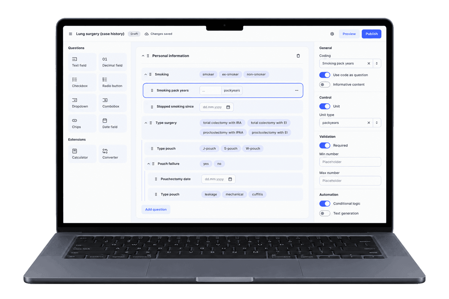
A patient platform across web and mobile
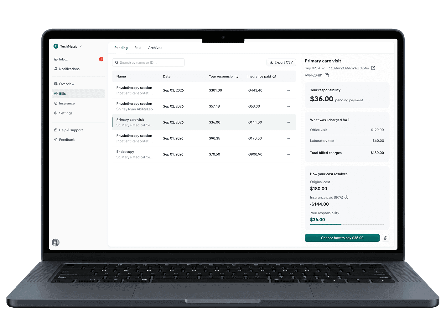
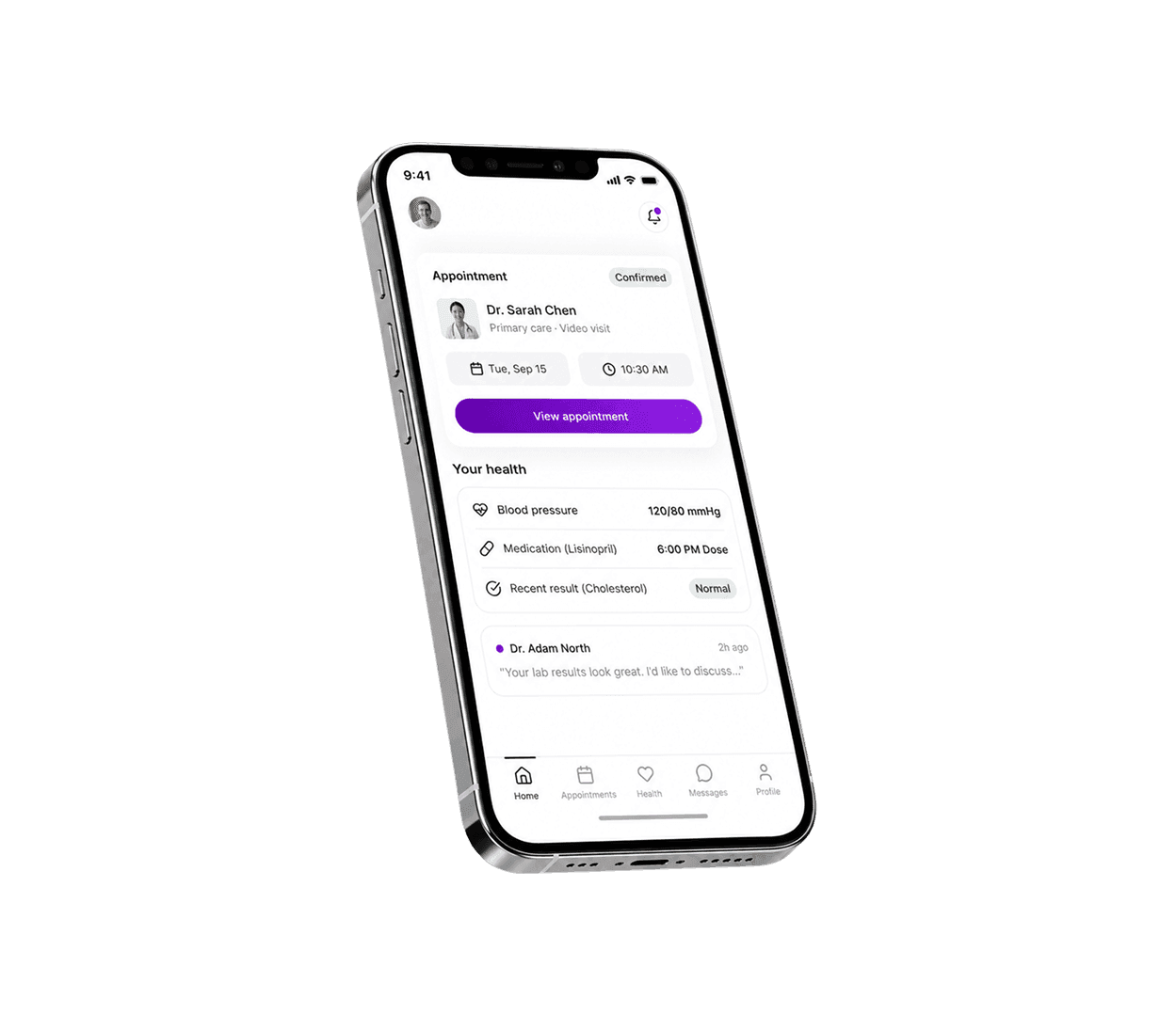
  • A patient portal for appointments, health information, forms, and communication with healthcare providers
  • A responsive web experience and mobile app for patients managing healthcare on different devices
  • Accessible interfaces designed for diverse users, including people with disabilities and older adults
Case icon
The problem we set out to solve

The product contained complex information and essential healthcare tasks, but accessibility had not been consistently built into the experience. Patients could face unnecessary barriers when navigating the platform, completing forms, or finding important medical information.

Case icon
Our role in the project
  • Build accessibility into the UX from the beginning, with Level AA accessibility requirements in mind
  • Simplify complex healthcare information and patient journeys through human-centered design
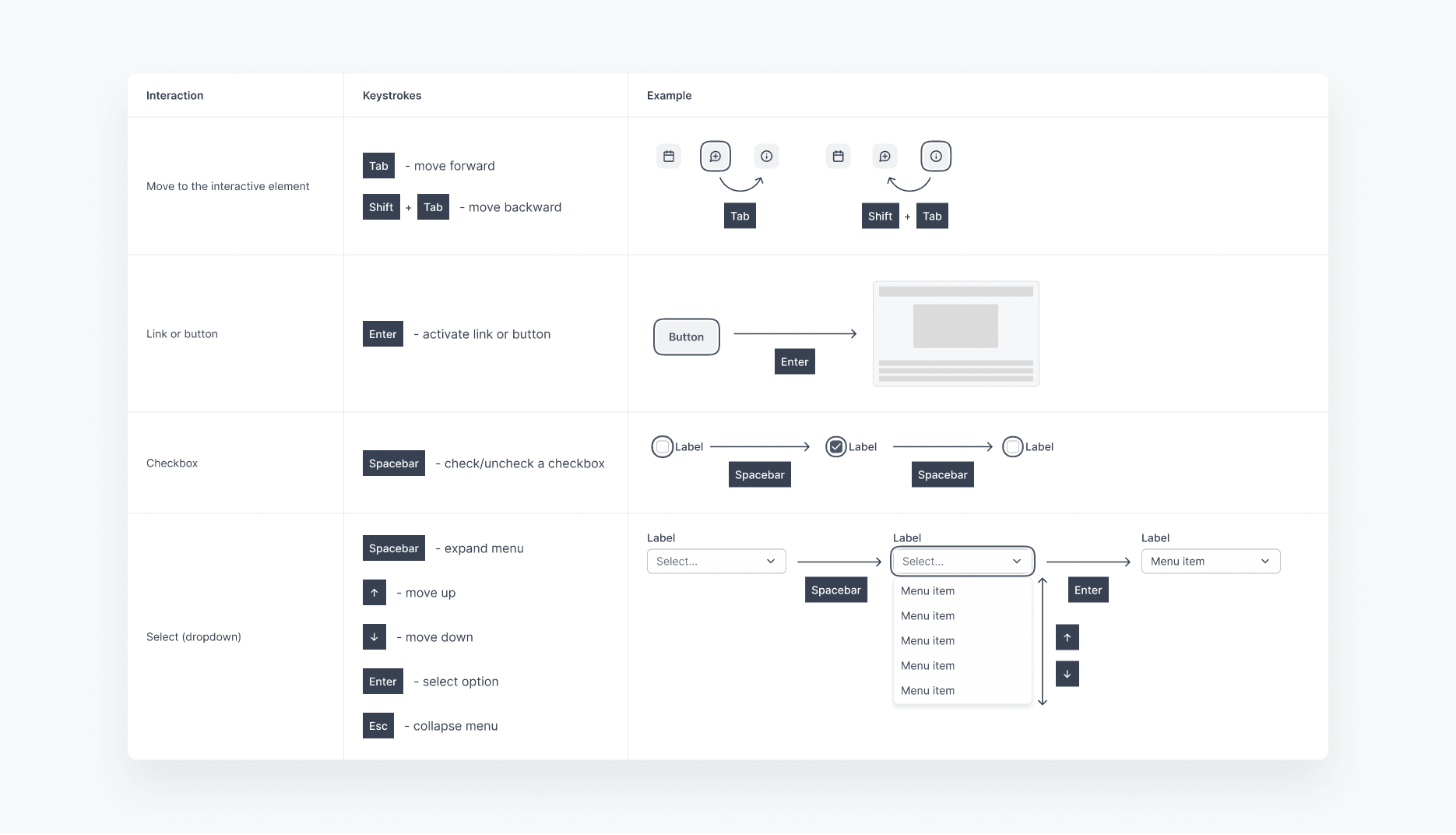
  • Design accessible forms, navigation, interaction states, and components with screen reader support and keyboard navigation
  • Create a scalable design system that helps the product team maintain consistent accessibility as the healthcare platform grows

What we learned early on

01

Patients have different accessibility needs

People with disabilities and older adults may interact with healthcare products in different ways, requiring accessible navigation, forms, and interactions.

02

Healthcare information can be difficult to navigate

Medical data, appointments, and messages can be overwhelming, making clear hierarchy and predictable navigation essential.

03

Small barriers can affect essential tasks

Issues with navigation, contrast, labels, or error states can make simple healthcare tasks harder to complete.

What we prioritized

01

Accessible patient journeys

We made key tasks like booking appointments and completing forms easier to navigate.

02

Clear and understandable healthcare UX

We simplified complex information and created clearer, more predictable interactions.

03

Accessibility built into the system

We integrated accessibility into components, forms, navigation, and interactions across web and mobile.

Who we designed for

We designed for diverse patients with different abilities, needs, and levels of digital confidence.

Patients with disabilities

Users who may rely on keyboards, screen readers, or other assistive technologies.

Older adults
Older adults

Users who benefit from readable content, simple interactions, and clear navigation.

Patients managing their healthcare

People using the platform to book appointments, complete forms, view health information, and contact providers.

01

UX strategy & Flows

We simplified key patient journeys and structured navigation around the needs of diverse users, reducing barriers across essential healthcare tasks.

  • Designed clear flows for appointments, forms, health information, and messaging
  • Simplified complex journeys into clear, predictable steps
  • Improved navigation to make important information easier to find
  • Reduced cognitive load through consistent interaction patterns
  • Considered keyboard and screen reader navigation from the start

02

UI design & Visual language

We created an accessible design focused on readability, clear information, and consistent interactions.

  • Applied web accessibility principles and accessibility requirements across the UI
  • Used clear hierarchy and contrast to improve access to medical information
  • Designed responsive digital experiences
  • Improved interaction and error states to support better task completion
  • Made healthcare content easier to understand and navigate

03

Design system & Implementation support

We built reusable accessibility patterns to help UX designers and developers maintain consistent digital products across the healthcare system.

  • Created reusable components for forms, navigation, and healthcare services
  • Standardized accessible interaction and content patterns
  • Built accessibility into the design system rather than treating it as a final check
  • Collaborated with developers to support accurate implementation
  • Created a scalable foundation for future digital transformation and UX improvements
01
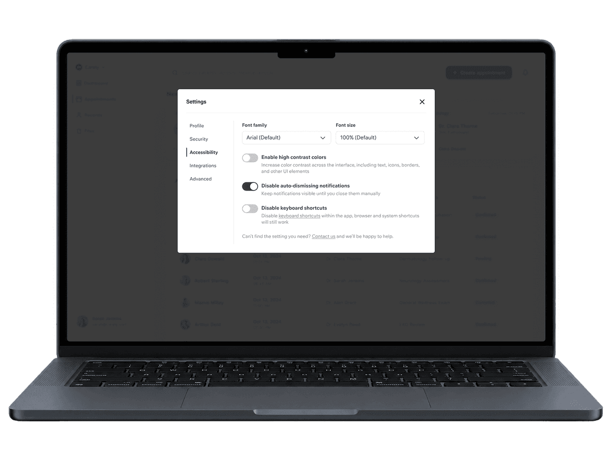
Accessible appointment booking
The problem:

Patients could face barriers when booking appointments, especially vulnerable users relying on keyboard navigation or assistive technologies.

Our solution:

We simplified the healthcare journey with accessible forms, clear navigation, predictable interactions, and web content accessibility guidelines in mind.

The benefit:

Patients could complete essential healthcare services with less friction, supporting better engagement and easier access to care.
Patients completed key tasks faster,
with ~30% less time spent
logo
02
Clearer access to health information
The problem:

Medical data, appointments, and messages were difficult to scan, making important healthcare information harder to understand.

Our solution:

We improved information hierarchy, simplified web content, and structured sensitive data into clear sections that were easier to navigate.

The benefit:

Patients could find the right information faster while maintaining patient privacy and reducing cognitive load.
Patients found health information faster,
with ~25% less time spent
logo
03
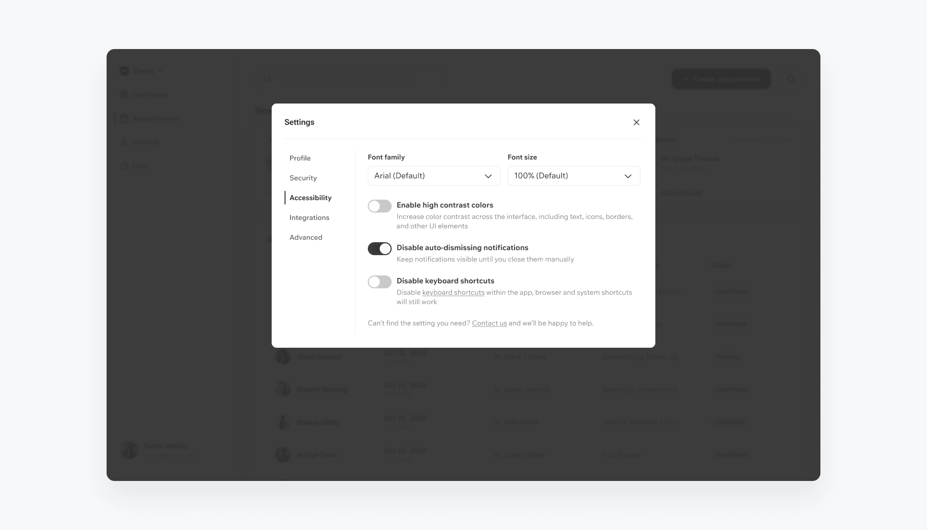
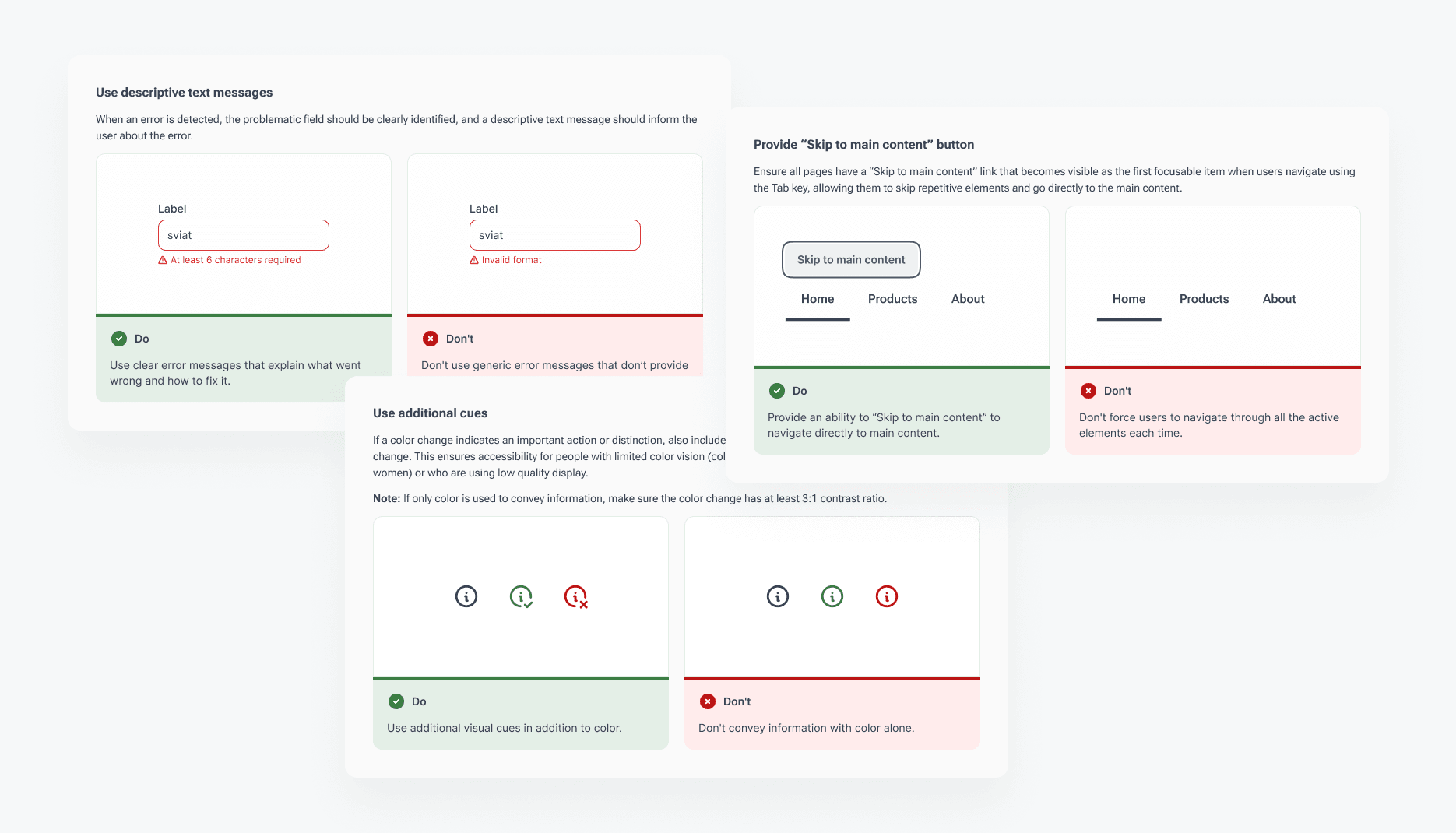
Accessible components
The problem:

Accessibility patterns were inconsistent across the healthcare product, creating usability issues for people with disabilities and older adults.

Our solution:

We created reusable components with accessible contrast, keyboard navigation, screen reader support, clear labels, alternative text, and consistent interaction patterns.

The benefit:

The healthcare team gained a scalable foundation for accessible digital products that supports diverse users and future UX improvements.

Patients experienced fewer accessibility issues,
with ~35% fewer issues overall
logo
Case icon
Business results
  • Established an accessibility-focused UX foundation for a modern health system
  • Created reusable healthcare tools that support consistent accessibility across web and mobile
  • Improved collaboration between UX designers and developers throughout implementation
  • Built a scalable design system aligned with accessibility requirements and technical standards
  • Prepared the product for emerging trends and future digital experiences in the healthcare industry
Case icon
Patient outcomes
  • Improved access to healthcare services for people with disabilities and older adults
  • Made essential healthcare tasks easier to complete through clearer user experience
  • Used usability testing and user feedback to identify and address accessibility barriers
  • Supported patient engagement through clearer healthcare information and navigation
  • Created a more inclusive experience for diverse users across different devices and digital environments

More case studies

Got an idea? Let’s talk!

Sviatoslav Nytka
Sviatoslav Nytka
Design Lead
linkedin

Sviat has a medical degree and has studied accessibility and rehabilitation science. He has worked on 20+ projects, focusing on improving UX design and accessibility. Sviatoslav is a lecturer at top Ukrainian universities, collaborates with governmental organizations, and hosts the UX time podcast.
We use cookies to personalize content and ads, to provide social media features and to analyze our traffic. Check our privacy policy to learn more about how we process your personal data.